"Escape from The Dollhouse"

DanOstergren

TPF Supporters
Supporting Member
Joined
Jun 2, 2013
Messages
4,493
Reaction score
4,141
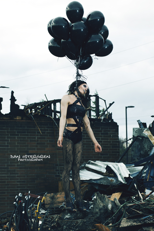
This is my first time sharing a photo here, so I figure I will start with one of my strongest portraits. This portrait is called "Escape from The Dollhouse". It depicts the death and rebirth of a friend. This photo has gotten a lot of emotional responses from viewers, both negative and positive. The way I see it, art isn't always about unicorns, Disney princesses and rainbows. It's about life and reality, and sometimes life is dark and full of death. This darkness and struggle brings enlightenment, and as an artist I find it much more productive to express my feelings through creating images, rather than physically acting on my feelings which sometimes could be very harmful to me.

This is my good friend Adam, and this is "Escape from The Dollhouse".

escape_from_the_dollhouse_by_danostergren-d5woszl.jpg
 
This is a very dark theme which won't appeal to everyone here. Despite the fact that I'm an old f*rt, I know enough Goths to be used to this kind of thing and to see that it would have a strong appeal to some.

Good choice of model and well made up to look the part of the doll. I like the positioning, you did an excellent job there, too. The shine on the balloons and the tangled strings also complement the theme as does the blue tone. The only suggestion I'd make would be to consider cloning out the overhead wires, IMO they don't add anything and their removal may make the image stronger.

I'd call it good photographic art but I wouldn't want it in MY living room! ;)
Well I certainly don't expect it to appeal to everyone here, but I do expect that most viewers will have an emotional trigger to it and be forced to confront something in themselves because of it. This to me is what making art is all about. Art to me has a statement and a reaction to that statement; it's the reason we show our work in museums and galleries.

I'm not always a dark person, but my life is a roller coaster of emotions and I choose to express and explore every facet of what I feel. Some may not like everything I feel, but to be honest I don't like everything I feel either, but I will share it.

Thank you for the feedback!
 
To me the illusion is not convincing, she appears to be standing, not floating or being lifted. She's very good, and almost pulled it off, but it doesn't quite pull together for me.

I rather like the wires overhead, though. I think they add a nice industrialist element. The clutter in the bottom of the frame isn't quite pulling its weight, for me. I see what you're going for, and I approve, but that particular mass of stuff doesn't strike me as contributing to the picture as it ought to. It's a little too random, perhaps. I think this would have benefitted from 20 minutes of staring and moving pieces of junk around, and staring some more, to create an "accidental" jumble that supports the frame a bit more. Sorry, that's kind of vague, but maybe you can get something you can use out of it.
 
I like it, but would love to see it with a more grundy HDR/tonemapped effect, especially replacing the nondescript sky with foreboding clouds.
 
If ever a shot should be made at 1.4 or 1.8, it is this one.
I think the background is too dark and prominent in the shot.
The bright metal leads my eye right out of the shot.
 
BG Too busy... subject does not stand out! Blends with the BG too much. The contrast between BG and sky is too great, IMO, as the BG is much too dark, and you can't modify it without blowing the sky. Better lighting would have helped that immensely. As Lew mentions above, a blurred background would have worked.. left more to the imagination (which is something else that art is all about). A blurred background would have also better defined the subject.

Some images do indeed cause an emotional trigger for me.. but this is not one that does.

Watermark is too prominent and distracting.
 
Wow, I really like this forum! I don't think I've ever gotten such great feedback anywhere else!

We were trespassing in order to get the photo. This in itself made it difficult to really move things around as we didn't want to attract the security guard's attention. Personally I think that there is beauty in this spontaneity alone, but this is more of a personal affect for me and the model rather than visual for the viewer. I agree that shooting at a wider aperture to get a more shallow depth of field would have looked good, but it would have also added too much of a dreamy feeling, and I wanted this to have a more crisp and real feeling to it, and shooting wide open on an 85mm lens wouldn't be able to do this in my opinion. It just wouldn't be sharp enough.

Thank you all for the great feedback! Seriously, keep it coming!
 
To me the illusion is not convincing, she appears to be standing, not floating or being lifted. She's very good, and almost pulled it off, but it doesn't quite pull together for me.
.

SHE is named ADAM! ;) (not that it really matters, but it is important for the proper emotional context)
 
BG Too busy... subject does not stand out! Blends with the BG too much. The contrast between BG and sky is too great, IMO, as the BG is much too dark, and you can't modify it without blowing the sky. Better lighting would have helped that immensely. As Lew mentions above, a blurred background would have worked.. left more to the imagination (which is something else that art is all about). A blurred background would have also better defined the subject.

Some images do indeed cause an emotional trigger for me.. but this is not one that does.

Watermark is too prominent and distracting.

Thanks for the feedback! And I don't expect every viewer to be triggered by it. Many are, many aren't.

As for the watermark, I don't see how it affects the overall image simply because it's only there for web sharing, not to be a part of the artwork.
 
Last edited:
To me the illusion is not convincing, she appears to be standing, not floating or being lifted. She's very good, and almost pulled it off, but it doesn't quite pull together for me.
.

SHE is named ADAM! ;) (not that it really matters, but it is important for the proper emotional context)
"She" is still a proper pronoun, regardless of the model's gender. You could use either really in this case and it would have the same context. And Adam goes by Vivikka as well.
 
Wow, I really like this forum! I don't think I've ever gotten such great feedback anywhere else!

We were trespassing in order to get the photo. This in itself made it difficult to really move things around as we didn't want to attract the security guard's attention. Personally I think that there is beauty in this spontaneity alone, but this is more of a personal affect for me and the model rather than visual for the viewer. I agree that shooting at a wider aperture to get a more shallow depth of field would have looked good, but it would have also added too much of a dreamy feeling, and I wanted this to have a more crisp and real feeling to it, and shooting wide open on an 85mm lens wouldn't be able to do this in my opinion. It just wouldn't be sharp enough.

Thank you all for the great feedback! Seriously, keep it coming!

I can shoot my 85mm wide open and it is very sharp... as long as I keep distance in mind to allow adequate DOF. (Nikon 85mm 1.4)

I find that those who willingly trespass and break the law / violate other rules... make it harder for the rest of us, when we try to get permission to do something legitimately. So I take issue with that! Many places no longer allow photographers access... because of this type of abuse.

And so you have a "less than what you envisioned" image dues to the fact you were trespassing, and had to be discreet! Wouldn't it have been better to get permission, or find a different locale... where you could have used proper gear, had plenty of time, and no hindrances on the shoot? Then you could have captured the image you really wanted!
 
Last edited:
BG Too busy... subject does not stand out! Blends with the BG too much. The contrast between BG and sky is too great, IMO, as the BG is much too dark, and you can't modify it without blowing the sky. Better lighting would have helped that immensely. As Lew mentions above, a blurred background would have worked.. left more to the imagination (which is something else that art is all about). A blurred background would have also better defined the subject.

Some images do indeed cause an emotional trigger for me.. but this is not one that does.

Watermark is too prominent and distracting.

Thanks for the feedback! And I don't expect every viewer to be triggered by it. Many are, many aren't.

As for the watermark, I don't see how it affects the overall image simply because it's only there for web sharing, not to be a part of the artwork.

Distraction... it is very prominent.. and draws the eye. The subject is so dark, that the watermark wins... not the subject. (IMO)
 
To me the illusion is not convincing, she appears to be standing, not floating or being lifted. She's very good, and almost pulled it off, but it doesn't quite pull together for me.
.

SHE is named ADAM! ;) (not that it really matters, but it is important for the proper emotional context)
"She" is still a proper pronoun, regardless of the model's gender. You could use either really in this case and it would have the same context. And Adam goes by Vivikka as well.

When referring to a male.. SHE is not the "proper pronoun"! HE would be. And the differences between HE and SHE will evoke different emotional responses in different people... especially when associated with different attire, or imagery. Just trying to "keep it real!"
 
To me the illusion is not convincing, she appears to be standing, not floating or being lifted. She's very good, and almost pulled it off, but it doesn't quite pull together for me.

I rather like the wires overhead, though. I think they add a nice industrialist element. The clutter in the bottom of the frame isn't quite pulling its weight, for me. I see what you're going for, and I approve, but that particular mass of stuff doesn't strike me as contributing to the picture as it ought to. It's a little too random, perhaps. I think this would have benefitted from 20 minutes of staring and moving pieces of junk around, and staring some more, to create an "accidental" jumble that supports the frame a bit more. Sorry, that's kind of vague, but maybe you can get something you can use out of it.
Funny you say she looks like she is standing, because she was standing on a milk crate. I took two exposures of this scene; one with the model and one without. I n processing I just removed the milk crate and replaced it with the portion of the scene that was where the milk crate should have been. Since the model was in heels it was really difficult to get a good "dangling" look without loosing balance. I feel like I could have done better on a number of aspects in this photo, but I'm still really happy with it. This was actually my first time doing a two image composite.
 

Most reactions

New Topics

Back
Top