Welcome to the forum.
Firstly, these are too large. The last, for example, is 1,582px × 1,055px. Which is larger than the resolution setting on most people's monitors, which makes it hard to see the whole image. Try to resize to about 800 pixels wide (give or take) before you upload. It also helps if you number them.
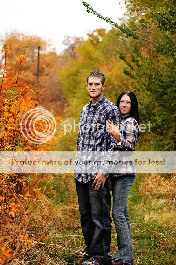
Image #1 is a nice portrait of the woman, but I don't like the way he is cropped out...we see his arm and his ear. If you are going to crop him, either do more or less...try not avoid random parts. I'd also like to see more light in her eyes. The exposure on her face looks great, but the eyes are dark and only have a hint of a catchlight. A reflector would have been ideal here.
I like #2. Great background and the shallow DOF, along with good clothing choice makes them stand out nicely. I might have tried to get rid of that telephone pole but it's not too bad. What I don't like, is that you cropped right into their shoes, yet left loads of space above them. Tilt the camera down just a tad and you've got a much better shot.
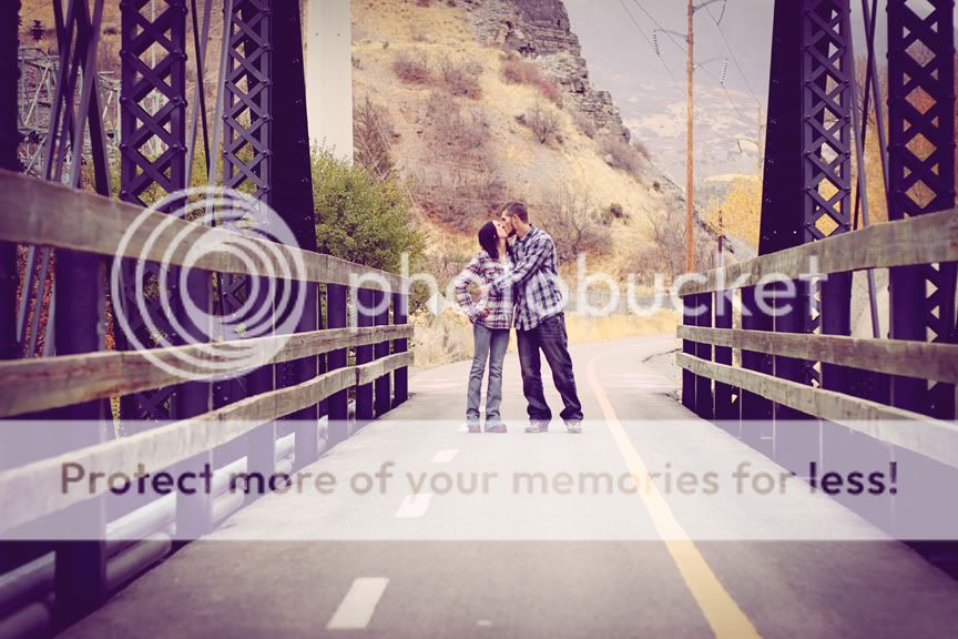
#3 is another good shot. I like your processing choice in this one. It's hard to get a feel for the symmetry (because the size). My first though is that I would have also tried stepping to one side of the bridge, thus using the rails as diagonal lines leading to the couple. But I would probably have shot it straight light this and then see which looks better.
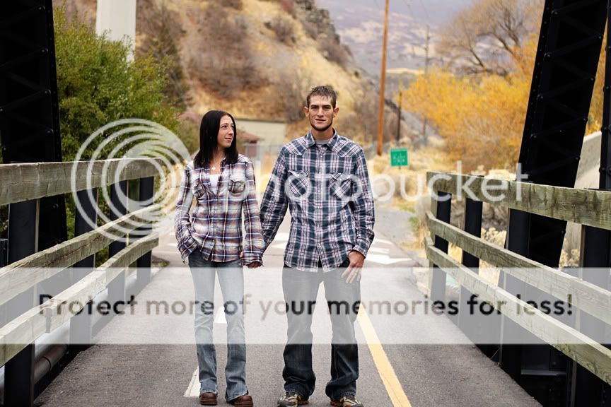
#4 is yet another good one. I like what is going on here. I might be temped to clone out the green street sign, but it's blurred enough that it really doesn't matter. But again, you cropped right at their feet when you had room above them.
Overall, I'd say they are very good. They are nice and sharp, the exposure is great, the DOF is pleasing, the poses work and the processing looks good.


![[No title]](/data/xfmg/thumbnail/31/31701-24a40368b575b319cb332e3114f39172.jpg?1734160369)
![[No title]](/data/xfmg/thumbnail/42/42066-badd1780980376f04f261f985a608adf.jpg?1734176465)


![[No title]](/data/xfmg/thumbnail/36/36099-feb952513e45dbf9f061ab28c1dc1121.jpg?1734168043)

