What's new

Fall is here!(2 for C&C)

Foxx

TPF Noob!
Joined
Jul 28, 2011
Messages
255
Reaction score
44
Location
Atlanta, Georgia
Can others edit my Photos
Photos OK to edit
Effin love fall. I honestly don't think there is a better time for picture taking, the leaves make for such excellent backdrops/subjects. Who's with me?

#1

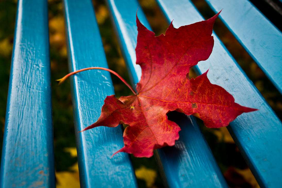
season_of_color_by_pianoblack97-d4al586.jpg


#2

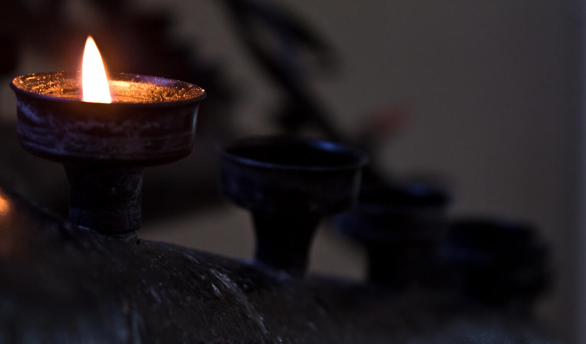
little_prayer_by_pianoblack97-d4al5h7.jpg


On the subject of brights objects in dark environments, how can I bring out the most detail in the surroundings without overexposing the object?(as in my picture above).
 
On the subject of brights objects in dark environments, how can I bring out the most detail in the surroundings without overexposing the object?(as in my picture above).

Blend 2 images, or use supplimental lighting, like strobed light.

The trouble with fall leaf pictures is they all tend to start looking the same.
 
I cant wait till all the leaves turn yellow/gold and red around my place too! I love your #1 picture.
 
With no relation to the pictures, I read the title as Fail is here! lol.

I really wish I didn't see the first picture. I have an assignment in class coming up to take pictures that relate to autumn... and that is probably the best way to do it. Now when I shoot, I'll have this image in my head and it will definitely effect my "vision" lol. Good job.
 
The trouble with fall leaf pictures is they all tend to start looking the same.

You can say that about literally anything common you shoot.
 
Last edited:
In #1 one, I don't think the blue works very well. It's not very autumn-ish.

I think perhaps the lines would work better if the smallest candle was lit. Now the line just takes my eyes away from the candle and into the image.
 
I really like the first photo. The blue against the red looks great, but I agree... it's not the correct color for fall. However, any shade of red/orange or even brown probably would have made for a much less interesting image given the color of the leaf... so yeah, it's working for me.

As Keith pointed out, taking #1 on a tripod at a few different stops would have given you something you could blend together to get the highlights you wanted... but I'm not sure it would have done a whole lot for #2 - especially with the flame. You would have had to use another layer for the flame or it would have looked like it had a halo or something with multiple exposures... I guess if you wanted to put the work into it :)
 
Thanks for the advice and comments! Yeah I realize the blue isn't very autumn-ish but I loved the colors together too much not to get a shot. It's what drew me to the bench to begin with, it's a very different shade of blue and I thought the red worked very nicely with it(and the yellows underneath).

thanks for the dark lighting advice, I am definitely going back to this church with a tripod, there is some amazing architecture I couldn't shoot while I was there due to the low lighting. I will try to get another shot and use a few different stops and see what I can't cook up with ps/lightroom/photomatix.
 
I'm not feeling the framing either. There are so many vertical lines in #1, the landscape framing just feels wrong.
And sorry, I just don't like the blue colour. Just my own opinions. What feeling is it you wanted to capture? "Fall is here"? I'm not feeling it :) Sorry.
 
I'm not feeling the framing either. There are so many vertical lines in #1, the landscape framing just feels wrong.
And sorry, I just don't like the blue colour. Just my own opinions. What feeling is it you wanted to capture? "Fall is here"? I'm not feeling it :) Sorry.

I'm not sure what feeling I am capturing! It's why I'm still here in the beginners section :) I'm still trying to figure out what that *certain* something is about a scene or frame that really entices me when I go to make a picture. What could I have done different with the shot? Why are the vertical lines not working? Should I have done a portrait and emphasized the lines with that? Or should I have avoided them all together and focused on the leaf differently? I post here because I need to learn how to realize what it is I'm "seeing" in a shot. Your input is greatly appreciated :)
 
When I talk about composition, you should take my statements well salted, as I'm not pro in the area. However, I feel the horizontal framing is interfering with the vertical lines, and somehow the total impression of the image leaves me a bit tense. As a general rule, when I take a picture in which I know there will be vertical lines, I take it in portrait orientation.

Why? That is the question. Why did you take this picture? What made you decide "I need to photograph this?". That is something people should think about, imo. Because, that feeling, or that which made you take the shot, that is what you're trying to tell everyone looking at it. Sunset pics often are nice sunset pics, but the feeling of it is hard to convey that is the challenging part: making the viewer feel what you felt when you took the picture. So, having an idea of why this particular scene interested you is smart. If you're not feeling anything, you're just snapping for the sake of taking pics, which rarely leads to anything particularly interesting.

Horizontal framing often leads to a feeling of calm, beauty, relaxation and such. Landscapes, great valley views or a still morning by a lake could be examples. Vertical framing can imply pride, "standing tall", something divine or great. The same goes for vertical lines. Diagonal lines imply some sort of motion, as does curved lines. Framing has a great deal to say of how a picture feels, and the specific scene decides the framing of the picture.

I'm not saying a vertical framing would be better, but I'd like to see what it looked like as there are so many vertical elements in this picture.

edit: it's ridiculously late now, and I need my beauty sleep!

 
In #1 one, I don't think the blue works very well. It's not very autumn-ish.

I think perhaps the lines would work better if the smallest candle was lit. Now the line just takes my eyes away from the candle and into the image.

Compaq pretty much sums up how I feel. I do agree that Fall is an amazing season!
 
The first one is very good, nice contrast between the leaf and bench.
 
For what it's worth, I ran the #1 by my wife to get her initial unbiased opinion. She's the art director for a local magazine, has taught many art classes, actually has a BA degree in her field, and is a very successful graphic designer. She loved the picture and the first thing she pointed out was the contrast of the blue and red and that it was a "very good use of complimentary colors" - she has no problem offering brutally honest critique, and I hear a lot of it with my pictures ;)

Anyway, beauty is in the eye of the beholder I suppose... but I still say it's a very fine shot, and it appears I'm not alone.
 

Create an account or login to comment

You must be a member in order to leave a comment

Create account

Create an account on our community. It's easy!

Log in

Already have an account? Log in here.

Back
Top Bottom