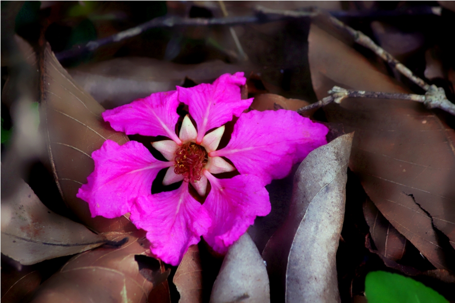
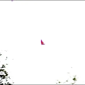
I love the contrast here between the flower and the dead leaves, but the flower petals need more of an edge to jump off the page. Softening the brown leaves is not enough.
I love the contrast here between the flower and the dead leaves, but the flower petals need more of an edge to jump off the page. Softening the brown leaves is not enough.
I agree with you both on possible adjustments on sharpness, contrast etc... however since i am not sure about handling things in photoshop, did only minimum adjustments there
I like this and the softness of the image really doesn't bother me, but I think I'd crop out the bright green leaf tip in bottom right, its a bit distracting. Just my opinion.
I agree with you fully Dagwood.... i too was a bit unsure whether to remove it or not; finally posted it as such...now i too feel it is off the subject




![[No title]](/data/xfmg/thumbnail/32/32935-452d7573a35ee2f5d0b9ad6463de680e.jpg?1734162731)
![[No title]](/data/xfmg/thumbnail/30/30995-7e48e5498fe9a56ea3d405cf87f3a1ec.jpg?1734159070)
![[No title]](/data/xfmg/thumbnail/32/32934-eca2db7323b1a6e751e5de701244a4bc.jpg?1734162726)