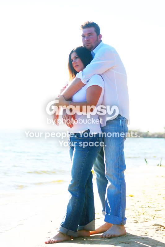
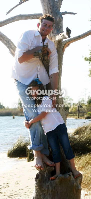
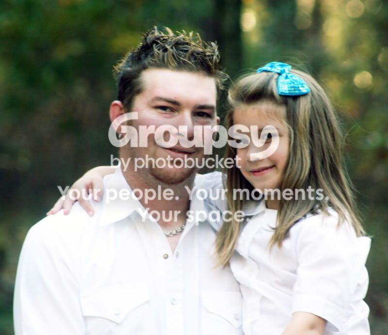
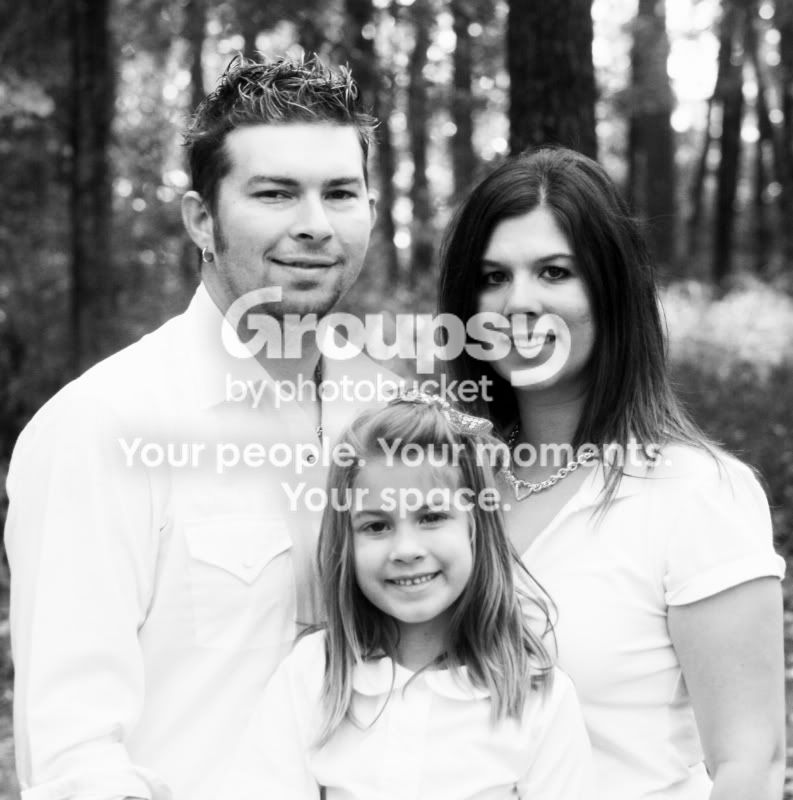
Well. OK, I don't mean to hurt anyone's feelings here on the forums, but the only passable one I can see here is 3. All the others are total failures to my mind. Sorry to be so frank, I don't really want to hurt you. But 1 and 2 are frightfully overexposed, and 4 and 5 are out of focus. 4 more than 5. The whites of the clothes are completely blown in 4 and 5, too.
While 3 is the best of all, exposure and focus-wise, it still isn't really sharp, and composed with the persons a bit to the bottom, while there is room aplenty over their heads. A tiny tilt of the camera down would have made composition more balanced.
I don't think I have to say more about the first two, they just do not pass. The sky is totally blown, exposure was downright wrong. The second is a nice idea, though, and I like the interaction captured between daughter and father.





![[No title]](/data/xfmg/thumbnail/40/40297-5b7d12c4c72c43b505a6f575d338d573.jpg?1734174708)
![[No title]](/data/xfmg/thumbnail/40/40300-583eaa43665714005823e12314084a4d.jpg?1734174710)
![[No title]](/data/xfmg/thumbnail/41/41778-1940e957c27e1919c300dfedbc32d1c3.jpg?1734176084)