I also have to agree with WesternGuy's comment about the rule of thirds...the second shot there has the horizon splitting the middle of the image. Also, while I'll admit that I tend to be somewhat biased regarding the use of b&w (as in I think b&w concersions are often over-used or at least often used for the wrong reasons), I can't really see what the point of the conversions were there on the first two shots. Just my own personal opinion obviously, however those first two shots were lacking to begin with and the conversion didn't add anything at all.
Just my .02¢ worth.
The second but not the first?
[Clue: they are the same crop, the same shot.]
I like the texture of both the sky and of the sand. To crop to make it thirds, ether pre or post shot would have meant losing one or both of these.
To be honest, there just wasn't that much interest there for me to really study them in order to determine they were the same. Had there of been
something else in the shot to carry the composition, even something so simple as a singular flower to create some sense of juxtaposition against the desolation, the image might have worked, however
in my opinion the texture alone simply isn't strong enough to create a truly interesting image.
This is just my own personal philosophy - most of the time I think good/interesting textures can help
support an otherwise good composition...interesting textures can make a good image even better,
however, texture in and of itself doesn't usually make for a significantly interesting image. To use an analogy here, consider music...scales and modes and chords and theory are
part of music...they are elements that help to make a
good composition, but they are NOT the music itself. Seriously - would you
really want to go see even the most accomplished performer just sit there an play scales all night? Would that not get insanely boring rather quickly? To my eye, that's what those first few images represent...
just the scales...just one singular element of what should be included in a composition.
My earlier tongue-in-cheek, stereotype comment about the Danish aside, I am a very strong believer in that a
good image is one that gives the viewer something to look at...something interesting that keeps the viewer's eye looking at the image. You're last shot there for example...there's lots there for the eye to explore. There's some interesting lighting (I especially like the headlight flare of the car in the background), cool textures, a good use of foreground, mid ground and background, line, form, complimentary colors, interesting buildings...it's an interesting, if not pleasing image to look at. The first shot(s) however...the viewer's eye, or my eye at least, easily recognizes the clouds and the foreground as something that's easily dismissed....there really isn't much there at all to keep the viewer's attention...very little for the eye to explore.
As far as the rule of thirds is concerned, in
most cases I find it to be a rule that's well worth considering. Sometimes you may indeed have to sacrifice some foreground or background in order to work with this. -IF- you have something to balance the image...say nice reflections on water for example, then such considerations can take precedence over the rule of thumb, however at the risk of being blunt, I just don't feel there's anything THAT significant in your first shot(s) to make such a justification. Looking at the foreground for example...there really isn't any significant change in that texture from the bottom edge of the image to the horizon (other than perspective). Why would it matter if some of that were trimmed off? Same goes for the sky really...you could have easily trimmed the top of the image down to that large cloud without any significant impact on the rest of the sky.
Please understand I'm -not- trying to be rude here at all and these are, again and obviously, just my own opinions, however I really think your mental focus here is a bit misplaced. Texture is nice, but in most cases, it's just not the end all, be all of a composition and with most landscape images it's usually best to follow the rule of thirds...it works for a reason.
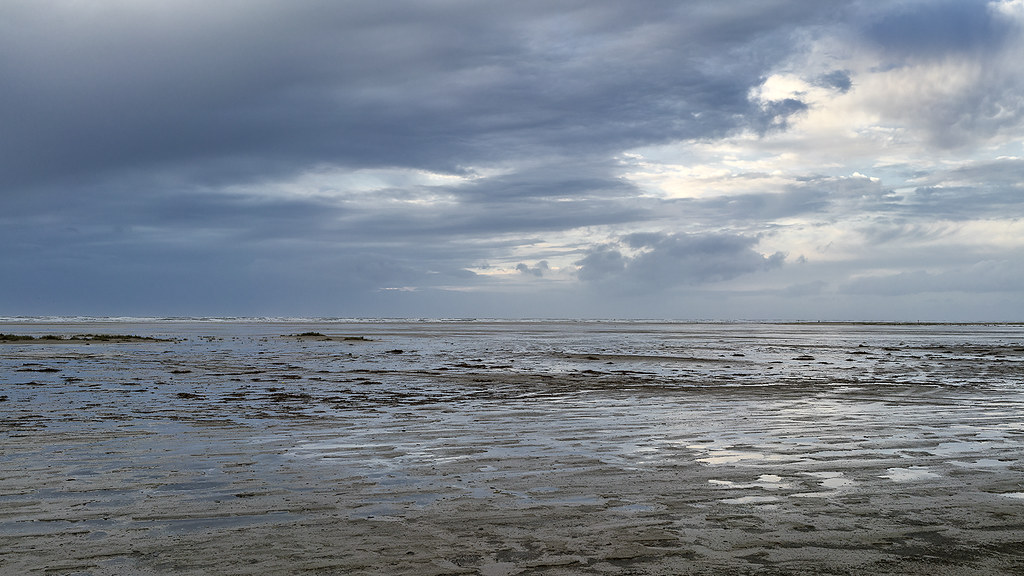 Fanø Sands-2 copy by singingsnapper, on Flickr
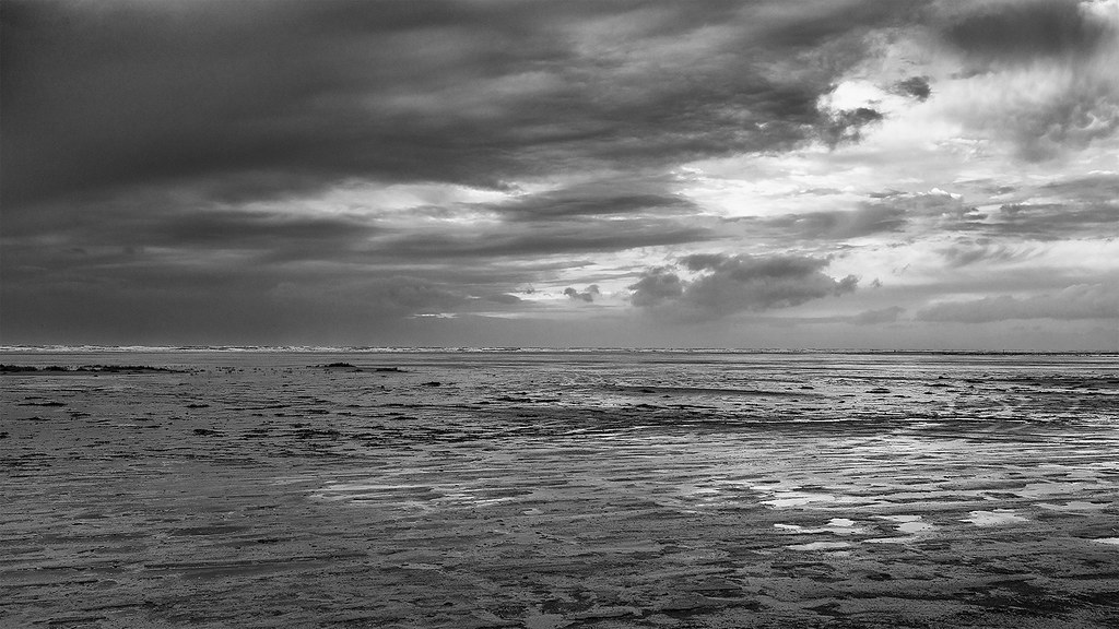 BW Fanø Sands-2 copy by singingsnapper, on Flickr
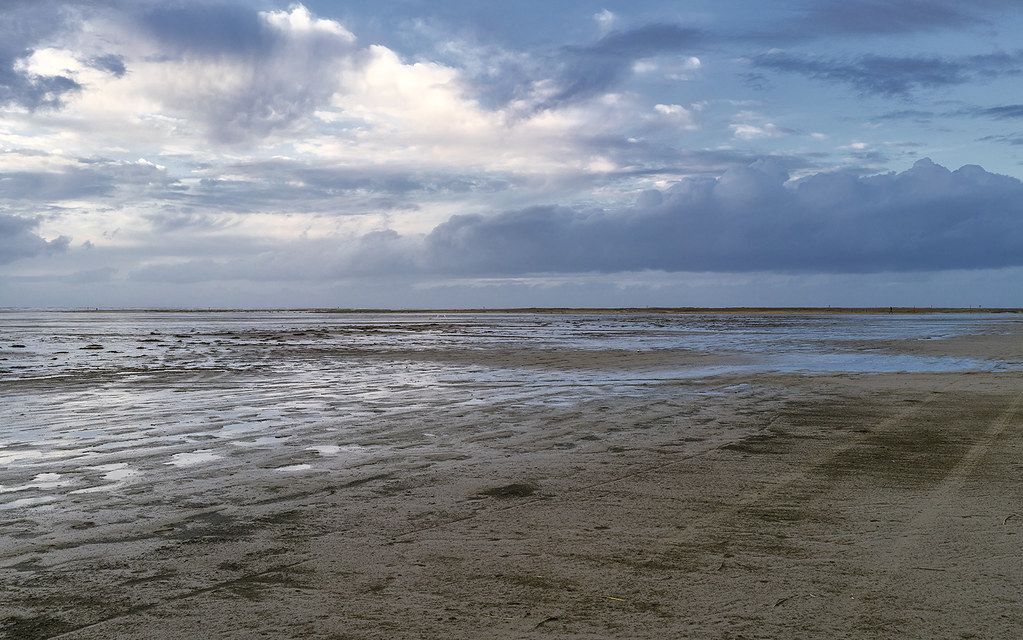 Fanø Sands copy by singingsnapper, on Flickr
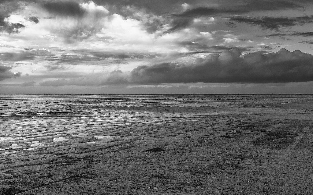 BW Fanø Sands copy by singingsnapper, on Flickr
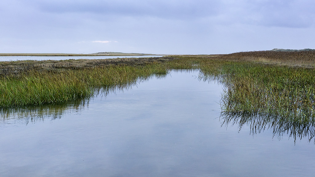 Fanø Old Harbour copy by singingsnapper, on Flickr
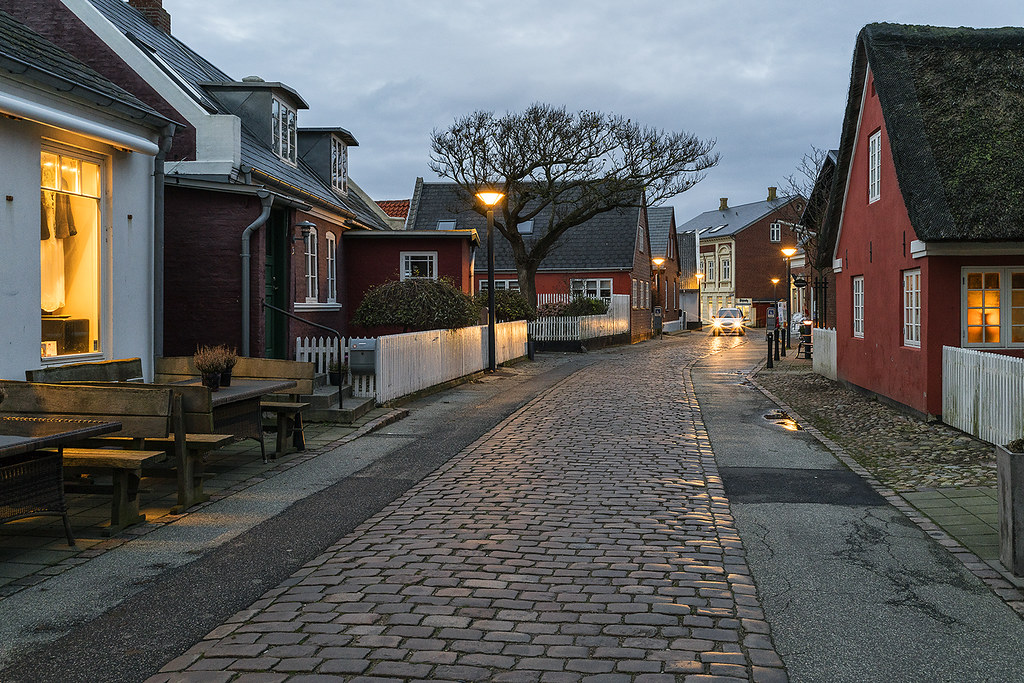 Fanø Town copy by singingsnapper, on Flickr
") . Go into the lands in the north of Jutland and you will see pure desolation. Not every part has a Nyhavn. Parts of Denmark really are quite bleak. Perhaps I haven't quite captured that. I'm not a slave to rule of thirds especially when cropping to 16:9 as I have with most of these.
. Go into the lands in the north of Jutland and you will see pure desolation. Not every part has a Nyhavn. Parts of Denmark really are quite bleak. Perhaps I haven't quite captured that. I'm not a slave to rule of thirds especially when cropping to 16:9 as I have with most of these.


![[No title]](/data/xfmg/thumbnail/33/33029-f4556b4c89cecbad12ebe6b782a51ef5.jpg?1734163040)


