I'm not sure what you want to hear about these two photos; they do have a sort of genuine, user-generated content, like they were shot maybe by a fashionable man, a regular guy...so maybe a little less-than-Madison-Avenue, maybe a little bit of deliberate imperfection, is a good thing? An art director might, or might not, like these photos. These might be perfect for their intended use. Hard to know. If they're for a blog or social media, sure, fine work.
Both of these have a slightly heavy-handed sort of Instagram filter type vibe to them. I see images like these relatively often these days. The first shot looks a bit dark, and the vignetting appears just a bit too heavy. I think the jeans should have been folded so the bottom of the pocket's stitching was shown, and the shirt needed to have been folded ever so slightly differently, so that the button at the bottom showed fully, and so that the palm tree embroidery had a bit of white shirt underneath it.
This second shot is the kind of thing a professional advertising shoot would have had a stylist on-hand to make sure ALL the details were 100 percent perfect. For example, the back of the iPhone is all scratched, and it shows because the lighting is specular and reveals a lot of detail. In the upper left hand corner, there's a board seam at an angle, but all the other flooring boards are shown lined up properly. How much space is allotted for the shoes at the bottom right edge is not in keeping with the way the jeans. Your camera was too far over to the right, and is being "aimed back at" the left side, causing the distortion that's making the floorboard in the big,empty area top left look wonky.
Overall, I think the second shot has a good idea: phone, fashion watch, wallet, jeans, shirt, shoes. But no belt? No socks? And the top shoe, it's angled up a bit at the toe region, which looks slightly 'off'. Working with a very tightly-framed shot with so few items in it makes precise framing and precise positioning and properness in all things. I think the jean pocket, the shirt fold, and the bent shoe are the things that make this feel just a bit 'off'.
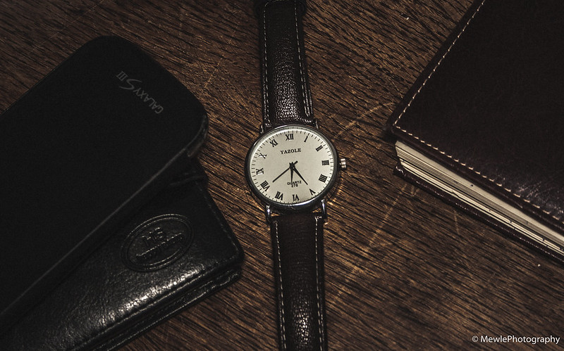 Watch by Mevludin Stenaklic, on Flickr
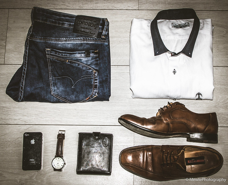 Gentleman Collection by Mevludin Stenaklic, on Flickr


![[No title]](/data/xfmg/thumbnail/37/37606-3c9ffb5906173fa2aa489341967e1468.jpg?1734170733)

![[No title]](/data/xfmg/thumbnail/34/34133-7a1339dcac8b8cda8f7e1e4b6c828ccb.jpg?1734164664)


