- Joined
- Aug 6, 2012
- Messages
- 4,834
- Reaction score
- 5,764
- Location
- near St Louis
- Can others edit my Photos
- Photos OK to edit
I used a cheap black curtain panel as a backdrop and cleaned up a little in photoshop. How is the conversion and crop? I used Nik Silver Efex.
 Father & Son by Cheryl, on Flickr
Father & Son by Cheryl, on Flickr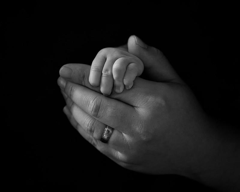 Father & Son 2
![[No title]](/data/xfmg/thumbnail/37/37494-d432dd0601f47668ec55d04f350f243b.jpg?1619738113)

![[No title]](/data/xfmg/thumbnail/31/31753-281132967af6a422c89bcc0d6f16499a.jpg?1619734991)


![[No title]](/data/xfmg/thumbnail/37/37492-bafc92488a1ab17e4ca6603ee5b38376.jpg?1619738112)