What's new

Feedback must...have...feedback....:)

PixByATeen

TPF Noob!
Joined
Jun 19, 2011
Messages
45
Reaction score
2
Location
Wanamingo, Minnesota
Can others edit my Photos
Photos OK to edit
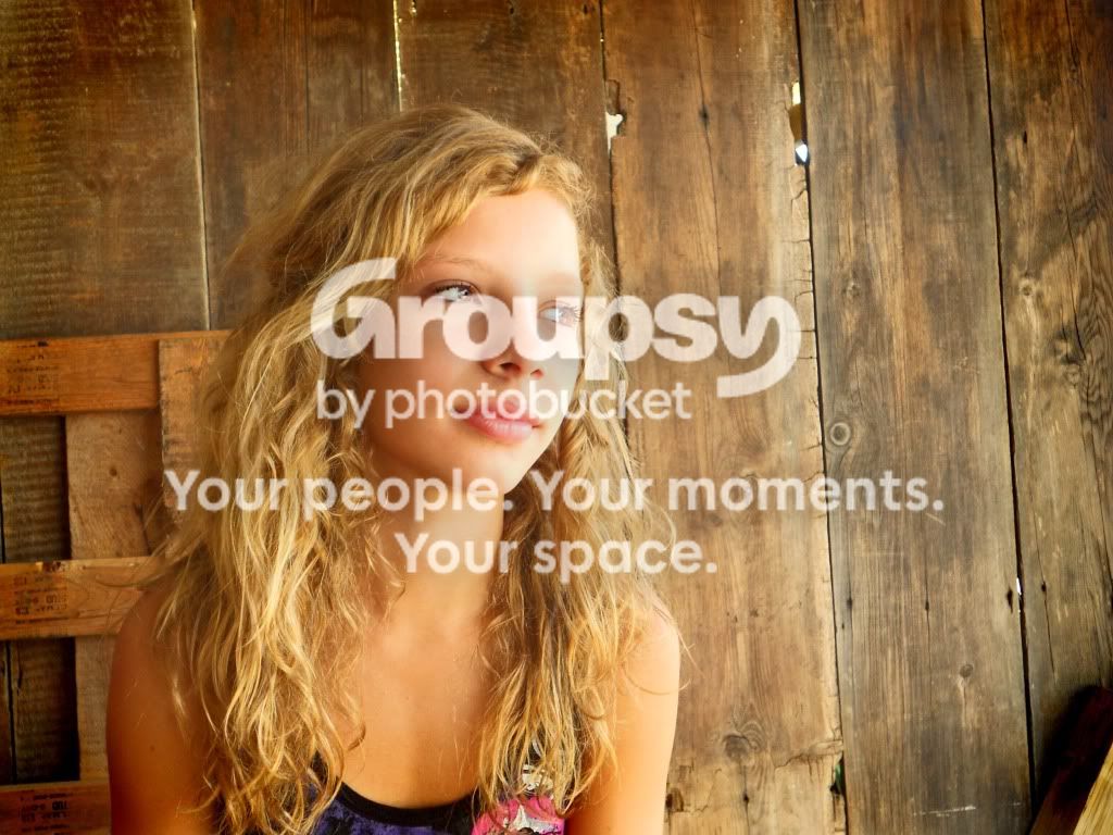
Ok so this is my best friend Libby who is by far my #1 model and I really like this picture we got and I was wondering what I could do to make it better or if its good the way it is..any ideas???
DSCN2124.jpg
 
the little bit in the lower right corner is distracting to an otherwise wonderful shot. I really like the color and textures of the background.
 
Your Main light is too hot.

Your model's eye position and head position are fighting each other. The "rule of thumb" is to follow your nose.

The model's square shoulder (football) is boring. Turned 30-45° from the camera, a whole new dynamics would appear.

The very lower right of the frame is not appealing.

The verticals need attention.

Increasing the model's distance from the background would be a benefit.
 
Your Main light is too hot.

Your model's eye position and head position are fighting each other. The "rule of thumb" is to follow your nose.

The model's square shoulder (football) is boring. Turned 30-45° from the camera, a whole new dynamics would appear.

The very lower right of the frame is not appealing.

The verticals need attention.

Increasing the model's distance from the background would be a benefit.


Thanks for all the advice!!! I can see now what you mean about the way her shoulders are it is really boring and great advice really! thanks so much OH and the follow your nose thing is great!
 
It's pretty good, all the above comments are something you should consider. I may be wrong here but what lens/focal length did you use? It seems like she has a little distortion in her face kind of like wide angle exaggeration of the features.
 
The good part is that you used a location that had nice side lighting coming in. Side lighting (or any light that is not on the camera axis) can create highlights & shadows, which can show form, depth and texture.

The old boards in the background look great. Her hair is full of form & texture. He face has a lit side and a shadow (less lit) side. All good things.

But as mentioned, the exposure is too bright on the lit side of her face. It doesn't appear to be 'blown out', but it's close. A little less exposure would allow you to keep the skin tones looking better.
 
It also appears to be too warm, at least on my monitor. I'm guessing dirt floor(?) and all the wood around is really making that light orange.
 
I love the background in this shot and she's very pretty. Your photo is very yellow, I can't decide if it's a white balance issue or just all the light bouncing off the wood. Either way it could do with cooling down a bit. The framing is also not great, there's a bit too much dead space for my liking and a few too manys distracting shapes in the background.

I hope you don't mind, but I spent 2 minutes coming up with something I might do to improve it. I'd've done a bit better if I'd spent longer on it ;)

I cooled the whole thing down by removing some yellow and red and cropped out all the clutter. I also burnt out some of the highlights on the right-side of her face and gave the contrast a boost:


Uploaded with ImageShack.us

Hopefully it now looks a bit more like it would've to your eyes at the time and a bit more natural. :D
 

Create an account or login to comment

You must be a member in order to leave a comment

Create account

Create an account on our community. It's easy!

Log in

Already have an account? Log in here.

New Topics

Back
Top Bottom