You do have leading lines, but the picture doesn't come together entirely. The part that the eye is drawn to is the very right-most part of the frame, which is really distracting. Your leading lines (the wall that goes from the foreground to the background) take you nowhere; it starts at the right-most part of the frame, and ends at a point that is also not interesting.
I think the concept is good, and the wall is really interesting & exposed exactly right, but the grass and the sky are very boring. A different angle might be able to bring out more interesting features in the scene, or allow for the wall to be presented in a way that doesn't wrench the eye to the right of the frame.
I'll preface my criticisms by stating that I can't always come home with the images I want. Sometimes there's something I want to capture, and I just can't do it the way I want to.
With that said, the second image you're showing loses the leading lines. You don't have to have that exactly, but that's somewhat gone. Examining the immediate foreground, we have grass. In the midground, the wall; the wall is again interesting. The background consists of clouds, and the heads of trees popping out from the top of the wall (distracting). The foreground and background are distracting/boring once again. Again, about 1/2 - 2/3 of the shot consists of the grass and sky.
Remember that there is often a difference between capturing a snapshot (a recording of what you saw) versus capturing what you actually felt. In order to capture what you feel, sometimes you need to cut out 95% of the surroundings and focus in on one key thing; that's difficult, since it's human nature to want to capture everything if something you see is intriguing (and sometimes that works!). So remember, less can be more. Or, sometimes more can be more...
If you want to show more in the shot, you need to make the grass and sky work with the photo. They're just sort-of there, which can be acceptable, but in this case it just ends up being a little bland because of that.
Conceptually, the first photo might work if it were closer to the wall (not sure though). The second photo is better though, if we're just comparing them as-is. That's my opinion, since I get more wall.
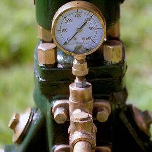
I did get this one, again not one of my favourites but may be even closer to what your thinking.
It was quite a hard thing to capture due to how low it was, how thin it was, shooting into the sun at midday and the extremely boring surroundings

")
![[No title]](/data/xfmg/thumbnail/31/31738-a077d4eda797b023c93d1824b4f2ddb3.jpg?1619734985)


![[No title]](/data/xfmg/thumbnail/32/32930-09414fc020c2a60a456ff59a05c5ef8f.jpg?1619735759)
![[No title]](/data/xfmg/thumbnail/39/39446-903cfeac143cee6330a51546ecfdda92.jpg?1619739035)
![[No title]](/data/xfmg/thumbnail/39/39286-ae386da044402acf92e55d8b68c26af3.jpg?1619738956)