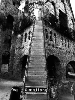
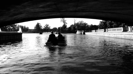
I like the picture of the stairs. Nice composition IMO. The water under bridge and guitar pic seem to lack the contrast between black and white for me to like them.
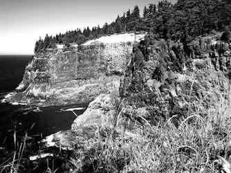
The rocky outcropping is just another picture to me. Nothing makes it pop out to me.
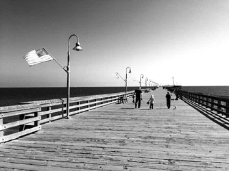
I like the dock picture but I think you could have cropped in tighter.
Again, only my thoughts. Oh and welcome to the forum.
Too many pictures and tooooo different.
I agree with RunJZ that the rock picture is the weakest.
The stairs photo is OK but it's just there with no special viewpoint from the photographer.
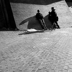
People under the bridge is getting there but their outline is confused by the background and the bright cement on the right pulls my eye away from what should be the center of interest.
Girl with the guitar is close but the grey wall to her right hurts the impact.
Dock picture might be the 1 picture in ten million that would benefit from a very muted selective coloration of the flag. You included it as a design element and the b&wness of it takes away from the nice composition.
You might get better and more useful critique if you allow editing.
It is difficult to say in a few words what a picture will show.
Watch your highlights. Digital isn't very forgiving to over exposure, and you lost the highlights on each of these.
For me, the cliffs holds the most interest, but that's just the kind of photography I enjoy. But even in this photo you unfortunately lost the highlights near the top of the cliffs.
As far as subject matter my fave is the stairs/cobble stone building. Composition is good.
The woman strumming the guitar is the least interesting, can't see her face and the background is very "muddled"





![[No title]](/data/xfmg/thumbnail/31/31756-ed344608f5fc9a69ff1d67dc7d03161c.jpg?1734160479)






![[No title]](/data/xfmg/thumbnail/31/31755-9bffabfa76f6307bcd78f535b2421cb5.jpg?1734160477)