GoM TPF Noob! Joined Jun 14, 2006 Messages 1,537 Reaction score 1 Location Toronto, ON Can others edit my Photos Photos NOT OK to edit Dec 11, 2007 #1 A collection of two #1 #2
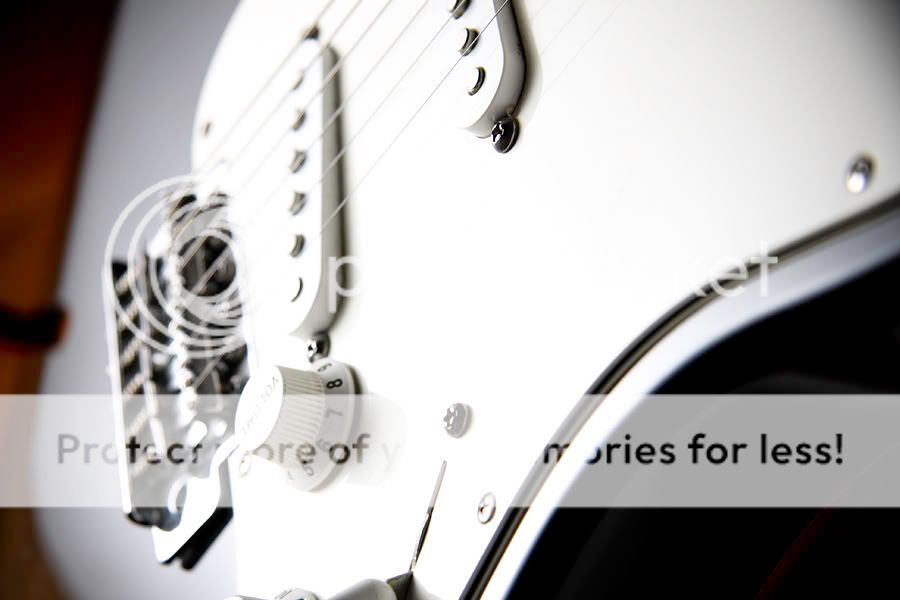
ewhip17 TPF Noob! Joined Dec 7, 2007 Messages 26 Reaction score 0 Location Marietta, GA Can others edit my Photos Photos OK to edit Dec 11, 2007 #2 to me, there's not a more beautiful non-human shape than the Fender Stratocaster, so these are OK with me! HAHA. I do like #2 better though because it details more of the curve of the instrument.
to me, there's not a more beautiful non-human shape than the Fender Stratocaster, so these are OK with me! HAHA. I do like #2 better though because it details more of the curve of the instrument.
den9 TPF Noob! Joined Dec 8, 2007 Messages 572 Reaction score 3 Location Doylestown, PA Dec 11, 2007 #3 number 1 looks too bright and out of focus, number 2 looks pretty good though
Grudge TPF Noob! Joined Dec 11, 2007 Messages 15 Reaction score 0 Location Sydney, NSW Can others edit my Photos Photos OK to edit Dec 11, 2007 #4 number1 is too bright number 2 is really good
GoM TPF Noob! Joined Jun 14, 2006 Messages 1,537 Reaction score 1 Location Toronto, ON Can others edit my Photos Photos NOT OK to edit Dec 11, 2007 Thread Starter 🔹 #5 #1 was intentionally *really* high key
kalmkidd TPF Noob! Joined Oct 9, 2007 Messages 550 Reaction score 1 Location Harlem New York Can others edit my Photos Photos NOT OK to edit Dec 13, 2007 #6 both look 2 bright. but nice shots
Lorielle99 TPF Noob! Joined Dec 3, 2007 Messages 733 Reaction score 0 Location south, new jersey Can others edit my Photos Photos OK to edit Dec 13, 2007 #7 kalmkidd said: both look 2 bright. but nice shots Click to expand... agreed
C C.Lloyd TPF Noob! Joined Oct 22, 2007 Messages 299 Reaction score 0 Location Holly, Mi Can others edit my Photos Photos NOT OK to edit Dec 14, 2007 #8 GoM said: #1 was intentionally *really* high key Click to expand... But it looks like the focal point is right where it's washed out. It doesn't direct my eye anywhere. #2 looks decent though.
GoM said: #1 was intentionally *really* high key Click to expand... But it looks like the focal point is right where it's washed out. It doesn't direct my eye anywhere. #2 looks decent though.

")


![[No title]](/data/xfmg/thumbnail/32/32717-74f4cee577117aa4476c9eb68fec51c7.jpg?1734162352)


![[No title]](/data/xfmg/thumbnail/33/33354-6ffc81f7f344284105512b442aee229c.jpg?1734163271)


