What's new

Fettered Frill

Ysarex93 87

TPF Supporters
Joined
Nov 27, 2011
Messages
7,717
Reaction score
4,577
Location
St. Louis
Can others edit my Photos
Photos OK to edit
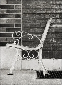
I used to sit on this bench across the street from the coffee shop. Then the wood in the bench finally rotted and they hauled it away except for this end that was cabled to the grate. Maybe they lost the key, so now it's a decoration.

Joe


8540152372_8cf4d5bcee_c.jpg
 
That's cool. At first I didn't even pay attention that the rest of the bench wasn't there.
 
Yup, good composition.
 
Good job Joe, I love this photo.

It has all the things to me that sum up a great picture. The composition is great, the asymetry of the walls balance the chair very well and good use of colour and textures. The grate is cool tooThe wee backstory seals the deal for me. The only thing that is in my head is maybe it is a tiny bit over saturated, but that's a borderline call for me and I'm undecided as it really does pop.
 
Good job Joe, I love this photo.

It has all the things to me that sum up a great picture. The composition is great, the asymetry of the walls balance the chair very well and good use of colour and textures. The grate is cool tooThe wee backstory seals the deal for me. The only thing that is in my head is maybe it is a tiny bit over saturated, but that's a borderline call for me and I'm undecided as it really does pop.

Appreciate the comment. I gotta admit I was having a good time with the color and I did lean on the saturation slider -- I love those glazed bricks. Since you liked the background story here's some more: 150 years ago my neighborhood was dotted with clay mines. We were St. Louis brick central and became famous for those glazed bricks which of course got heavily used in the local area. We still have scores of businesses and homes where the glazed bricks are intact.

Joe
 
huh... very neat. With the different bricks, the lines of the grate, and the curviness of the ... whatever you call that. Very neat.
 
Yes, nice. Just plain attractive.
 
Very nice. I'd be tempted to try B&W because the color to me is distracting. You could create a lot of tonal contrast in the two parts of the wall.
 
Well I'm flattered and thanks all.

Here you go Ken -- but I gotta admit I'm a color photographer. I got my first darkroom back in 1972 (bathroom at night) and I still remember my very first ever print -- it was color. I didn't make my first B&W print till a few years later.

Joe

$bench_end.webp
 
Color is better here I think. I might puch the color a bit, but that's just my taste.
 
Well I'm flattered and thanks all.

Here you go Ken -- but I gotta admit I'm a color photographer. I got my first darkroom back in 1972 (bathroom at night) and I still remember my very first ever print -- it was color. I didn't make my first B&W print till a few years later.

Joe

I have the opposite experience. I also started with a bathroom darkroom, a few years later, but it was B&W. I did some color printing years after that, but still did mostly B&W.

For this image, I think I'd make the yellows and greens darker, which would darken the upper left to set off the dark grille in the lower right, and also darken some of the yellowish rust on the bench end, although if you really aren't a fan of B&W I suppose it doesn't matter.
 

Create an account or login to comment

You must be a member in order to leave a comment

Create account

Create an account on our community. It's easy!

Log in

Already have an account? Log in here.

Back
Top Bottom