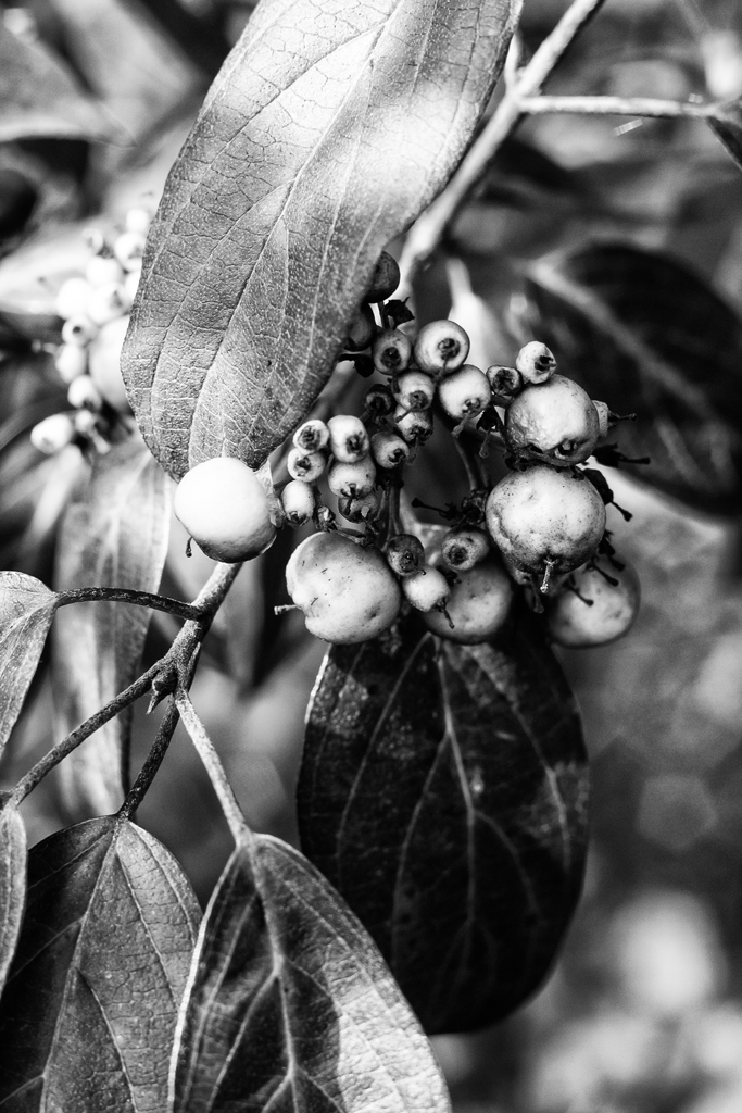
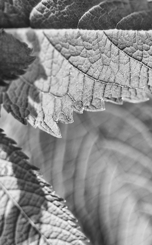
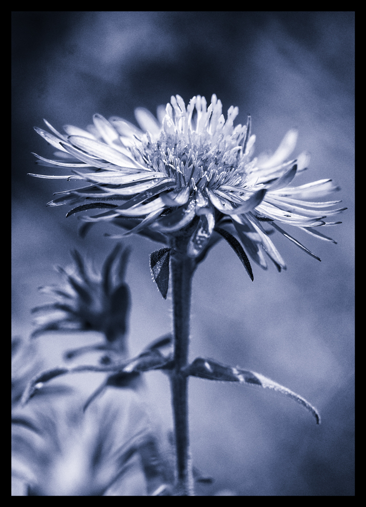
I must agree with Demers18--the third shot is the best. I have ALWAYS had a soft spot in my heart for blue-toned B&W images. I know a lot of people might not like them, but I really always have. I like the shot, but at the same time, wish it had just a little bit more room, a little bit more space in which to "breathe". It might look better with a slightly thinner border around it. This shot differs from the others in that it offers us a SINGULAR subject, clearly defined, with visual tranquility; the others show discord, and discontinuity.
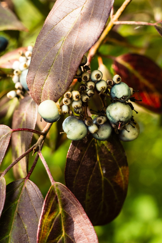
The first shot has interesting tones, but the dark leaf creates a sort of hole in the shot, and draws my eye back into it. The berries...are hard to read...I think the lighting that's falling on this does not reveal the subject quite as ideally as it might when the image is rendered as a B&W. This shot is sort of a jumble of stuff in nature.
The second shot is okay I guess..but doesn't hold my interest too long. It has some interesting visual quirks, like the dark, crisp horizontal "crease" at the top, but the majority of the shot, like 90%, is out of focus leaves in four different depth planes. Visual tricvkery, visual gamesmanship I guess it could be called...fun to create such images at times I think, but this one has so little that's really in-focus that I don't feel like I'm getting much of a visual reward from looking at it. Now...if I were a lab rat...I might get a little drink of sugar-water if I looked at it for 10 seconds and pressed a foot bar, right?
I look at these shots as sort of exercises in seeing...they seem to be you, exploring the close-up world, and experimenting with a number of different ways of illustrating things with a camera.