alright... real quick here's what I'm seeing (If in the future you can give them numbers that would be really helpful)
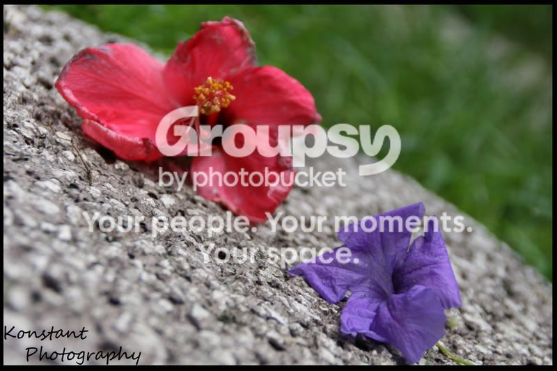
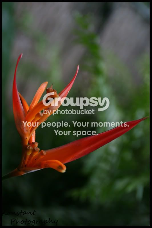
1.) Interesting with the really shallow depth of field, I would say that is also the majority of the problem with this photo as the red flower is out of focus and is thus distracting. Also, both flowers look a little wilted which is something I would try to avoid.
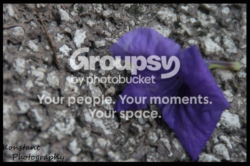
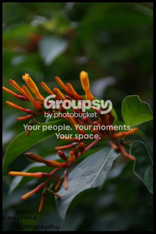
2.) Again extremely shallow DOF this could use being stopped down a bit or being stacked so that the flower would be more in focus. Also, if the bloom of the flower were more visible that would be nice (I think)
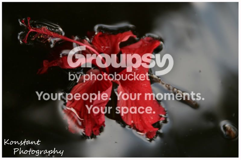
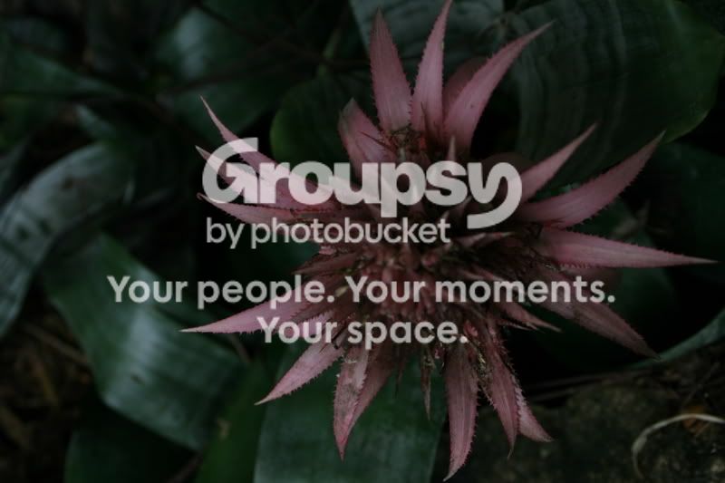
3.) I definitely like the idea of this photo, I think however the shutter speed may have been a tad slow or something as it seems to be just a bit blurry. Nice composition and idea though.
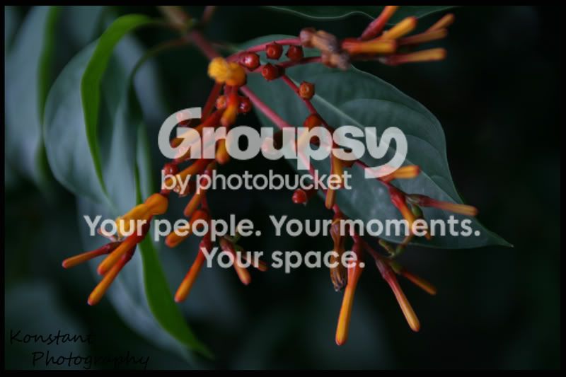
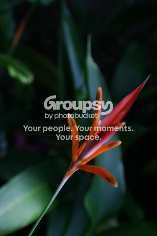
5.) I find this one very compositionallyl attractive. I like it quite a bit, also pretty much the whole flower is in focus which is nice.
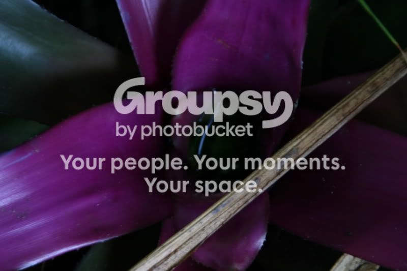
9.) I'm not really that huge of a fan of... the twig going across is quite distracting, and the shadows and darkness on the right I can't really see the flower that well.
I'm not going to comment on colors as I'm on a completely uncalibrated monitor and would probably tell you wrong... The biggest thing I would work on with these is getting the DOF to keep at least the majority of each flower or of the subject in focus. Shallow DOF can be very creative and nice... but it can also be quite distracting, mostly watch out for it when the item is running in different planes.