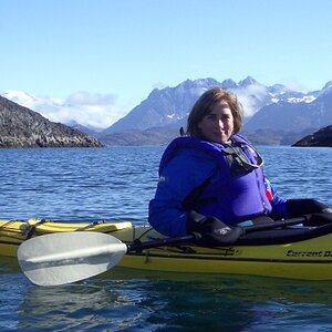
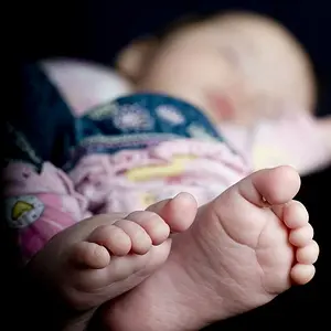
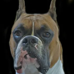
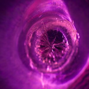
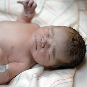
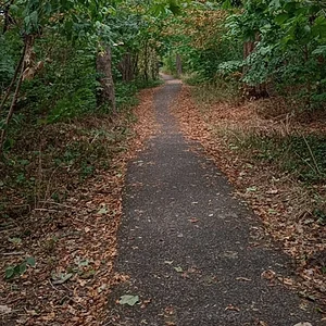
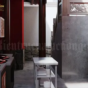
I'm with invisible. The first is the winner here. The other two are "meh" (the photoshopping and vignetting in 2, which I take is an edit of 1, are not to my liking).
Only does Photo 1 need a tad more light - now I see that also 1 shows the vignette ... where does it COME from???
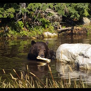
And the more I look, the more I find that 3 HAS potential, but it needs to be straightened and to be selectively brightened up (mildly and carefully!) in the bottom part, to bring out some more detail on the ground.







![[No title]](/data/xfmg/thumbnail/32/32699-3434a76363cb383404e00a3cd5ed5728.jpg?1734162254)