I think they would all look better if the bursts were higher in the frame. I would be tempted to crop some off the top, and then expand the canvas at the bottom, below each burst, so that they appear "higher in the sky". As shown, the bursts look too low in the frame.
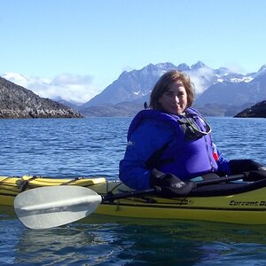
I'd be tempted to flip the last image (mirror image along a vertical axis) so it looks like its moving to the right, I think it would balance out better.