First ever critique! Go hard on me!

I like this shot a lot, I think Unimaxium's treatment works very well for this photo.

Very nice shot.
 
Maybe it's just me, but this photo was lacking borders. It needs this to secure everything within the photo so it doesn't look like everything is flying out the side of my screen. It also "finishes" the photo, also sephia was an excellent choice.

100_04962.jpg
 
Kevin got my point :D thanks :) exactly this crop I mentioned :D
and it looks nicer with high contrast :D good job with editing, Kevin!
 
I dont understand the purpose of the light.... kinda makes it look like someone has taken a picture of a picture and the flash from the camera has reflected off the glossy photo paper.... lol
 
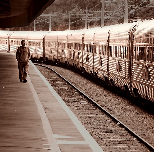
I love the picture and I think the coloring in the last edit was perfect, minus the extra flare of light. I perosonally go for slightly darker shots to give it a diffrent mood, however I will still shoot the bright "perky" shots occasionally. I also prefer this image croped, but thats just me.
 
Here is my stab at it:
218874871_c5fac94e01_o.jpg


Just though the bottom of the picture would "end" better if the rail ended at the corner. I think simplifiing the image by toning down everything except the subjects (train and person) works better in my opinion. Of course a little more contrast helps.
 

Most reactions

Back
Top