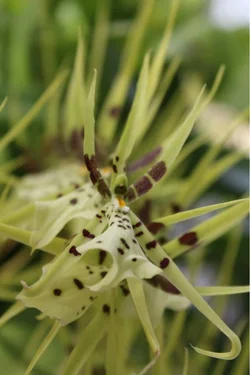
The green fellow is sort of visually flat, and the framing in the first one is a little.. well it feels chopped off. I like the framing in the vertical one with the green flower in it. I think a little fooling around in a photo editor to give it a little more visual pop might make that one rather nice.
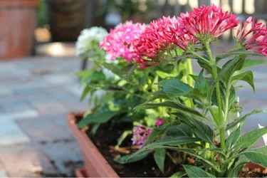
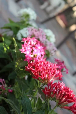
The pink ones don't work well for me. They have the visual pop, but the horizontal one has the "subject", the main point of interest, way up at the top right of the frame, a bit too far off center for my taste. Off-center, though, was a solid choice. The last one, the vertical with the pink flowers just feels sort of weirdly tilted, and again a little cut off (lower right corner).
You've got some ideas here, and you're making pictures that are pretty darn close to pictures I would like, but you're not quite putting it all together for me.


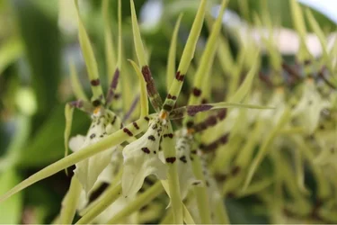


 I will definitely keep everything in mind for the next time! Luckily is my mother in laws patio, so I can go again!