Abby Rose
TPF Noob!
- Joined
- Feb 17, 2010
- Messages
- 642
- Reaction score
- 2
- Location
- Michigan!
- Can others edit my Photos
- Photos OK to edit
Ok. I downloaded photomatixs free trial version and put it to work. However, I'm kind of confused, I'm hoping you guys can help me out.
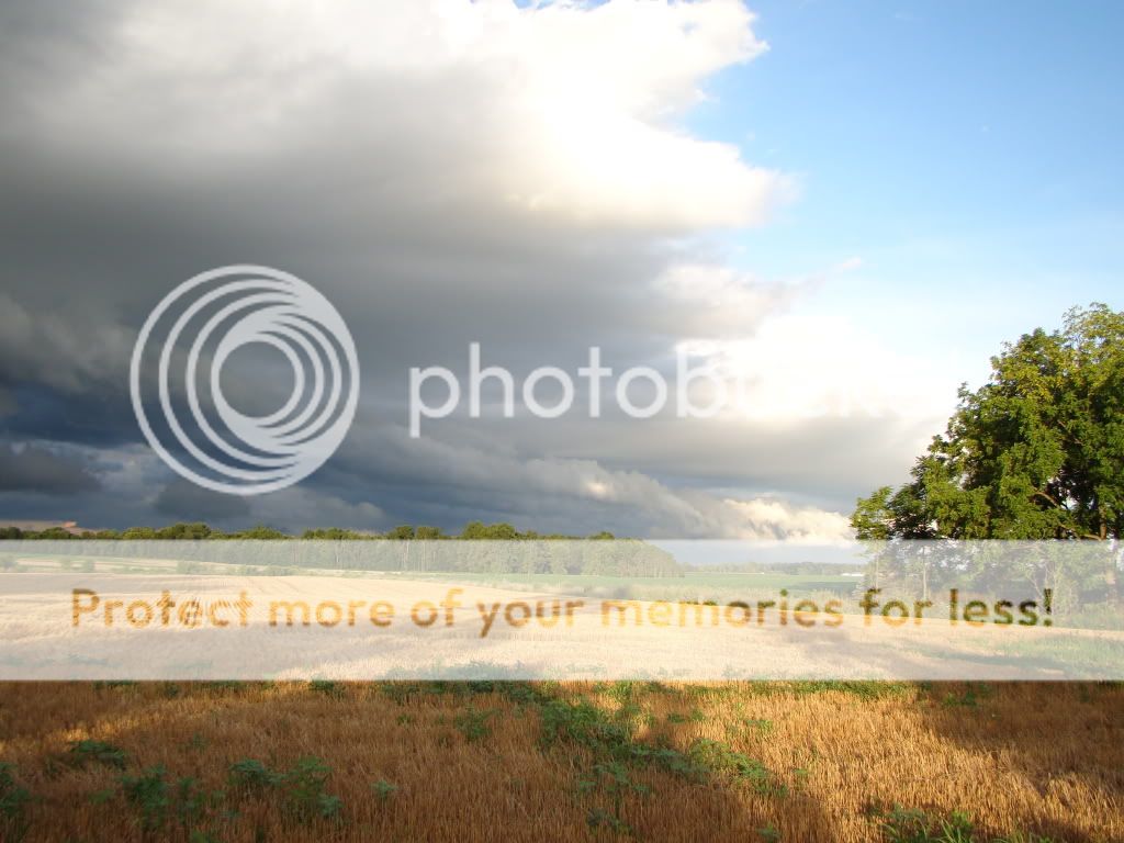
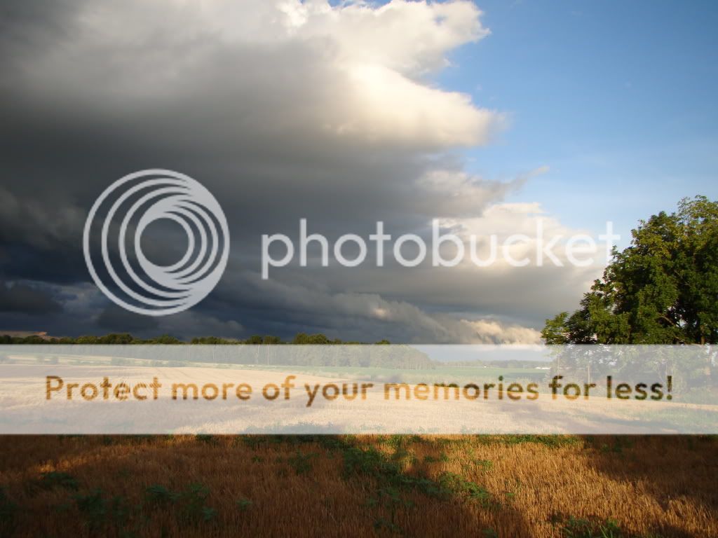
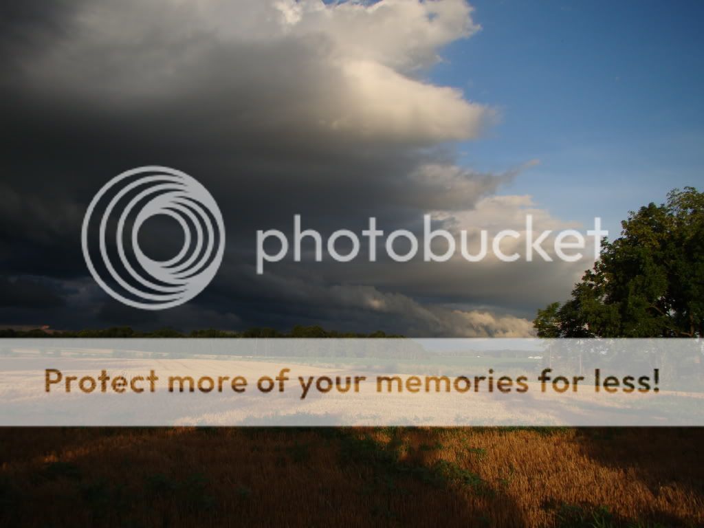
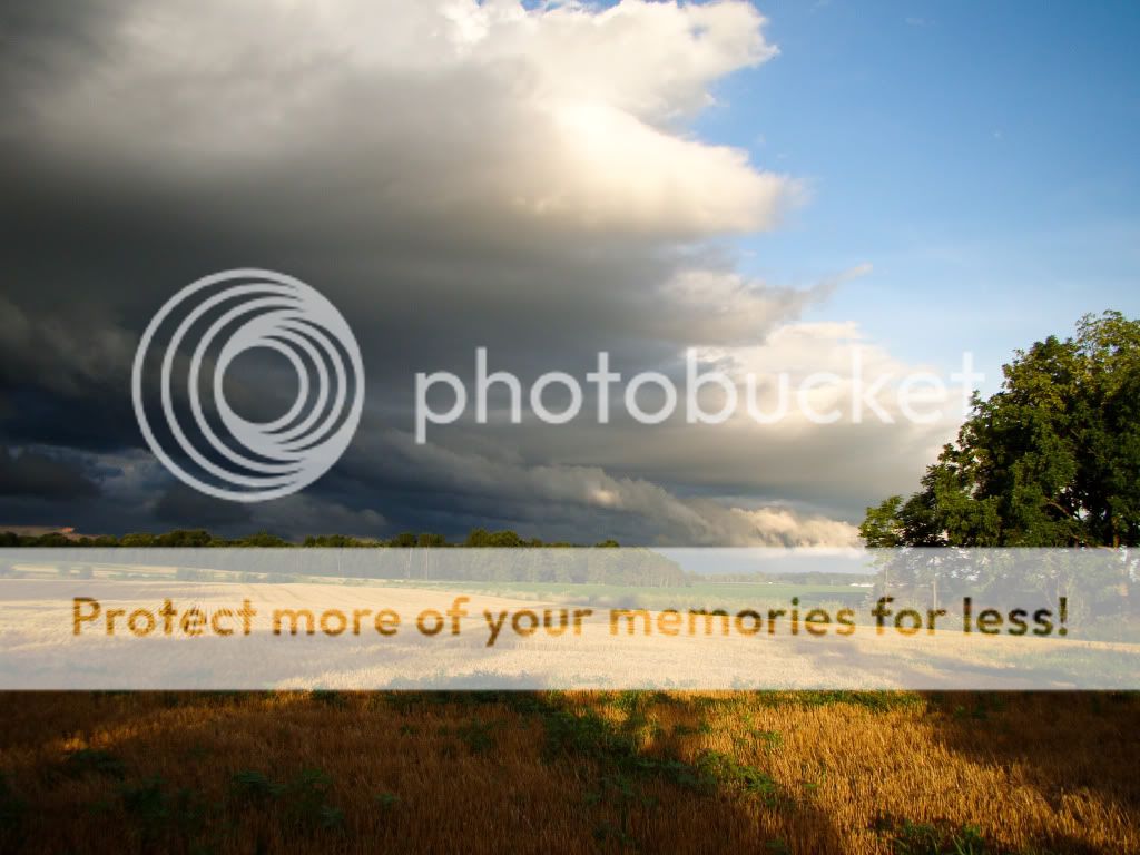
Here are the three original exposures I put into the program. Now, I'm not sure if they are similar to what most people use. I set the bracketing option on my camera and took three shots 1 EV apart. Its the option with the biggest difference between the pictures. I could manually make the difference, greater, though, without setting the bracketing option.
I chose the option 'generate hdr image' and it did but it looked like crap, which the tutorial said was to be expected. Once that was generated, it said it needed to be tonemapped so I chose that option, which made something that looked like a cross between the lightest and middle original exposures (the first two photos) but with less black and contrast. It didn't look too good. But it gave me a chart of sliders to adjust. I twiddled things around and they began to look better. I ended up with this:
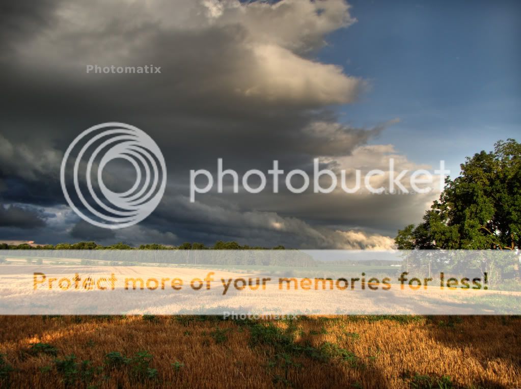
which does indeed look better than any of the originals, I think. I opened it in pse8 and did a little bit of contrast and clarity adjustment, as well as dodging the blue sky which was sort of grayish. It's still a little gray, but better now. However, it doesnt look that different to me than this edit that I did on the middle one of the original exposures. I adjusted contrast, clarity, and blacks here. There is less detail in the sky, for sure, and the tree shadows on the wheat stubble.
So, I do think it looks better, and fairly natural, but I wonder if it's worth it for me. Its nice, but not dramatically better, I dont think. And what about the cartoon results people are always complaining about? I wanted both a natural and cartoon result to compare, but I couldnt figure out how to get a cartoon one. I do prefer the natural ones, but I'd like at least the option to play around with a surreal one.
How should I have done this different? Or did I do it right?
Oh and also, panorama questions. I have enough shots to make a panorama of this scene which was my plan, but what is the best way to go about it if I stick with photomatix? Should I make three panoramas with the different exposures first and then combine them in photomatix? Or should I make HDRs of each batch of exposures first and then make the final blends into HDRs? Or would it turn out the same?
Here are the three original exposures I put into the program. Now, I'm not sure if they are similar to what most people use. I set the bracketing option on my camera and took three shots 1 EV apart. Its the option with the biggest difference between the pictures. I could manually make the difference, greater, though, without setting the bracketing option.
I chose the option 'generate hdr image' and it did but it looked like crap, which the tutorial said was to be expected. Once that was generated, it said it needed to be tonemapped so I chose that option, which made something that looked like a cross between the lightest and middle original exposures (the first two photos) but with less black and contrast. It didn't look too good. But it gave me a chart of sliders to adjust. I twiddled things around and they began to look better. I ended up with this:
which does indeed look better than any of the originals, I think. I opened it in pse8 and did a little bit of contrast and clarity adjustment, as well as dodging the blue sky which was sort of grayish. It's still a little gray, but better now. However, it doesnt look that different to me than this edit that I did on the middle one of the original exposures. I adjusted contrast, clarity, and blacks here. There is less detail in the sky, for sure, and the tree shadows on the wheat stubble.
So, I do think it looks better, and fairly natural, but I wonder if it's worth it for me. Its nice, but not dramatically better, I dont think. And what about the cartoon results people are always complaining about? I wanted both a natural and cartoon result to compare, but I couldnt figure out how to get a cartoon one. I do prefer the natural ones, but I'd like at least the option to play around with a surreal one.
How should I have done this different?
Or did I do it right?Oh and also, panorama questions. I have enough shots to make a panorama of this scene which was my plan, but what is the best way to go about it if I stick with photomatix? Should I make three panoramas with the different exposures first and then combine them in photomatix? Or should I make HDRs of each batch of exposures first and then make the final blends into HDRs? Or would it turn out the same?
Last edited:

") I thought you meant that the land looked tilted downward to the left. Understand how I was confused?
I thought you meant that the land looked tilted downward to the left. Understand how I was confused? 
")


![[No title]](/data/xfmg/thumbnail/36/36101-1d9d7b0215488ea489d3bdb28d87ebeb.jpg?1734168057)


![[No title]](/data/xfmg/thumbnail/34/34147-1d3c1583c083bc674df087f4aa2ec7cb.jpg?1734164731)
![[No title]](/data/xfmg/thumbnail/39/39189-22b7e8d8eadc9cc3d7b341bfb336079e.jpg?1734173064)


![[No title]](/data/xfmg/thumbnail/36/36100-56ca0f8143ffca369fbf5f3dfe9cabd4.jpg?1734168051)
![[No title]](/data/xfmg/thumbnail/32/32183-06800ba86381f42976d75297ee6b5942.jpg?1734161047)