All in all pretty good, a few issues I see where at least in my mind some improvements might be made:
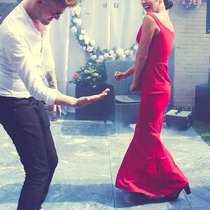
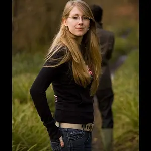
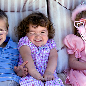
#1 - The white balance here seems off. Also the crop seems extremely tight, the very bottom of her chin is pretty much right at the bottom of the frame and her eyelashes are cut off on the top. I think I get what you were going for here and I understand you wanted a closer crop on this, but backing off the crop ever so slightly would have made for a better image IMHO.
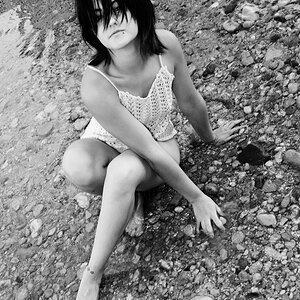
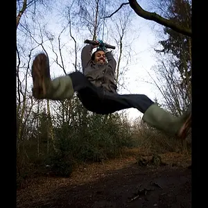
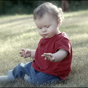
#2 - Again the composition here seems a bit off to me. You've got plenty of space at the top, so much so that you've got sky above the trees - but at the bottom of the frame you've cut off part of her feet. The sky is blown out and there appear to be some blown out areas in her hair as well, and there's a lot of space on either side of her that really doesn't have much of interest in it.
#3 - The cropping here is just way too tight for me, makes her look very cramped in the frame. At the bottom of the frame the crop is too close to her elbow joint. Also again the WB seems off, and the whole picture seems washed out without enough contrast. I think the backlighting is too strong and a fill flash would have helped a lot here.
Just my 2 cents worth of course. And no, my intent is not to be cruel or destroy, just to point out areas where I think improvements can be made. YMMV, offer not valid in all states.