beckyh
TPF Noob!
- Joined
- May 8, 2008
- Messages
- 27
- Reaction score
- 0
- Website
- www.sdactionsports.com
- Can others edit my Photos
- Photos OK to edit
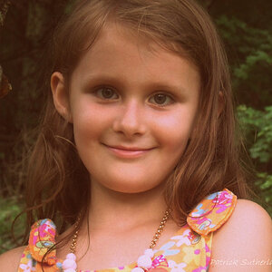
I just had my first portrait session, other than family this past week. Please feel free to critique as much as possible. It will make me better in the end ") Thank you all!
Thank you all!


Thank you all!![[No title]](/data/xfmg/thumbnail/39/39292-4169a355b794ae9735845c4ad45d06ff.jpg?1619738958)

![[No title]](/data/xfmg/thumbnail/37/37660-eb4529b6ea38a042c4e9b64866178d7b.jpg?1619738174)

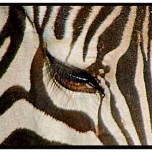
![[No title]](/data/xfmg/thumbnail/31/31980-e5048a424621c7b3cd0d306d63c09d67.jpg?1619735137)
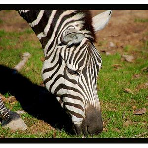
![[No title]](/data/xfmg/thumbnail/31/31977-2b717e032201241cbeae8226af23eba4.jpg?1619735136)
![[No title]](/data/xfmg/thumbnail/34/34063-09779b4ba56a0acb2b0fa36cf8720dfb.jpg?1619736260)
![[No title]](/data/xfmg/thumbnail/34/34062-c0c9c0a752bc1af58237eff1ec850163.jpg?1619736259)