What's new

First Light

ceeboy14

TPF Noob!
Joined
Dec 5, 2012
Messages
2,566
Reaction score
788
Location
Florida
Can others edit my Photos
Photos OK to edit
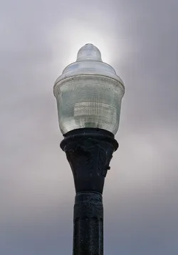
$8792574220_93ff9756fd_o.webp
 
Surely someone can comment on the light...sigh.
 
Well,there isn't much PP but even so, a comment is almost always warranted.
 
I looked at this last night and tried to come up with something to say, but as Lew says it's pretty thin.

I *do* like the juxtaposition of the lamp against the light regions in the sky, there's a sort of visual pun here and also a sort of abstraction of light. I get a weird sense of religious overtones, for some reasons. Sort of a "God's Light" kind of vibe. I could totally see this on the cover of some sort of tract.
 
It was shot with cruxificion overtones. I thought there was a beautiful light as the sun was emerging from a low level fog bank and the simplicity of the pole and lamp led me to .." I am the way, the truth and the life." Jesus was a simple man, and this is a simple image.
 
It was shot with cruxificion overtones. I thought there was a beautiful light as the sun was emerging from a low level fog bank and the simplicity of the pole and lamp led me to .." I am the way, the truth and the life." Jesus was a simple man, and this is a simple image.

A great photo appeals to emotions and knowledge that are common to most of the audience.
This is a pretty good example of where you as the photographer have too much of the meaning embedded in your consciousness and you are supplying meaning that the photo doesn't.
 
Don't take the lack of feedback too seriously, I post pictures here and lot and in most cases get no feedback which as sad as it is it also means my pictures are boring and I need to improve them so for me lack of feedback is also a kind of a feedback.
I don't get sad or offended, I simply try harder to make better pictures that will be interesting.
 
Ok...so I will ask you for some answers. You shot the picture in manual mode. Why did you choose 320ISO? Why did you decide to shoot at 1/4000 second at f-7.1? Did you "purposefully" disobey the rule of thirds? and if so why?

I am not attacking you in any way. I just want you to answer these questions, because you are the ultimate answer. If you set out to capture this light this way, you designed your shot, and captured what YOU wanted, then the image was a success, regardless of anyone else's opinion. We can give you ideas of how WE would like to have seen it, but ultimately it was all you.

 
In my opinion, be it ever so humble, the rule of thirds works for about 60% of all photographs and should be ignored for the rest. I was walking out to my car, saw the sun trying to peek out of the fog, set the camera to manual and made a shot based on what was already there from the night before shooting little league stuff. The sun emerged long enough to get the exposure I wanted for the light. I did dial back to ISO 320 from ISO 3200 to avoid excessive noise. I generally look at compositions for light, tone and focus point.
 
It was shot with cruxificion overtones. I thought there was a beautiful light as the sun was emerging from a low level fog bank and the simplicity of the pole and lamp led me to .." I am the way, the truth and the life." Jesus was a simple man, and this is a simple image.

A great photo appeals to emotions and knowledge that are common to most of the audience.
This is a pretty good example of where you as the photographer have too much of the meaning embedded in your consciousness and you are supplying meaning that the photo doesn't.

On other forums, I've had many mentions as to the ethereal quality of the light and how it gives a sense of some kind of spirituality so I know I did reach some people. A great photograph appeals to emotions but I disagree these emotions must appeal to a common audience. Most common audiences wouldn't recognize a great photograph from a poor one in the way that most people wouldn't know great literature from Reader's Digest. I rarely go with the ooh---ahhh factor when loking at other people's works. I look at the photo to see if there is good, or even great tonality, if the focal point is reasonably and thoughtfully placed, if the contrast is right for the image and if there is some kind of response other than the obvious. Even if there isn't further travel within the image, I can like it if the other criteria are met.
"Walking to Work" in your Cover's Portfolio is a good example of meeting the other criteria without have a secondary message. It is a good image which stands on its own.
 

Create an account or login to comment

You must be a member in order to leave a comment

Create account

Create an account on our community. It's easy!

Log in

Already have an account? Log in here.

New Topics

Back
Top Bottom