What's new

First "model" pictures...

fiveoboy01

TPF Noob!
Joined
Dec 28, 2008
Messages
684
Reaction score
1
Location
Waunakee, WI
Can others edit my Photos
Photos OK to edit
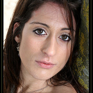
I say "model" because it's my GF, we were on our way back from dinner and I had the urge to make her pose for some photos. All I had was the D60 with the 50/1.4G mounted up. Mistakenly had dynamic area autofocus activated which screwed up most of the pictures, I did get lucky and get a few.

C&C is a must on these guys, I'm trying to learn technique as well as I can. Good bad or ugly let me have it;)

1.
614661089_VCJCt-XL.jpg


2.
614661269_ede6P-XL.jpg


3.
614660626_nDyJ9-XL.jpg


4.
614712671_CnA6r-XL.jpg


5.
614712343_w8e9y-XL.jpg


6.
614712542_nMEnh-XL.jpg


This one just for fun, set the timer and let it rip, I don't think I have a picture of myself anywhere here:lol:
614712038_tQg94-XL.jpg
 
#1 has too much head space.. and you cut off her feet.. wrecks the pic, and reminds me of a high school snap because of that.. (sorry)
#2 isn't bad.. seems a little bit to dark though... i dont know that the pic is flattering to your model though.. her face looks quite weathered to me
#3 again, to much head space.. and the angle (camera tilted) makes it look like shes going to fall over.. tilting the camera is totally great for some shots, I don't think this is one of them though..
#4 i like.. except i would brighten it up a hair... it looks like an ad for something.. good job
#5 the fact that you cut off her arm ruins it for me.. and the sign is distracting..
#6.. see comments on #3.. and I dont get the pout... not flattering at all..
 
#1 - I think this shot might have worked better if you shot this from a few steps to the right and made it look like she's walking up the path (path at a diagonal from lower left to middle or upper right). Maybe get a little closer too.

#2 - Too much dead space on the left. Crop it as a portrait (vertical) shot and it changes the whole feel of the image.

#3 - Tilting the frame has it's place but you have to understand why you would tilt it in the first place, not just tilt it for the sake of tilting it. This shot doesn't work. Might want to fill the frame more with your subject next time.

#4 - Image is a little too cool. Don't care for the expression on her face.

#5 & #6 - See comment #3.

#7 - Cut off the bottom third of the image and you have a very nice shot.
 

Create an account or login to comment

You must be a member in order to leave a comment

Create account

Create an account on our community. It's easy!

Log in

Already have an account? Log in here.

Back
Top Bottom