What's new

FIrst model session C&C please

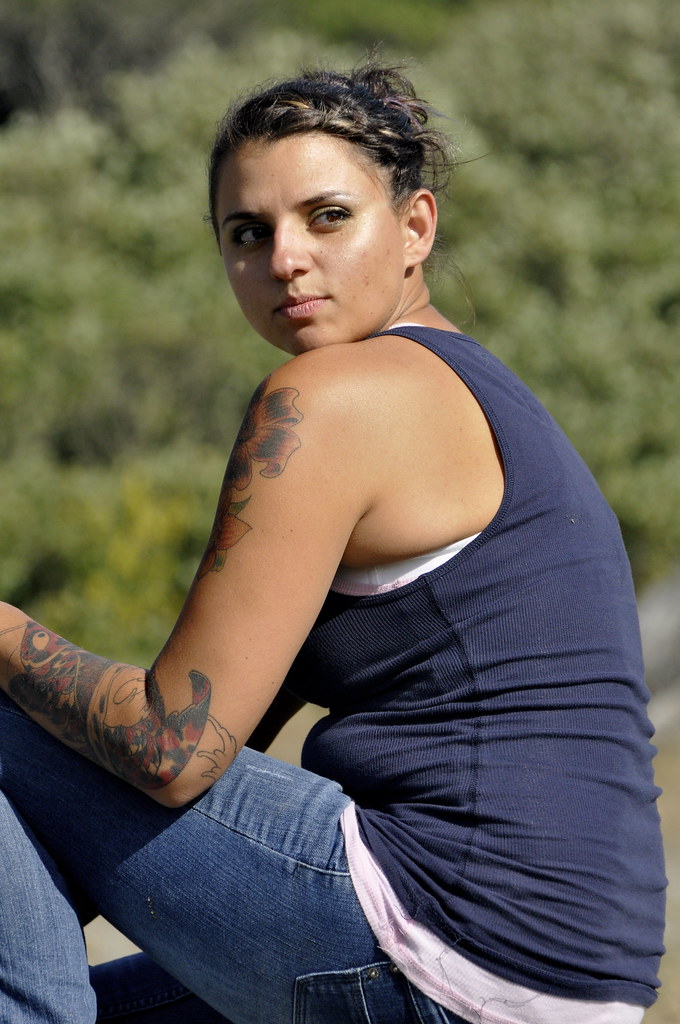
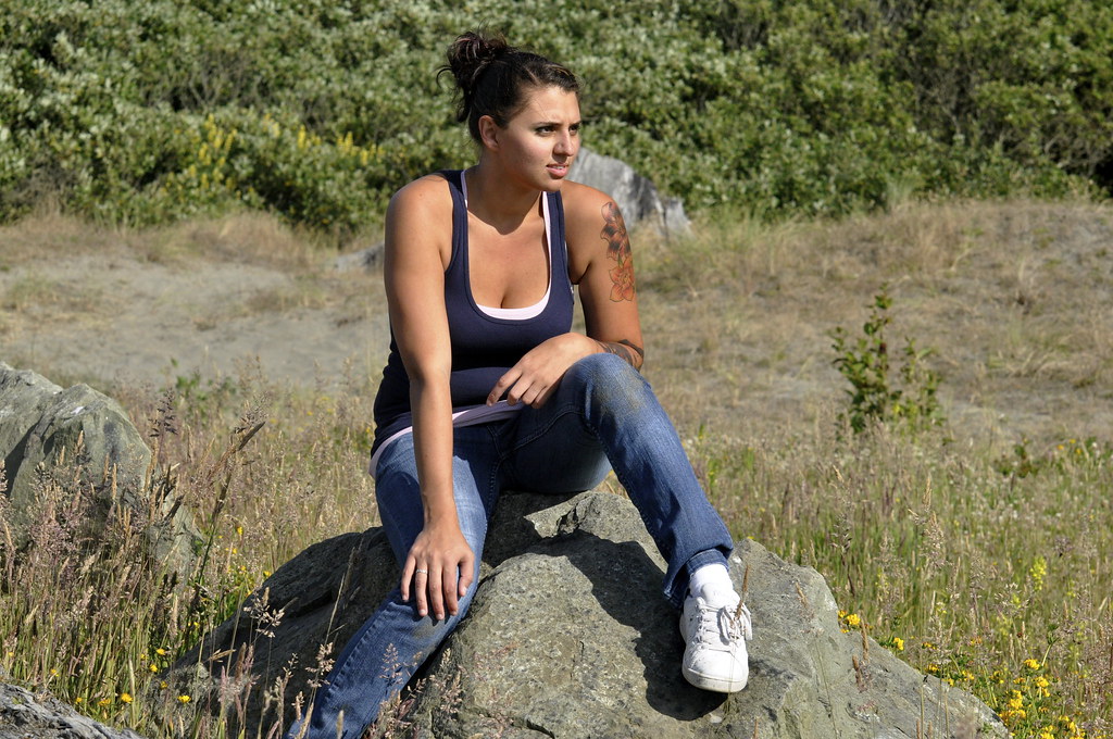
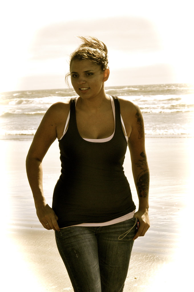
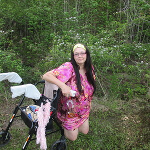
3 looks under exposed. The sitting poses are unflattering to her figure. I don't want to be mean but next time take shots that don't show her "rolls". or a bit looser clothing. the standing up one I like she is more stretched out and its more flattering than the others. Learn to use the liquify tool to pull in her stomach a little.
 
#1 you cut off her legs and arms and prob not her best pose.
#2 maybe a better crop so she is sitting more on the left of the photo.
#3 not feeling the color at all.
 
C&C per req:

1. This shot, unfortunately is an example of just about everything that can go wrong. You've got unintended [I assume] split lighting on her face resulting in one side being in deep shade with the eye all but obscured, There's bra strap showing underneath her arm, her left arm creates an odd shadow on her leg, and there is a very awkward crop, especially with the lateral bisection of her left lover leg. The position also give the impression of her being rather fat, which is clearly not the case.

2. Rather too much depth of field, resulting a too-focused, and thus distracting background. Shoot with a larger aperture and/or longer focal length to reduce this. Again, her arms and position create odd shadows, and her leg positioning is, well... rather less than feminine. If you're going to pose someone looking that far from the camera, try and let the viewer see the reason they're looking that way.

3. While I'm not fond of the processing, and once again the bra-straps are a prominent feature, this is a nice shot and definitely the strongest of the three. I think if you leveled this one, cloned out the straps and reduced the intensity of the processing a little you'd have a really nice shot.

Overall, they're nice enough, but 1 and 2 really look to me like photos that were taken when the subject was either unaware or didn't want to be photographed. As critical as your skills with a camera are, your skills at getting the model to pose correctly and relax are even more so. Keep shooting!

Just my $00.02 worth - your mileage may vary.

~John
 
Direct sunlight is not your friend. :)

#3 would actually have worked, with the sun behind her like that, if you'd had some supplemental lighting like a reflector to brighten her up and add some dimension, but I really don't like the editing work here, especially the work around the edges for that kind of faux-vignette.
 
doesnt look like a model session.
 
In shot one, you can see a big, long, obvious blue thread hanging out of her blue tank top, and showing against her pink undershirt...details,details!!! Same with the bra poking out, and the back-fat protruding from the tank top's arm hole.

The third shot, ALMOST shows off her ample bust line and youthful figure...except that her shoulders are perfectly squared-up to the camera, which is a fantastic look for a linebacker or wrestler, but not the best for a young woman...

My guess is that you have many other shots, and these might not actually be "your best" shots. Many times it is difficult to self-edit.

I think shot #2 is instructive. I personally think THAT is a GREAT way to work with direct, unmodified, no-fill, high sunlight--throw the under-chin shadow down and onto the upper chest/lower neck area, and illuminate the front mask of the face fully, 100 percent, AS IF one were using a beauty dish or other "hard light". TO me, the lighting in shot #1 is a disaster, but the lighting in shot #2 is excellent. The pose in #2 is awkward, but your utilization of the natural light is good in shot #2!

 
I'm not trying to be rude but I'm not feeling these. They look more like snapshots. I think you're trying to go for the candid look here but they don't look like they were thought out really well.
I would have her try other poses, surely these are the only poses you have. Post a couple more
 
Should learn how to compose and have her posing differently, these looks like snapshots.
 
IMO you cold easily fix the "rolls" mentioned and make #2 a decent picture by burning the shirt where her stomach is. It would make it not so obvious. But I agree... if I can avoid direct overhead sunlight I do! closer to sunset or sunrise is the best!
 

Create an account or login to comment

You must be a member in order to leave a comment

Create account

Create an account on our community. It's easy!

Log in

Already have an account? Log in here.

New Topics

Back
Top Bottom