First impressions - please number your images when you post them, this makes a lot easier for reviewers to refer to them without having to flip back and forth...
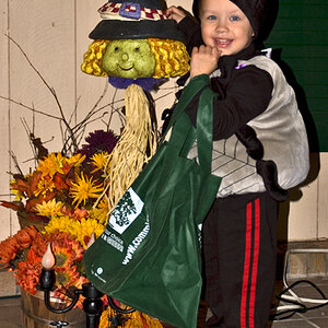
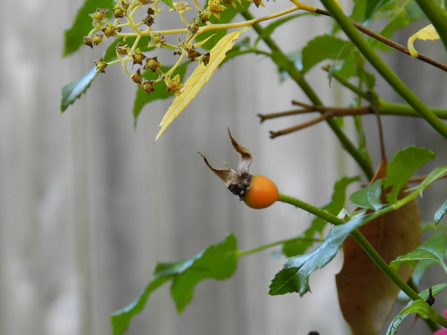
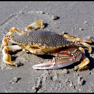
#1 Not bad, the yellow leaves are a bit distracting, and you placed the main subject right in the middle of the image. Check out "rule of thirds" and composition.
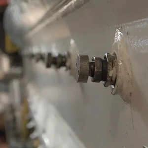
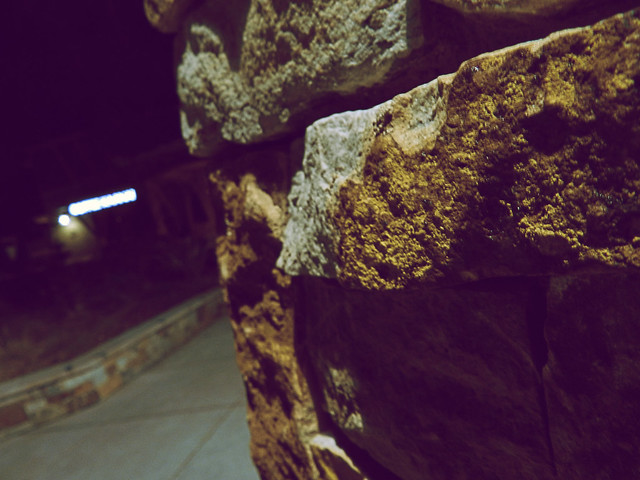
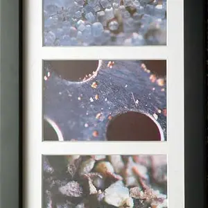
#2. Not even sure what this is - I suppose I could guess, but a good, well-composed image should not make me have to do that. The image could be a lot sharper as well.
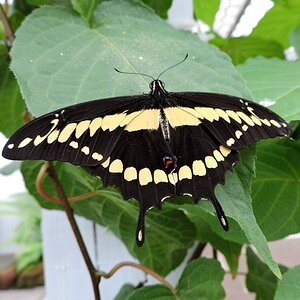
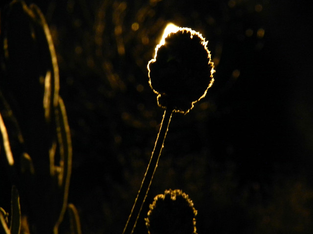
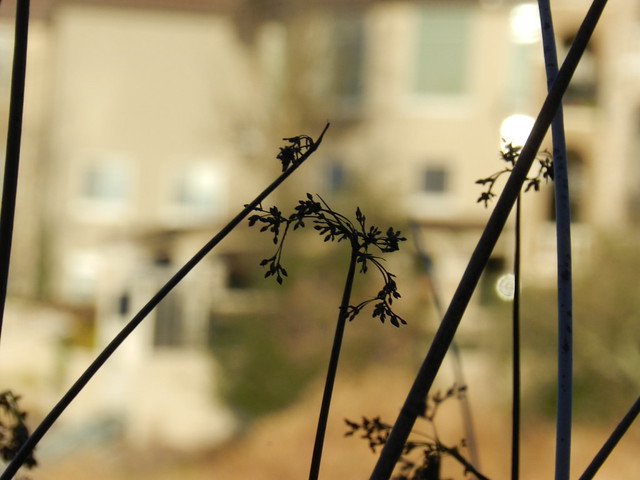
#3. Nice attempt at silhouettes, if that is what you were going for, but the edges are not sharp - maybe they are not sharp anyway, but just my first impression.
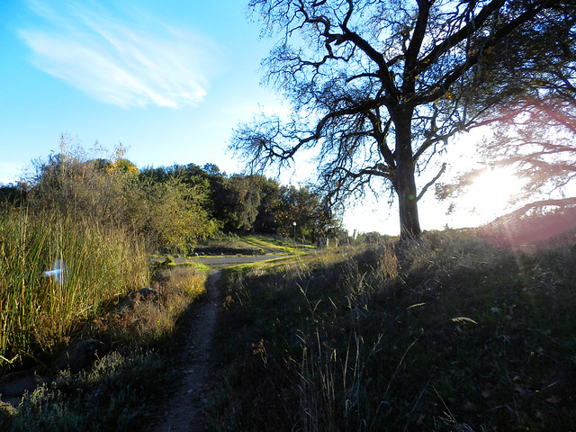
#4. Not bad, but ruined by lens flare and the foreground is underexposed.
#5. Nice silhouette, but it is a little cluttered, in the sense that there too many elements in the actual silhouette itself. One of the key aspects of photographing silhouettes and other things for that matter is simplify - if you put too many elements in the main part of the image, as you have done here, then the viewer does not know where to focus their attention. Don't feel that you have to fill the whole image with something - you might want to look up the concept of negative space as an element of composition.
My 0.02¢ FWIW. HTH.
Cheers,
WesternGuy





![[No title]](/data/xfmg/thumbnail/39/39181-9016b4d45a06d288c1a2b92565ba7837.jpg?1734173055)