Cmoorephoto
TPF Noob!
- Joined
- Jan 15, 2011
- Messages
- 17
- Reaction score
- 0
- Location
- Va Beach
- Can others edit my Photos
- Photos OK to edit
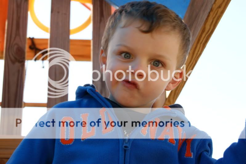
So i finally got the nerve up to post some pics. My kids are such characters.
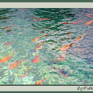
1.
2.

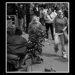
3.

4. Cant forget the other kid:mrgreen:

1.
2.
3.
4. Cant forget the other kid:mrgreen:


![[No title]](/data/xfmg/thumbnail/38/38294-cb4a5aa0ded725d4c694e6eebe276f0d.jpg?1619738564)

![[No title]](/data/xfmg/thumbnail/31/31747-2e2e2bda16938a6a1d5fd6120c558293.jpg?1619734987)