What's new

First Picture Post C&C...

mynameistin

TPF Noob!
Joined
Apr 25, 2011
Messages
7
Reaction score
0
Location
Kansas
Can others edit my Photos
Photos OK to edit
Alright before i hit the sack thought id resize some images for faster viewing and throw three up...Ive been shooting since mid January so any tips pointer everything id greatly appreciate. Thanks in advance

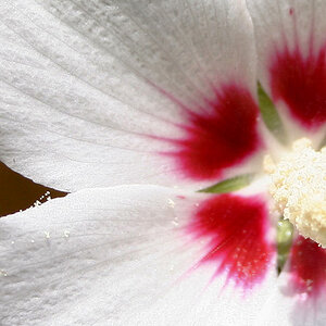
200963_10150213152460948_503895947_8287854_5136630_o.jpg

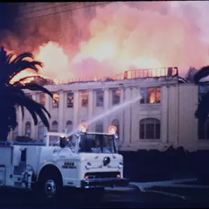
204467_10150224235145948_503895947_8383123_7808172_o.jpg

219742_10150224393030948_503895947_8386088_6651328_o.jpg
 
The composition is quite good on all three. I would however crop the top of the 1st photo~
 
thank you for the kind words myvinyl
 
Last edited:
They're all crap!!!!


hahahahaha, just kidding Justin!!!! Welcome to TPF man!!!
 
I really like the sky on the second one.
although I think it would look nice with more vibrance/saturation.
Just my opinion =p
 
These are cool! :) the third one really has a sense of space and mood
 
thanks guys...i did think that about the sky with the horse and the only reason i didnt was to jsut go with the day. it was real cloudy and overall sort of a crappy day as it has been for about the last week so far.
 
I the second shot I would have made the horse in focus and over just a touch to the left.

In the last one I would have moved way over to the left and focused on the three older people more and less on the bench itself.

The focus should be on the older people, I think, because they are more interesting than the bench and there is some kind of story behind three people sitting together on a bench rather than just a bench. If you use rule of thirds, our focus is on the bench, which is a little uninteresting in some ways. Still, I like it the way it is too. Does that make any sense? Yeah, I doubt it! LOL! But it was meant to be CC and not just criticism. Just ideas.
 
I really like #1. I'm not sure I like this aspect ratio and maybe see a tad more space on the left side of the image. Then again, maybe that's why I like it so much. It feels kind of like the flower doesn't belong.

:thumbup:
 
thanks a ton guys for the kind comments...photogirl i totally understand what your saying no worries i take it as CC :) when its full resoultion maybe the three people catch your idea easier? i went with the rule of thirds and i also make a grid in my camera well imagine a grid and i placed them in the bottom left intersection so what your saying would look good i did try haha i guess i just failed slightly or due to the small resolution i uploaded it failed me but i will try this again! :D thanks again everyone
 
The line created by the horse throws me right out of the photo. Try placing it so the head is facing into the frame, rather than out.
 
Crop a little off the top of the first one.
#2 little more color to the sky and you got it!
#3 I love it. Favorite one:D
 

Create an account or login to comment

You must be a member in order to leave a comment

Create account

Create an account on our community. It's easy!

Log in

Already have an account? Log in here.

New Topics

Back
Top Bottom