What's new

first post....ironically of a post.

i'll consider it. i'd be more willing to send/know who has copies of my pictures.

you're kidding, right?

lew, your pictures aren't available to edit. despite the fact that i do not do this for a profession(i studied law) i would like to keep my work mine. because i want to learn and grow by doing things myself. no offense, but chill, its my choice.

I appreciate your good sense in trying to model your behavior by mine, but at your stage in photographic development, you would definitely profit by seeing how other people would deal with some of the issues in your pictures. Not allowing editing means that the critic must try to define in inadequate words what is much more easily shown in an illustration. You would never say to a dance teacher, don't show me, tell me, because that is a visual medium. So, obviously, is photography. That would handicap the dance teacher, frustrate the teacher as they try to describe in words what is meant to be shown.

In regards to doing and learning on your own, that is certainly a valuable intent but having an example does not mean you can't learn how to do what you want, it merely provides you with a sensible, understandable goal.

I repeat that you will get better and more useful help if you allow editing.
 
Welcome to the forum.

Lew always gives good advice.

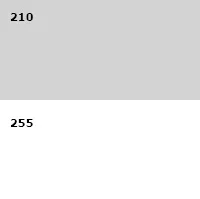
Pic_chick, Ken and Mully all noted the photo needs more contrast. It sure does. There is no black in the photo and there is no white (really no white!) -- it's all just muddy greys. You don't have a white value in the photo that makes it to 210 -- white is 255.

$twoten.webp
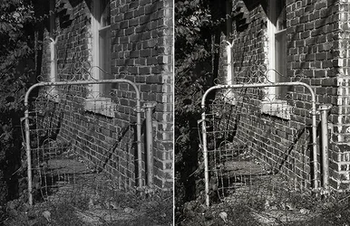
Here's a visual example that doesn't use your photo. The version on the left is comparable to your photo in terms of tone response -- flat and lacking contrast. The version on the right has normal contrast. I also tinted the version on the right which I think your photo would benefit from as well.

$flat_bandw.webp

Joe
 
I see your points, and so i enabled editing. just tell me what youve done, so i can learn. thanks for the help!
 
Snow is still gray in your photo.. not white. Think about it! ;)

(p.s. Lew is pretty good... he won't steer you wrong, unless he is "messing" with you.... and he normally doesn't do that to new people!) Now that guy with the mustache??? Watch out... lol!
 
I see your points, and so i enabled editing. just tell me what youve done, so i can learn. thanks for the help!

Great, and again welcome. You've met some of the regulars now; Lew, Ken, Mully, Rick, Charlie and of course "The Stash" (pic_chic is still kinda new). Looking at that list you've got a combination of both working professionals and avid amateur photographers with extensive experience -- you came to a good place.

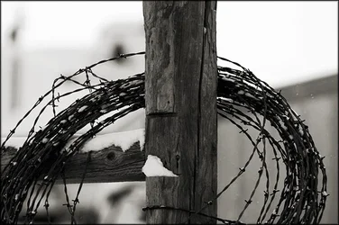
Here's your photo:

$fence_post.webp

I've basically normalized the tone response -- if it were my photo I'd frankly be tempted to raise the contrast even a smidge higher. Your version was really flat with the whites barely making it to light grey and the blacks a little short. To help, we need to know more about what you're doing. What software do you have? How did you convert this image to B&W? Did you shoot this as a camera JPEG or raw capture? The more you tell us the more we can help.

I put your photo into Photoshop and used Levels along with a Soft Light blend mode to get the result you see here. I set a black point (where the wire meets the fence post your right) and then I stretched the rest of the tonal data up so that the snow and sky in the background were closer to white. This raised the contrast and then I raised it some more. Last step I tinted the photo very slightly brown -- goes with the subject.

Joe

P.S. Where are the frozen north lands?
 
Last edited:
I think Ysarex' edits pretty much cover the PPing issues.
From another viewpoint, I think this composition isn't well thought through.
Exactly what are the viewers supposed to be looking at?
My eye sort of wanders around with no specific place to come to rest.
The post being almost exactly in the middle seems to be the obvious candidate yet it is rather boring without even much texture to catch the eye.
I think a vantage point a little more to the left would have moved the post off the center, make the right side less bulky, making the wire a spiral that contrasts nicely with the formal cross of the posts.
Then in PPing, you could make the snow whiter, make the post detail more obvious and crop to fill the frame more completely with interesting stuff.
Darken the corners to keep the viewers' eye in and I think it becomes a more interesting and comfortable image.

_MG_0292_zps655677a7-1lllll_zpsdbeca23a.jpg


In framing a picture, the maker needs to think through what impression he/she wants to give and where he/she wants the viewers' eyes to go and then frame everything to support that.


EDIT

In case you'r wondering what I did.

I sharpened only the post to get the detail.
Selected and cut the right side, pasted it to another layer and moved that layer below the top layer and slid it in until it made a spiral looked good.
Then cropped in 2:3 aspect ratio so that the composition filled the frame, taking off some of the top post that wasn't doing anything.
Darkened the corners to keep the eyes in the frame.
 
Last edited:

Create an account or login to comment

You must be a member in order to leave a comment

Create account

Create an account on our community. It's easy!

Log in

Already have an account? Log in here.

New Topics

Back
Top Bottom