First post, looking for honest feedback!

pacu928

TPF Noob!
Joined
Mar 29, 2006
Messages
16
Reaction score
0
Location
Beloit, WI
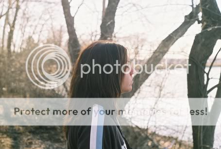
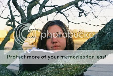
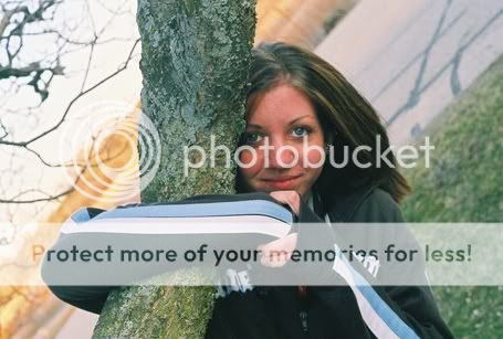
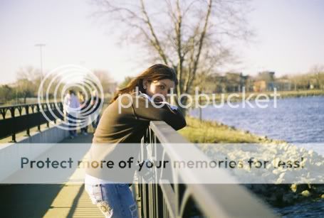
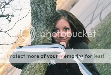
These are some recent photos I took last weekend. Just looking for some honest feedback and criticism. More can be found in my photo blog here: http://bthansen2.blogspot.com. Please let me know what you think, what my opportunities are, etc. Thanks!!

131313-R1-20-3A.jpg

141414-R1-23-2.jpg

121212-R1-01-23A.jpg

141414-R1-21-4.jpg
 
Thanks for the welcome! Here's some more photos. I have tons more in my photo blog here. I'm really into portraits and landscape/cityscape photos.

Adjusted hues and saturation on this one.
treehugedit.jpg


headermoresat.jpg


bridgemoresat.jpg


141414-R1-21-4.jpg
 
Welcome to the forum.

The newer ones look better, the first ones were lacking contrast. I like the tighter crop on the landscape as well.

For future reference, you won't get too much specific feed back when you post a bunch of photos together like this. It's just too confusing for people to critique one of many images. If you want feedback and critique, post just one image into the critique forum and explain the photo...what you were going for and what you like/don't like about it.

Feel free to share multiple photos in the gallery though. We look forward to seeing more.
 
Hi and welcome to ThePhotoForum, your choice in adjusting the hues and saturation made the photo's much better in my opinion. They are a bit small to see all the details that I am sure you seen.
The 2nd picture seems a little soft, and I would have cloned the dark circles from under the girls eyes, and I'm not sure if I like the angle.
Did you use any ND Grad filters on the city scape? I think you would have toned down the blown out area on the dome and gave the sky definition. Out of all of them the girl with her elbow on the tree is the best by far.
Keep posting, there are a lot of great photographers on here that's willing to help you out!
 
Big Mike said:
Welcome to the forum.

The newer ones look better, the first ones were lacking contrast. I like the tighter crop on the landscape as well.

For future reference, you won't get too much specific feed back when you post a bunch of photos together like this. It's just too confusing for people to critique one of many images. If you want feedback and critique, post just one image into the critique forum and explain the photo...what you were going for and what you like/don't like about it.

Feel free to share multiple photos in the gallery though. We look forward to seeing more.

Thank you for your input. I must have missed the Critique section..oops! I see it now that you mentioned it. Thank you thought!
 
i like them! in the third one in the first set you posted, if you cropped it so that the model isn't in the middle, and is more off to the side, i think it'd look great. but nice start! welcome to the forums! stick around and i'm sure you'll learn alot!
 
macawlvr said:
Hi and welcome to ThePhotoForum, your choice in adjusting the hues and saturation made the photo's much better in my opinion. They are a bit small to see all the details that I am sure you seen.
The 2nd picture seems a little soft, and I would have cloned the dark circles from under the girls eyes, and I'm not sure if I like the angle.
Did you use any ND Grad filters on the city scape? I think you would have toned down the blown out area on the dome and gave the sky definition. Out of all of them the girl with her elbow on the tree is the best by far.
Keep posting, there are a lot of great photographers on here that's willing to help you out!

Thanks for the feedback. And yes I used a UV filter on the cityscape pics. Those were taken with a Minolta X-370 w/70-210mm lens. I don't know what degree of filtration the filter is though since its been a while since I bought it. The pics with the camera and lens are the only ones i've had a problem with the darkening of the corners and blowing out. You can see what I'm talking about in my photo blog. But thank you very much for your input!
 
Pretty girl and nice cityscape! Like that second one the best, although it could possibly do with adjusting the black point level to correct the exposure slightly - most likely a scanning issue I would think.

Anyway, welcome! A good start and I look forward to seeing more!

Rob
 
Good job, Pacu.

I notice that the subject is usually more or less centered in each of your pictures. You might try offcentering them some (about a third of the way from the top, bottom, or side is typically considered an ideal amount, hence the "rule of thirds" which isn't really a rule, but a good guideline). Also, if the horizon cuts horizontally across the center of the frame, as it does in the cityscape, you can try cropping it so it's about a third of the way from the top or bottom. In the cityscape with the water in the foreground, the water is empty space, or "negative space" I believe it's called. If you crop the bottom, the image could look more balanced.

A search for "photgraphy composition" will turn up lots of techniques.

Oh, and one great technique I've found to make a white building to stand out against the sky is to use a polarizer, which darkens the sky. You have to be careful however. I've more than once used it for that and wound up removing the reflection from the water, leaving it an unattractive muddy color. Still, a polarizer is a great investment! I love mine.

Hope this helps, and keep it up! I look forward to more photos from you!
 

Most reactions

Back
Top