What's new

First post.

Natethephotog

TPF Noob!
Joined
Nov 22, 2014
Messages
9
Reaction score
0
Location
Portland Oregon
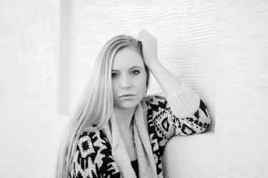
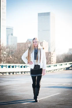
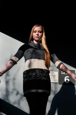
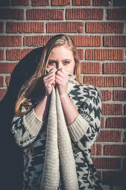
Been reading for too long with out posting, so here I go. Last week we finally had a break in the weather and saw some sunshine so took that opportunity to go shoot a friend around downtown Portland. Here are a few i liked. Critiques always welcome and needed.
DanaPortfolio-7784.webp DanaPortfolio-7735.webp DanaPortfolio-7661.webp DanaPortfolio-7448.webp DanaPortfolio-7513.webp
 
Numbering from left to right.
I am a bit short and cranky so read what I say with that in mind


#1, somethings going on with the color, the sweater clashes with the brick wall, large obvious (and disturbing) vignette.
#2 dappled light on face, background too bright and obvious
#5 light is harsh and she is too square to camera and shot from below so she looks stumpy - and I can see from the other shots she is not.

#4 - decent - I think she is a bit small in the frame and her light jacket recedes into the background.
#3 - best - almost high key, good pose, great eye contact - her head is tilted and there is a lot of space. I think the contact is better if her head is upright. She has a stronger, more affirmative look. (I think) You might get her to lift her chin a bit to remove that fullness below it.

DanaPortfolio-7661lllll.webp
 
The B&W is quite good -- I'd say crop it tighter. Back off on the vignettes. The "matte black look" is currently fashionable. Most of what's currently fashionable will embarrass the h*ll out of you in the very near future as soon as it's no longer a fad and everyone realizes that was dumb.

Joe
 
Thank you I do appreciate it. Working on some re-edits, and I definitely fell into the whats fashionable arena and started to mimic the matte too much lately.
 
Thank you I do appreciate it. Working on some re-edits, and I definitely fell into the whats fashionable arena and started to mimic the matte too much lately.

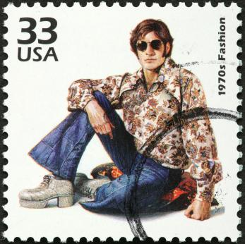
When I was your age I thought the ladies couldn't resist my great look:

139271-347x346-bell-bottom-jeans.jpg


I'm still trying to destroy the photographic evidence. I'll be rolling in my grave when my son is showing his kids the photos and saying, "this was your grandpa." Fashion changes quickly for good reason. If you can cash in on it fine, but make sure the EXIF data won't trace back to you. You got the B&W one right. :thumbyo:

Joe
 
Thank you I do appreciate it. Working on some re-edits, and I definitely fell into the whats fashionable arena and started to mimic the matte too much lately.

When I was your age I thought the ladies couldn't resist my great look:

139271-347x346-bell-bottom-jeans.jpg


I'm still trying to destroy the photographic evidence. I'll be rolling in my grave when my son is showing his kids the photos and saying, "this was your grandpa." Fashion changes quickly for good reason. If you can cash in on it fine, but make sure the EXIF data won't trace back to you. You got the B&W one right. :thumbyo:

Joe
You're one sexy man if it make you feel better
 
Jeans? Shoes? What about that SHIRT! :eek-73:
(I was in uniform in the 70s so I'm fairly safe ;) )

Been reading for too long with out posting, so here I go. Last week we finally had a break in the weather and saw some sunshine so took that opportunity to go shoot a friend around downtown Portland. Here are a few i liked. Critiques always welcome and needed.

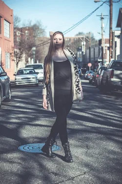
I've seen a lot worse first posts and posted worse myself. #2 you should have picked up as a non contender yourself, the shadow across her face looks like a beard. #5 makes her look chunky while 2 and 4 show that she isn't. I agree with the others that #3 is the best. :)
 
I'm not going to be specific about each one but there's definitely a lack of consistency. I'm not saying every shot should be a replica of the last but there's like 4 different processing styles on these. I would just stick with one, maybe two, if its all from the same shoot.
Just my opinion..
 
#4 is the strongest one out of the set in my opinion. Well exposed and well lit. Very good. The other ones has inconsistent shadows across her face which ruins it for me.

#4 is honestly really good. I like it. It's not how I would edit a photo like it but honestly, well done. BTW, can you tell me how you got her face so well exposed in the hard sunlight? Did you use a reflector or a flash for it?
 
I think 5 would be MUCH more powerful if she was looking straight ahead instead of down at the camera. It would have more power and would be more flattering.
 
BTW, can you tell me how you got her face so well exposed in the hard sunlight?
The sun was behind her left shoulder and up so with her walking towards me her hair blocked most of the sun of her face, hence a little highlight blown on her hair for #4. no reflector used for that shot.

think 5 would be MUCH more powerful if she was looking straight ahead
Thanks I agree I should have realized that with her above me looking down will never be as flattering.

Also in general, this was a longish shoot so have more photos of each editing style, but probably should have just posted more of similar photos rather than giving a wide spread. Im still messing around with different styles so every shoot I pick some photos to do different edits on.
 
1. The muted color actually works for me on this, and I like the pose, but the shadow seems a bit harsh
2. The shadow is just killing this one
3. Seems washed out but I like the contrast in the sweater
4. I like this one the most, but not the way her left arm is hanging. The vignette is a tad strong for my tastes.
5. Don't like the way I can't see separation from the top of her hair & the background.

Keep shooting, show us more, and BTW welcome :-)
 

Create an account or login to comment

You must be a member in order to leave a comment

Create account

Create an account on our community. It's easy!

Log in

Already have an account? Log in here.

New Topics

Back
Top Bottom