first shoot

alexzobi

TPF Noob!
Joined
Mar 26, 2013
Messages
81
Reaction score
24
Location
Philadelphia
Can others edit my Photos
Photos OK to edit
So the other day, a musician *friend *of mine and I got to talking and she heard about my interest in photography. well, she decided she needed pics for an upcoming event she has and asked if I'd help her out. with a face like that, who could say no? anyway, I've been wanting to take it to the next level and I figured this would be a good way to start my portfolio. what better way than with someone who's soon to be famous??? we took many many photos and it's difficult for me to limit myself here to just a few, but I did my best to control myself. anyway, C&C welcome, but let it be known these pics haven't been edited and I know the lighting and exposure in a few of them is definitely off. Still, I encourage all constructive criticism.
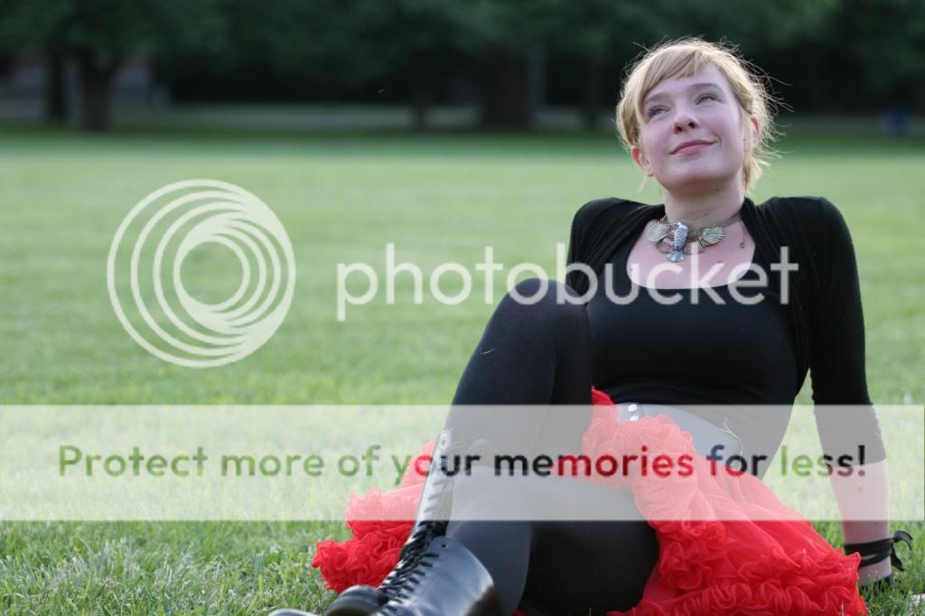
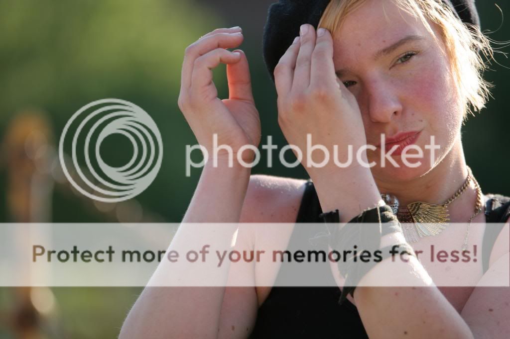
1.


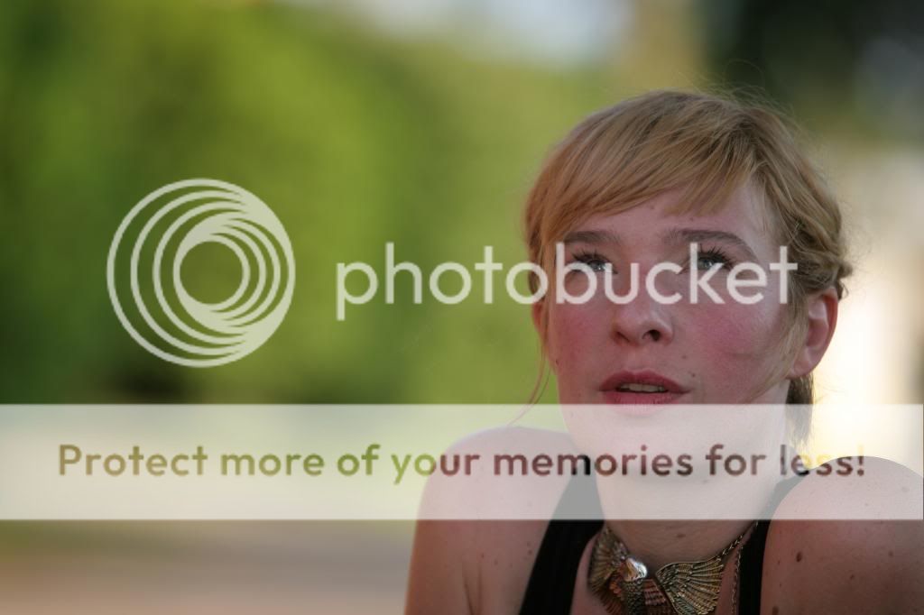
2. underexposed...damn photographer...


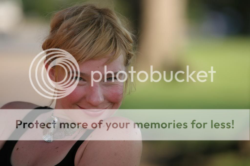
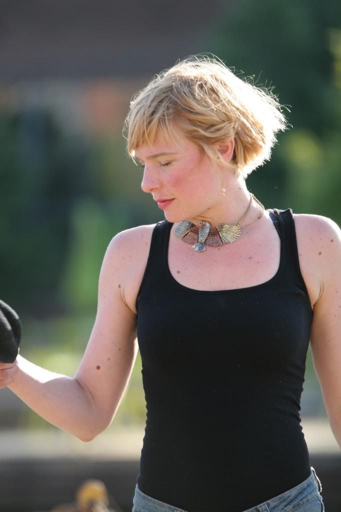
3. again, but with a face like that, who could resist...


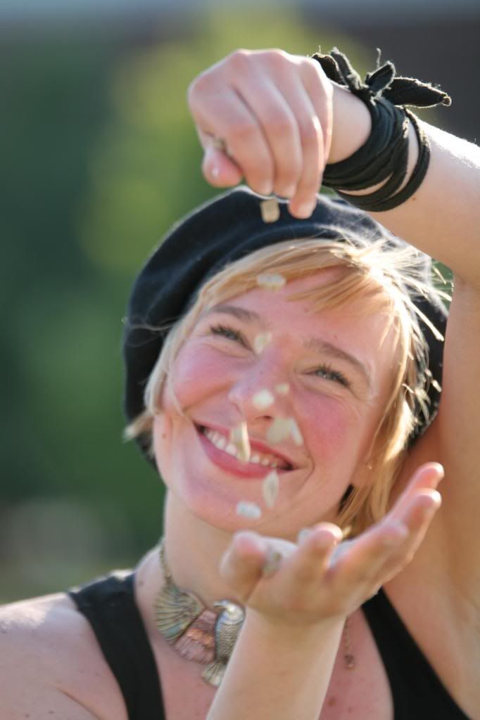
4. she certainly knows how to get distracted...


5.


6.


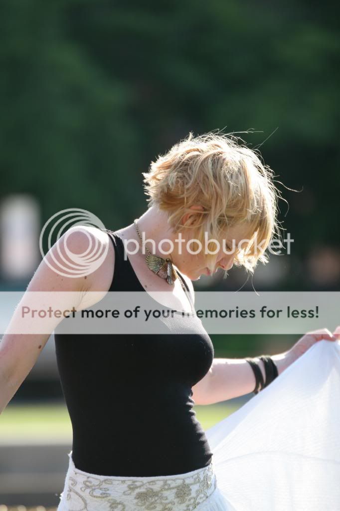
7. what is this thing??


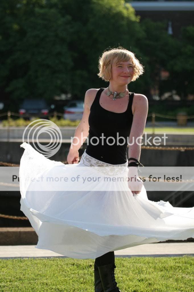
8. strutting her stuff
 
Last edited:
All need some sort of fill flash as they are too underexposed in my opinion.

not sure what's going on in #4 either, focus MIGHT be on her bracelet, maybe.... Would have been an instant delete from my camera before hitting my computer. Would have been a cute picture otherwise though.
 
I really like 3 and 8.. I feel like her personality shines through well in those. They do need more light though and I wish 8 wasn't missing her feet.
 
All need some sort of fill flash as they are too underexposed in my opinion.

not sure what's going on in #4 either, focus MIGHT be on her bracelet, maybe.... Would have been an instant delete from my camera before hitting my computer. Would have been a cute picture otherwise though.

yeah the under exposure was an issue I was aware of. unfortunately, I didn't have the foot for my flash to get it off the camera and closer to her. I was hoping to fix it up with a little editing, but I'm not entirely sure whether or not these are beyond repair. that issue aside, I'm interested to see what else people have to say. as for #4, unfortunately, she caught me off guard with this, otherwise I would've had it in manual focus and gotten it right. but she didn't give me long to steal the shot. regardless, I like it too much to delete it. maybe it's just because I know her and this picture captures her personality so well.
 
i played with 3...
$IMG_0790_zps88e4ecdc.jpg
 
That's definitely more of what i'm going for. maybe a happy medium between the two. first I gotta get lightroom installed on this comp...
 
Well, I think some can be helped, but it would take a good bit of effort. I gave #3 a shot. Very quick in lightroom. Fixed the white balance, raised exposure for the whole picture, then raised it on just her a bit more. Cropped it to portrait orientation. Still not perfect. Just a five minute edit. ;)

$tpfpic-1.jpg

Woops. Cross posted with mrstomommy. :p
 
You have some good ideas. The idea of backlighting can be good, but it's usually finished with fill light or a better poses, and there doesn't seem to be either. Learn to see light and learn how to use it to flatter models. The backgrounds are generally distracting because you didn't think about them while you were looking through the viewfinder. Nos. 1 and 4 are the only ones with OK backgrounds. Lack of fill light can work for some shots, but not every shot. Eventually you have to control some light and that's where the understanding of light and photography comes in. Some of the expressions are good and some of the lighting shows thought but is unfinished.

The full length shots are missing curves. Curves come from the art of posing. In No. 3 everything is crunched and square. If her head were tilted, if her shoulders were relaxed, those are things that improve the look. In No. 5 and No. 6, see the difference in the arms. In No. 5 her right arm is pressed to her body. Creating space between the arms and body gives the impression of being slimmer and more elegant, so the arms are better in No. 6. You could have spaced out the arm a bit and still had the hands doing something interesting in No. 5. But in No. 6 again her body is square to the camera, which is fine if she doesn't want a flattering figure, but I bet if you showed a curvy figure and a square one of the same shot without explaining them, most clients would pick the curvy one.

Learn to design shots. You should master portraits 101 before putting your own twist on it. If you don't know the rules, breaking them is only an accident, and that's not a professional method. You don't have to be a pro. But even as a hobbyist, the more you learn and understand, the happier you'll be with your images.
 
Last edited:
Other than the above suggestions I have to add that in the first pic... you shot up her nose. If she would have tilted her chin down just a hair or if your position was a little different you would have missed the "up the nose" look.
 
1,2,3,5,7,and 8 share a common characteristic: bad framing. I don't mean to offend you, but that's what I see. In #1, she's seated on the grass, but you crop off the points of contact-her feet and her buttocks, where they touch the ground, and the frame is 75% empty field, and 25% cropped-off person. #2 has her slammed into the lower right hand corner, and amputated, and again, 80% dead space, 20% person. # 3, same scenario--should have been a "tall". #4, her dropping the peanuts (?) is framed well, but focused poorly. #5, she's looking out of the frame, and is bordered by dead space camera left...I have no idea why...

#7...way too much top space, missing hand, and nothing going on visible to the camera. #8, also too much top space and her feet are missing. In a full-length, standing pose, the feet need to be shown, not amputated.

The girls' got charm, that's obvious. You managed to press the shutter button a few times while she was showing some of that charm, but the way the camera was aimed really did not convey things in a pleasing visual style. Composition is the name of the game. How to best utilize the entire frame is a big part of good composition. The photos need to be framed right.
 
I agree, watch how you're framing shots and where you're cropping people. Looks like you might need to work on how you're setting your camera so you consistently get a proper exposure and the subject sharply in focus.

You had some good ideas with a great subject; it takes a lot of practice to get good at anything including photography.
 
Learn to design shots. You should master portraits 101 before putting your own twist on it. If you don't know the rules, breaking them is only an accident, and that's not a professional method. You don't have to be a pro. But even as a hobbyist, the more you learn and understand, the happier you'll be with your images.

That's why I'm here. What better way to learn than with the help of an experienced group of minds?

Thanks all for the critique! Much appreciated. I realize now how right everyone is about the framing. Don't know why I didn't see it at first. As for the backgrounds, these pictures were taken in a highly industrialzed area and she wanted 'country' look to it, as it was for a country show, so finding a background that didn't scream inner city while still having the proper light on her to not cast bizarre shadows on her face/body was a difficult task.

Poses, framing, background and lighting. Got it.
 
you could of just turned her more to the sun, since it seems really harsh on the back of her
 
You should probably start by shooting a little wider, a from a little further back. By keeping the frame open, you can crop-to-fit more easily.

4 through 8 have quite nice light, albeit basically all the same. The first 3 just look flat, because you kept her in shade.

Posing, framing, backgrounds, and lighting is a lot to work on all at once. Break it down and work on one thing at a time. Don't worry about having keepers.
 

Most reactions

New Topics

Back
Top