1) Not bad, might need a little more sharpening. But somewhere between snapshot and good pic.
2) Somewhat creative, good focus... but the upper right of the hook is blown out. The subject doesn't do much for me. If you could capture the reflection of something in the water droplet that might make it a bit more interesting.
3) The focus is on 4S. The rest of the text is OoF... leaves me wondering why. I guess the composition and execution just don't do it for me. It seems like you were looking for something to try out a shallow DoF on.
4) Good focus on the emblem, but in the end the subject is kind of drab to me. As noted, you can see your reflection in the logo, which also is kind of bad.
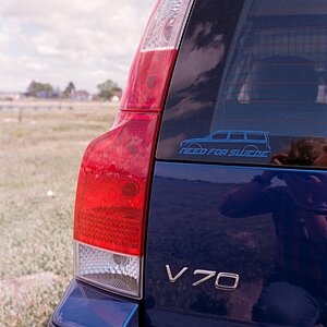
5) A little better. Not a great subject (to me, this is obviously very subjective). Again, you can see a reflection of what I assume is you in the emblem.
6) A little cocked to the right and it's just a centered Porsche emblem. Not much to say really, kind of bland.
Thanks for the C&C!!! The pics were the taken in manual modes which i just started using recently. The comments will make me pay more attention to detail before taking the shot. Perhaps i should look into some sort of editing software to correct and improve my photos.


") I love #2! Cute kid in #1. Is she yours?
I love #2! Cute kid in #1. Is she yours?
![[No title]](/data/xfmg/thumbnail/37/37657-01deca3769b38b716838942ccbfce66a.jpg?1619738172)


![[No title]](/data/xfmg/thumbnail/38/38443-d3f00036791c5f915b132320c9ac8865.jpg?1619738614)