What's new

First time with FIRST DSLR!

rachelrach11

No longer a newbie, moving up!
Joined
Mar 22, 2012
Messages
195
Reaction score
29
Location
Birmingham Al
Can others edit my Photos
Photos OK to edit
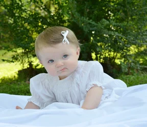
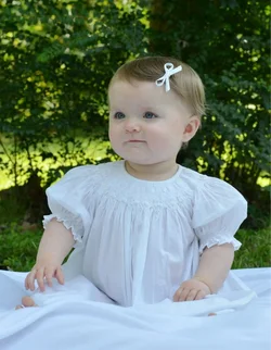
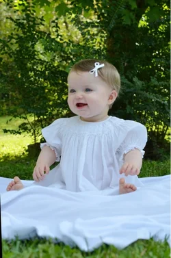
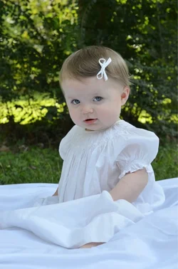
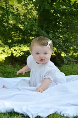
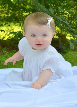
I FINALLY got my hands on my first DSLR ( Nikon D7000). My sweet little Piper has gotten pretty comfortable being my "model".

I would love any feedback, advise or suggestions on how I can improve. These were taken with my 50mm 1.8.
 

Attachments

  • $image-2819747988.webp
    $image-2819747988.webp
    75 KB · Views: 183
  • $image-725192399.webp
    $image-725192399.webp
    72.3 KB · Views: 178
  • $image-4186851131.webp
    $image-4186851131.webp
    74.4 KB · Views: 169
  • $image-2660110350.webp
    $image-2660110350.webp
    58.8 KB · Views: 185
  • $image-3860070073.webp
    $image-3860070073.webp
    77 KB · Views: 158
Last edited:
The white balance looks off, they all have a blue tint. Some fill light would help quite a bit I think. An off camera light source would be ideal, but just a reflector might have worked here, or a little on-camera flash if that is all you have.
 
Sweet looking kid!

Your camera is getting fooled by the brightly lit background and the masses of white fabric, so these could all stand to be brightened up a fair bit. When you're shooting masses of white dial in some exposure compensation, +1.0 or so.

These look oddly soft, not sure what's going on. I would guess the camera is putting the focus in almost but not quite the right place a lot of the time.

Someone's going to point out that the white fabric is actually coming out blue, because it's in the shade, and they will explain that your white balance is off. You can fix that too if you like, but I think that it looks more or less natural as-is -- after all, the kid IS in shade..

Seeing as the kid IS in shadow, it's hard to get any interesting light on her. Direct sun is too harsh, shade gives light that's too flat. Off camera flash is the orthodox solution here, but you can fool around with things that reflect light as well, like husbands in white shirts, light colored automobiles, and the like, to push a little more light onto the kid from one side or the other, to create some shadows for a more three dimensional look to her pudgy little face.

Cute scene, cute kid. Good setup, and nice attention to the background -- there's nothing bizarre back there. Looks like the depth of field is decently handled as well!

 
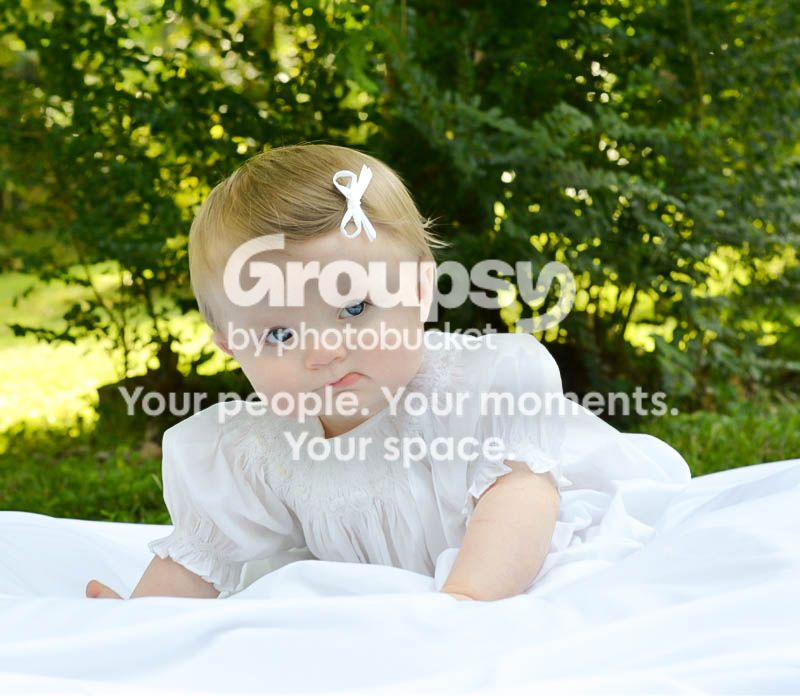
Check your WB. It's way off. Very greenish. Needs fill flash. Watch your backgrounds and separate your subject. In many of these, it appears she has a tree trunk growing out of her head. Not a great look. :mrgreen:

Cute model. You did well getting down at her level and not shooting down at her. Keep it up!
 
There is simply no way to take a bad picture of such a sweet subject!
(Disclaimer: I'm speaking as a grandfather who has never, ever taken a bad picture of any of my grandkids. Even the overexposed, out-of-focus ones are good. So there.)
 
eric1971 said:
The white balance looks off, they all have a blue tint. Some fill light would help quite a bit I think. An off camera light source would be ideal, but just a reflector might have worked here, or a little on-camera flash if that is all you have.

Thanks so much! I definitely see what your talking about now.
 
amolitor said:
Sweet looking kid!

Your camera is getting fooled by the brightly lit background and the masses of white fabric, so these could all stand to be brightened up a fair bit. When you're shooting masses of white dial in some exposure compensation, +1.0 or so.

These look oddly soft, not sure what's going on. I would guess the camera is putting the focus in almost but not quite the right place a lot of the time.

Someone's going to point out that the white fabric is actually coming out blue, because it's in the shade, and they will explain that your white balance is off. You can fix that too if you like, but I think that it looks more or less natural as-is -- after all, the kid IS in shade..

Seeing as the kid IS in shadow, it's hard to get any interesting light on her. Direct sun is too harsh, shade gives light that's too flat. Off camera flash is the orthodox solution here, but you can fool around with things that reflect light as well, like husbands in white shirts, light colored automobiles, and the like, to push a little more light onto the kid from one side or the other, to create some shadows for a more three dimensional look to her pudgy little face.

Cute scene, cute kid. Good setup, and nice attention to the background -- there's nothing bizarre back there. Looks like the depth of field is decently handled as well!

Thanks so much for the suggestions! What can I do to make these not look so soft?
 
jwbryson1 said:
Check your WB. It's way off. Very greenish. Needs fill flash. Watch your backgrounds and separate your subject. In many of these, it appears she has a tree trunk growing out of her head. Not a great look. :mrgreen:

Cute model. You did well getting down at her level and not shooting down at her. Keep it up!


Thanks for the advice! I remember thinking to watch for the tree in the background at first and then my attention had gotten redirected on just keeping her still;)
 
fiziwig said:
There is simply no way to take a bad picture of such a sweet subject!
(Disclaimer: I'm speaking as a grandfather who has never, ever taken a bad picture of any of my grandkids. Even the overexposed, out-of-focus ones are good. So there.)

Thanks so much ! The poor thing is going to hate the camera by the time she is a year old. She is definitely my "guinea pig" when it comes to learning the ends and outs.
 
With a WB adjustment, a bit of sharpening, and possibly a light crop... I think #4 is print worthy. Hang that on the wall!

 
mjhoward said:
With a WB adjustment, a bit of sharpening, and possibly a light crop... I think #4 is print worthy. Hang that on the wall!
Thanks! I took your advise and attempted to make the changes you mentioned. Although , I may have cropped a little too much?
 

Attachments

  • $image-2874846125.webp
    $image-2874846125.webp
    59.6 KB · Views: 169
8034272413_71f01aa133_o.jpg


lol idk what happened to the bottom of the frame...idk how that color got there
 
Very beautiful subject.... and nice fill on the lighting, but perhaps a bit too much. Some shadowing is always preferred with my style. My few pieces of advice:
1) General rule for me when taking people portraits is to have their clothing and the background darker than their face. This way the attention goes to the face. I understand the beautiful white dress and maybe this was clothing wore for an event, but the image would have been so much nice in a darker outfit, given the background.
2) Another easy way (with a little bit of an investment) to make these close up, outdoor portraits look like a professional is to use a long telephoto lens, stand far back and zoom in. This in effect blurs out the background and give the photo a totally different feel.
3) dark vignettes around the edges look great as well.

Best of luck.... keep clicking!
 
I played around in Lightroom. She is beautiful! I love editing little ones, they make it so easy!
I lowered the contrast a bit, played around with the tone.
Pulled out some blue.

image-2819747988-2.jpg
 
The #1 thing that vastly improved my photography is sticking to, knowing, and following the Rule of Thirds. Rule of Thirds alone will vastly improve your composition. Great start btw!!
 

Create an account or login to comment

You must be a member in order to leave a comment

Create account

Create an account on our community. It's easy!

Log in

Already have an account? Log in here.

New Topics

Back
Top Bottom