The first pic was originally in color, the rest I shot in B&W.
I'm surprised how much I like the look of B&W and would love tips on what makes a good B&W photo.
"What makes a good black and white?" Hmm, that's right up there with, "If a tree falls in the forest and no one is around to hear it..." Seriously though the same things apply to making a good B&W as a colour image. What will take it to the next step is to have a strong understanding of how certain colours render in B&W. For instance in colour, a dark green hedge against a dark blue wall would look nice, and have a good contrast between the colours; in mono, both the dark green and dark blue will render as near-black and you'll have a large dark area which is probably not going to be very attractive.
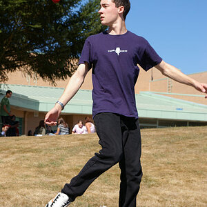
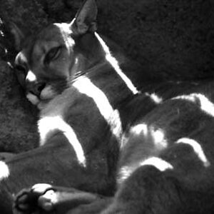
WOW! The first shot is absolutely lovely in B&W. The second shot is also very nice. The third photo is also interesting, especially if one looks at it for a bit. The fourth photo is a cull-class shot in my opinion.
WHat makes a god B&W shot? Some of the elements of design that really help B&W images might be considered line, shape,mass, texture, value, repetition, and variation.
Line,shape,mass,texture,and value are six areas where successful B&W photos often have strengths. Value, as in tonal values, not intrinsic value or some other definition of value.
Your first sample, of the three glass spheres is almost ENTIRELY about lines, shape, mass, texture, repetition, and different tonal values. If we throw in variation, in the way that you cropped off the two spheres at the top and lower right corners of the competition, we can see that your strongest B&W photo uses seven elements and principles of design.
Thank you.
Cull class = garbage, right? That was the photo I was least happy with but I was trying to get a few different pics to see what worked and what did not...and I don't trust myself to always recognize that yet. Figured it would be good to hear opinions from you guys.
I very much appreciate your input. I am going to work on more b&w this week
Thank you! There was a huge Hans Godo Fräbel exhibition at the conservatory so there was LOTS of glass to photograph. It was a very new and interesting photo day.
What I learned: some glass photographs well, and some...not so much LOL
That last shot was a hard line drive up the baseline that just barely went foul. The shot has a nice S-curved line the viewer naturally follows. The angle of the shot is good. If there was no one in the shot, I think people would say "Nice, but no subject." You have a subject, but there's nothing really in the subject that evokes an emotion. It looks like a seasoned citizen, but hard to say. Maybe if they were closer and you could have gotten a good wrinkly face in the shot with lots of shadows and contrasts...
I award you the Close But No Cigar award. But if this was your first try at B&W, keep at it. I think you'll hit it sooner than later.
And in my humble opinion, black & white succeeds when it causes an emotional response, where a color picture more often succeeds when it tells a story.


")
![[No title]](/data/xfmg/thumbnail/31/31751-fb2f68cca32f9eec468dbde7d649840f.jpg?1619734990)
![[No title]](/data/xfmg/thumbnail/41/41755-a922f39cc29ff8f6e66a197508bf99f3.jpg?1619739881)
![[No title]](/data/xfmg/thumbnail/30/30873-79f4c5bc298110a994e9eed027728db8.jpg?1619734490)
![[No title]](/data/xfmg/thumbnail/36/36299-468f060314a0ac2bf5e37da1c33149d2.jpg?1619737493)
![[No title]](/data/xfmg/thumbnail/30/30874-7f3345ba7c76a7c5fa2570559598531b.jpg?1619734491)
![[No title]](/data/xfmg/thumbnail/36/36303-10b1a386a9a00cf90fb7605d2d2c48c1.jpg?1619737497)
![[No title]](/data/xfmg/thumbnail/41/41756-e54235f9fba04c8380cd991845bb84b1.jpg?1619739881)
![[No title]](/data/xfmg/thumbnail/42/42397-30faa170de7ed9be38adf00b9b26a220.jpg?1619740167)