What's new

First venture into B & W

abhishekdg

TPF Noob!
Joined
Apr 15, 2012
Messages
175
Reaction score
11
Location
Minneapolis
Hi friends,

Got my first DSLR and started learning the basics. However, nothing appealed to me as much as the B & W pics appealed to me. Hence here are 3 of the novice trys .Let me know your views and basic mistakes commited.

Camera :- Nikon D90 with 35 mm 1.8g prime lens

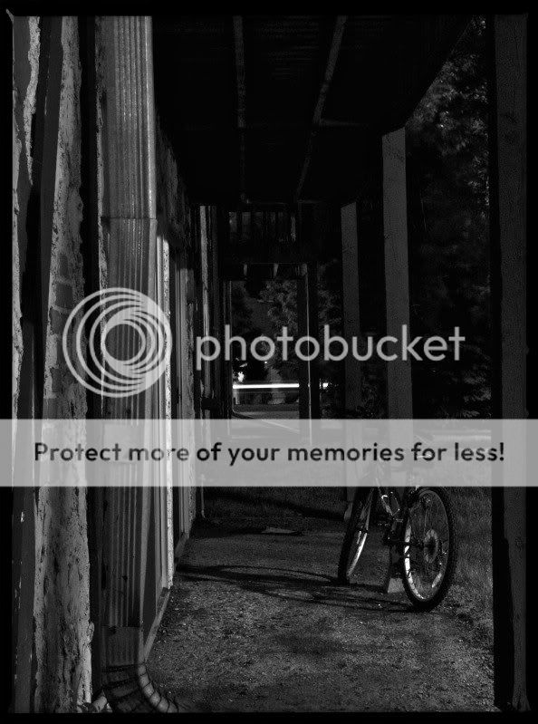
1. Long exposure at night :- f/11, 10 secs , ISO -200
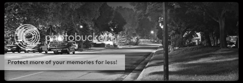
DSC_0021-1.jpg


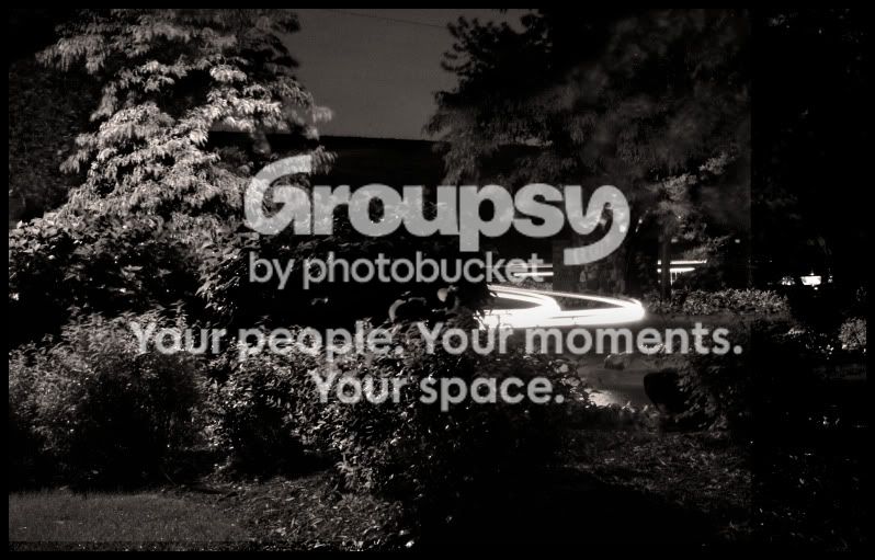
2.Long exposure at night :- f/18, 20 secs, ISO -400
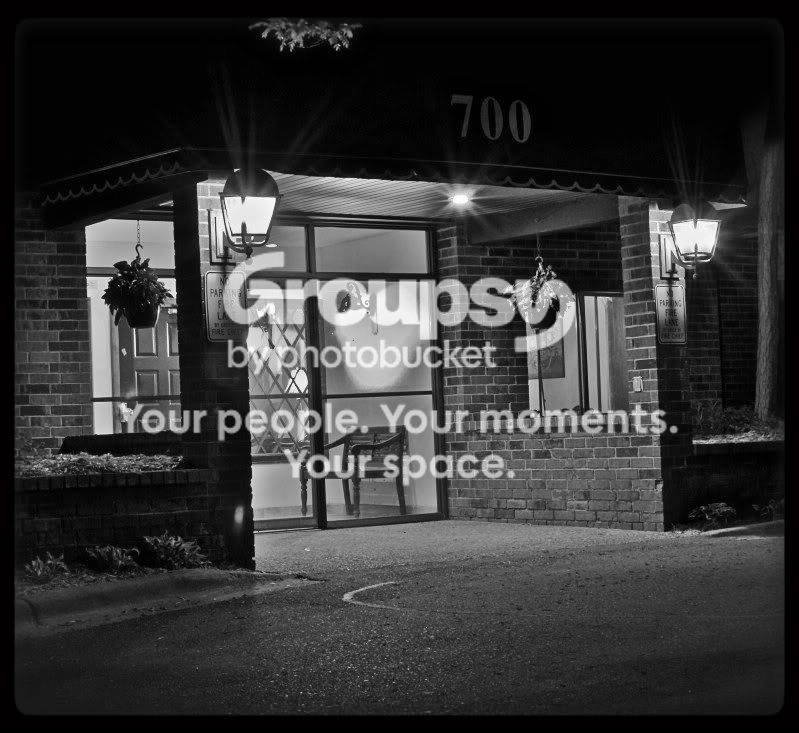
DSC_0042.jpg


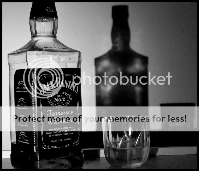
3. Indoor practice :- f/3.5,0.5 secs, ISO -200
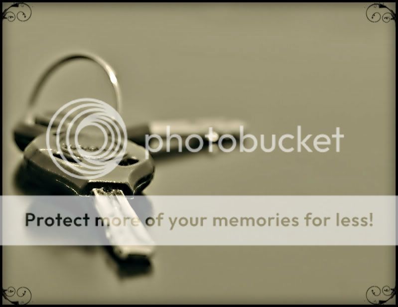
DSC_0040.jpg
 
I spent the first 4 years of my photographic life shooting and processing only B&W....not so much these days with digital but B&W certainly can convey a mood as well or better than color in certain instances.

These shots are not horrible but they don't really tell me anything other than a road with cars, a porch and keys.
 
Thank you so much for the comments!! Well you are absolutelt right.. I am yet to learn composition. That's what is missing badly.
 
Was trying light painting for the first time.. had nothing other than a brown towel, a watch and some copper coins. So thought of this theme :-

"MONEY can't buy you TIME"

DSC_0061.jpg
 
interesting concept, try dimes and nickles to contrast the brown background better. Randomize the coinage to look less like a pile. I have a similar image here..


Pleasure and Pain by Trever1t, on Flickr
 
:x..Now that you have pointed that out i see that.. Should have kept the cents all over rather than packing them up..Anyways here's one more.Had nothing to do in the rainy night so was tweaking my new remote shutter release button to see how it works..

ISO - 200 , F/18, 2 mins

DSC_0064.jpg
 
You have occasional problems with alignment. The 700 Doorway, and the Whiskey bottle are slightly skewed, to my eye, and that looks like an accident, which makes you look bad! If you're going to skew, skew hard, so we know you meant it.

I like the keys, it's a strong composition. Doesn't say much, but keys are pretty evocative on their own so maybe it doesn't have to say much. I would get rid of the border, it adds nothing and is a little distracting.

I like the bicycle best, I think. It's a strong composition, good eye leading. There's a little visual confusion since the eye is led toward the enigmatic white line (a railing?) in the distance, which, graphically, wants to be the visual center, but the bicycle is the most interesting thing in the frame, so we're not really sure where to look. This does create a little visual tension, though, which is nice. I think maybe a slightly lower viewpoint to push the two centers a little closer together, and a little further into the frame without destroying the composition might have helped here, but I am not sure.
 
Looks good. Keep blasting away!
 
I like the bike one a lot, the white railing doesnt seem to bother me much. I agree, you should get rid of the borders. I just think they look cheesy. ofc in some photos they might work. And idk if its the resolution or the uploading process to the thread, the picture looks a bit grainy. or maybe its just me :P
But good job on all :)
 
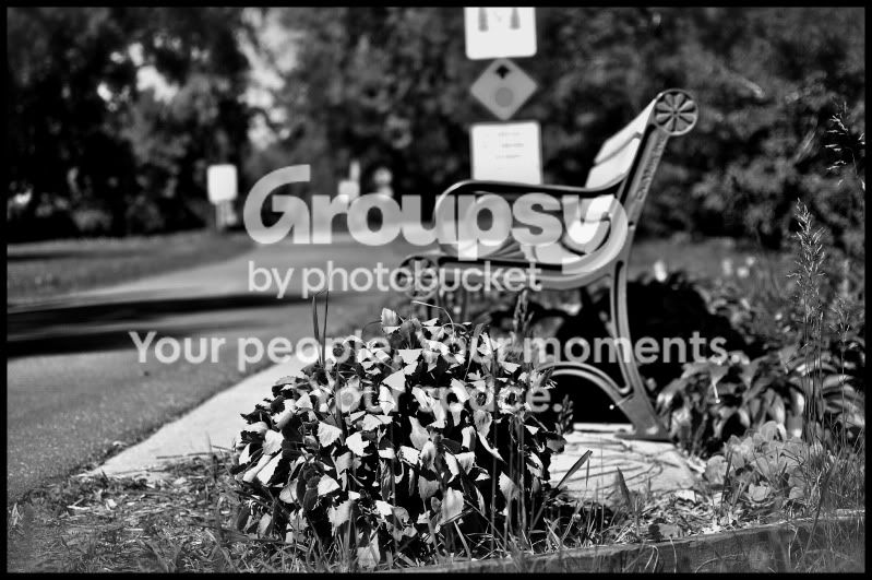
Thank you guys so much for the CC.. It really means a lot to me. Well even I am frustrated with the borders. How come I missed the tilted borders !!!! Now that you have pointed it looks like an eye-sore to me. Anyways here's one more pic that I took the other night.Kind of loving these long exposures in B&W.. CC are welcome

DSC_0077copy_1.jpg
 
Long exposures of roadways is really a thing that needs to be done in color. There's a couple reasons:

1) we've seen these things 139898298 times, and they're always in color -- it's simply the way that one is taken. Like all "rules" it can be broken, I suppose, but it has to be broken carefully!
2) Without the use of color, the streaks of light tend to be just confusing. Is that a railing? What? OH! It's.. cars, I think.

If you're going to try that sort of thing, I'd try to find an image where #2 doesn't happen because it's SO OBVIOUS, lead the viewer by the hand a little, and then give us a reason why you're breaking the rule. Give us streaked lights across, for example, a gritty urban scene, something that we like to see in B&W and for which the streaked lights enhance the sense of motion and activity, maybe. That's just one idea, but I hope it illustrates the concept - break the rule carefully, and for a reason, and don't confuse the viewers!
 

Create an account or login to comment

You must be a member in order to leave a comment

Create account

Create an account on our community. It's easy!

Log in

Already have an account? Log in here.

New Topics

Back
Top Bottom