Over all very nice work. I’m sure the bride will be very pleased. Even better is that this is your first wedding. That really says a lot about your general level of skill and comfort with you gear and also the process.
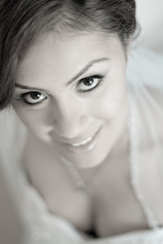
#1: Very intense effect. I would like to see the original out of the camera on this one
#2: You captured a nice moment though maybe not the best photo to put in their album. Very harsh lighting on the left.
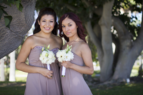
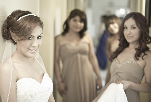
#3: Nice photo. Curios why this pose. I feel this pose lends itself to the idea that these two are very close to each other. Were there other bridesmaids? I really like the tree in the back out of focus but feel like the one on the left is “pushing” in on them.
#4: Very nice. I understand what others are saying about where their attention is drawn but her eyes are amazing in this photo. This photo is done very tastefully.
#5: Nice photo. The bride does not look as natural here as she does in others. Might just be because it was early in the day. I would rather see the girl on the further back and also out of focus like the others. Yes, this photo does feel a bit tight.
Again, they are all good photos. They will be very happy. I did feel like some were a bit more processed than I would like but that could just be me, or maybe you selected to share these processed images specifically. I feel like you gave up the rich colors of wedding on these.
Did you apply that processing feel to all the photos? If so why? I’m just curious. If not I’d love to see a few with less processing.
Nice work.

 kris and ivette by Carsten Schertzer, on Flickr


![[No title]](/data/xfmg/thumbnail/33/33028-42917987307dfd2eb37ddccec6dcb655.jpg?1734163036)