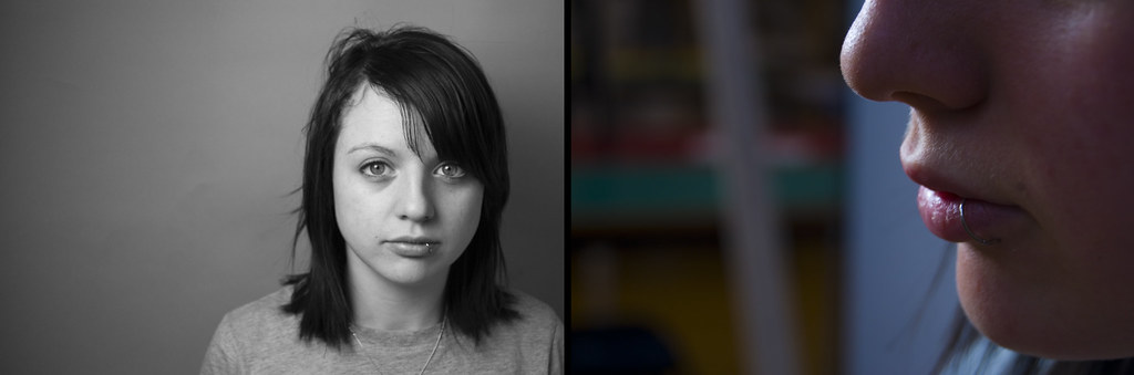
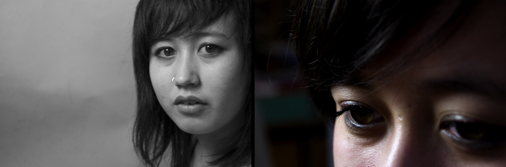
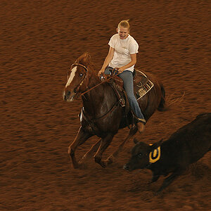
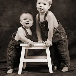
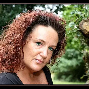
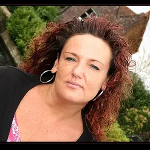
This is a good idea. One comment would be that the close-up on the girl at the top is decidedly different than the others that follow, and it stands out as being incompatible with the other close-ups.
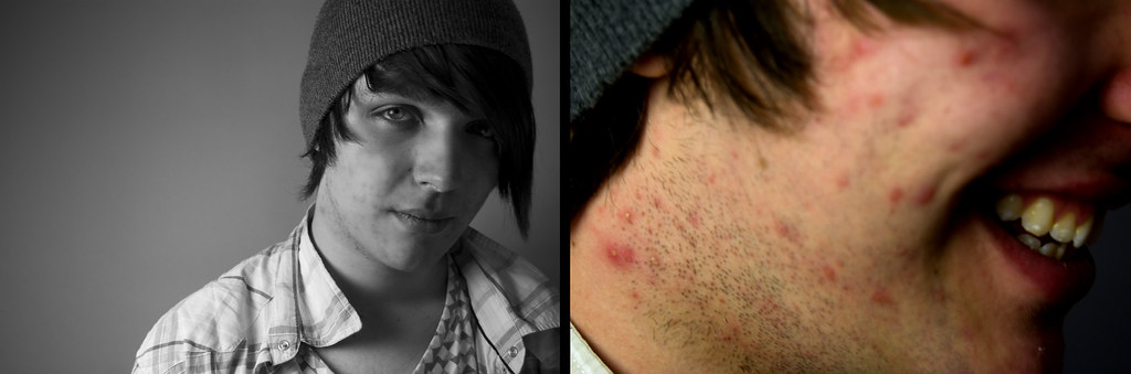
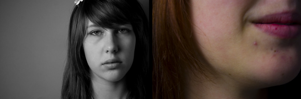
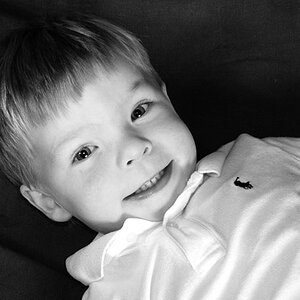
I think these would all be stronger if the camera were oriented in what is now commonly referred to as the 'portrait' orientation, or if you cropped off the large areas of dead space that makes up the left hand side of each of the five B&W portraits.
I think the frame-filling compositional style of the unflattering close-ups in shots 2-5 is the way to do the close-ups, which is a style known as "as-in-a-painting", meaning that the subject touches three or even all four sides of the compositional frame. There's actually a name for that style of composition, and the #1 close up breaks the style,causing dissonance. If you could substitute the same style on close-up #1 the whole collage would be more effective.
If you want to make this REALLY awesome, you might think about how to frame this so that the features in the portrait line up with the features in the unflattering close-up--lips straight across to lips + acne, pox-marked nose bridge straight across from nose in the portrait, and so on.







![[No title]](/data/xfmg/thumbnail/39/39429-cfa441056f1e6a1995539dc87c794876.jpg?1734173523)