flickr color problems

I know it can't be a setting because i upload to facebook and it looks as it should.

It can and still is. Facebook edits and resizes the photo. In other words they open the photo and whatever software they use if it recognises ICC profiles will correctly re-render and save an sRGB version on facebook.

In Lightroom when you click export, go down to file settings, and select sRGB right underneath where you select JPEG.


If you are ever in doubt, open your saved picture in internet explorer before you upload. If it looks desaturated compared to Windows Picture and Fax viewer, then it's the wrong colour space.


.
 
i see, it is set to prophoto... which i read was better so to speak than sRGb...
i still am confused as to what the differences are.
i am at work now, i will try to change the setting to sRGB when i get home.

so to recap, facebook is automatically converting to sRGB, and flickr is displaying the prophoto profile i set it too.

one question, why does the facebook version match pretty much identical to LR, and the flickr version is different? shouldn't flickr match LR and facebook be different?


thanks for your response by the way... :)


-shawn
 
For me they match. That is the problem with these fancy colour spaces. They need application support. Currently safari on mac supports embedded ICC colour profiles, and so does Firefox 3.x with a bit of a config hack.

Here's the gist of the problems though:
ProPhoto is a wider colour gamut. That means the colour RGB(255,0,0) represents a far redder red in ProPhoto than sRGB. Now the problem here is that not all applications are aware of colour spaces. sRGB is an IEC standard. By default every non-colour aware application including the entire Windows OS assumes the sRGB space. The problem is sRGB(255,0,0) is equivalent to ProPhoto(179,70,26). These are the same colours visually. But now view the ProPhoto image in internet explorer which assumes these are sRGB values because of a lack of colour mangement and you end up with a colour which looks like a dull brown, rather than a bright red.

This is why ProPhoto AdobeRGB and all the other fancy spaces in my opinion are not worth the hassle. Colour management is a headache especially if you don't know what you are doing. Also if you have some time read this post: http://www.thephotoforum.com/forum/...prophoto-colour-management-general-worth.html
And also know that every wonderfully colourful image you have seen on the web is actually in the sRGB space.
 
It worked !

Thank you for your help and your explanation of the color spaces.

I can say I understand them now.

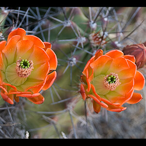
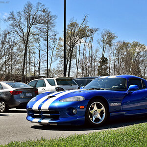
Here is what it should look like.

IMG_4654 on Flickr - Photo Sharing!

Thanks again.

Now all i have to do is just re-upload a whole lot of pics...ugghhh...
 

Most reactions

Back
Top