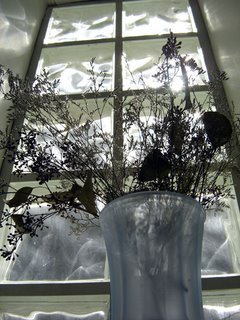
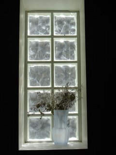
I do like the third one. It looks as if the window is an indentation on a black surface. I like the way the line of the window is straight rather than the surrounding wall.
I think I would like to see a bit more space at the top of the window and also to the right, but failing that, I think a tighter crop works too. What do you think?
On second thoughts, I think I like your original better :roll:
I like the first one best. The second one looks flatter then the other two, I prefer the sense of depth. On 2 and 3, I agree with raindrops, I like a tighter crop, and a balance (tho maybe not perfect symmetry) in the 'black space' around the window.
I also love me some glass bricks.