Flowers for C&C

JeffieLove

No longer a newbie, moving up!
Joined
Feb 8, 2010
Messages
1,601
Reaction score
15
Location
Elkton, MD
Can others edit my Photos
Photos OK to edit
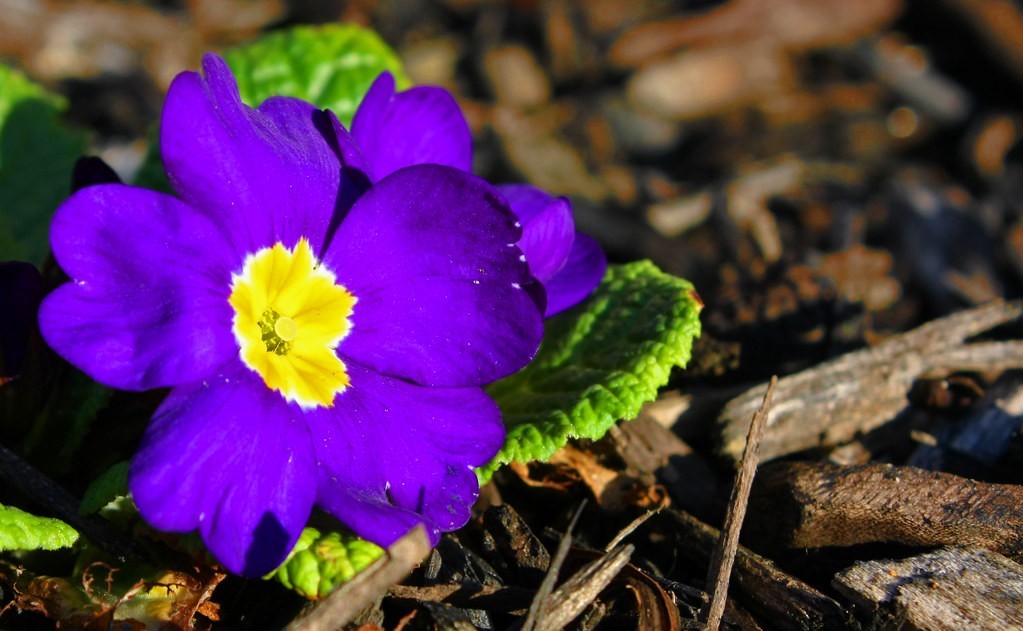
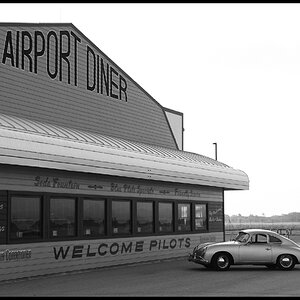
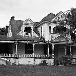
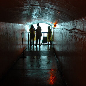
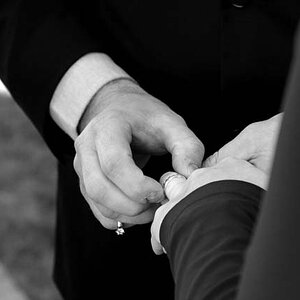
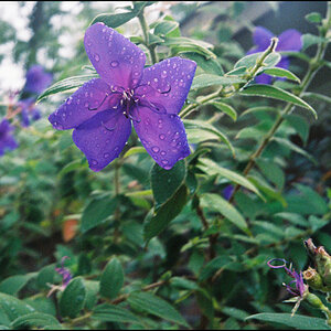
I know some people may think that a few of these are over saturated, but I'm a saturating junkie :) 
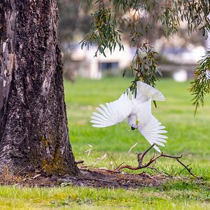
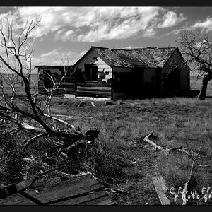
I like how it looks for some reason ;)

4480277609_722c6e4720_b.jpg


4480277871_e6b5d74de3_b.jpg


4480927020_83327095eb_b.jpg
 
3, I knew that would be said ;)

2, It looked focused and my focus indicator thing beeped on my camera... Not sure where it was focused though... Up until I got it on the computer, it looked focused :/ Thought maybe I could save it, guess not ;)

1, Was just a pretty bunch of daffodils (one of my favorite flowers) :)
 
haha.. well at least you have a good eye for your own pictures... 1 to me just looks bissy and a little out of focus also. your problem with the focus might have been if it was a little windy and kind of dark you might have not used a fast enough shutter so you capture a bit of the flowers swaying.
 
1) you should try shooting it again, but zoom out or step back a little to give it some flare, but keep your focus on the flowers and dont but them in the middle.

2) is nice but could be better IF it was in focus

3) i like the burst of purple, but there needs to be more field of depth, try getting lower to the ground next time.
 
3) i like the burst of purple, but there needs to be more field of depth, try getting lower to the ground next time.


First... it's depth of field...

Second, you can tell in the shot that my camera was ON THE GROUND to take the picture ;)
 
1.
The idea wasn't to bad but there wasn't enough symmetry so it looks messy. Try going for more balance. Its a bright flower! Go for a more peppy look next time work on the angle to make it appear happy. For a plant that just been watered it looks really sad :(.
2.
Issues with over exposure on a few parts of the plant. You have the leaf on the top left corner focused.The buds above the flower stick out of bit too much for my liking. The shadows on the main flower takes away from its red beauty. The sun can't always be on your side ;p. As mentioned before you missed the focus on the flower, other than that I believe it would've came out ok.
3.
I have a friend that also love to saturate. I'm used to it. I looooove the purple but the yellow in the center hurts my eyes and takes my focus from my favorite color(purple) into an eye sore ;p. The green is also a bit too much but reminds me of a picture from a science text book on bacteria. There is also too much empty background on the right, maybe if it was a more solid and constant color it'd be nice.
 
I think part of my issue is that I really need to learn how to mask in PP and only edit certain parts of the pictures... i just never have the time or patience to get all that detail! lol
 
I dont have and can't afford lightroom :(
 
re-edited my fave of the group :)

4482646753_0a7ed033a6_b.jpg
 
It would be better if you shot more at ground level.
 

Most reactions

Back
Top