spang1mw
No longer a newbie, moving up!
- Joined
- Oct 2, 2012
- Messages
- 165
- Reaction score
- 45
- Location
- Northern Michigan
- Can others edit my Photos
- Photos NOT OK to edit
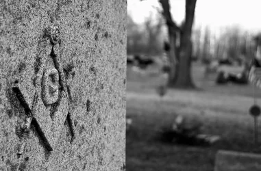
I'm not too fond of how you made the tombstone cut your photo into two halves: the actual subject on the left, and the OOF background (which adds NOTHING to what you want to show) on the right, sharing equal parts.
And the earth is tilted. No wonder grave stones are always sloped off to the side.
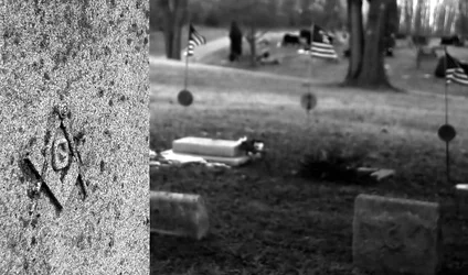
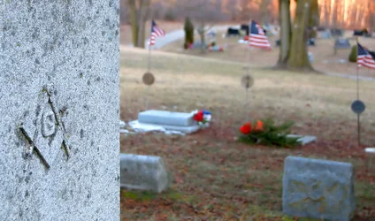
I figured a lot of people might not like how sharp the tombstone cuts the photo in half. My intention was to have the American flags in the background showing to go with the freemason symbol. Here is a couple of re-edits that I did. I think even these give too much area to the OOF background and not enough emphasis on the symbol. Are they any better? Or just throw aways?I'm not too fond of how you made the tombstone cut your photo into two halves: the actual subject on the left, and the OOF background (which adds NOTHING to what you want to show) on the right, sharing equal parts.


I figured a lot of people might not like how sharp the tombstone cuts the photo in half. My intention was to have the American flags in the background showing to go with the freemason symbol. Here is a couple of re-edits that I did. I think even these give too much area to the OOF background and not enough emphasis on the symbol. Are they any better? Or just throw aways?I'm not too fond of how you made the tombstone cut your photo into two halves: the actual subject on the left, and the OOF background (which adds NOTHING to what you want to show) on the right, sharing equal parts.
I agree with you on that I would have liked to have had my tripod and more time to set it up and plan it a lot better. It was very rushed unfortunately.O.K., I think the #3 shot (color version) is much better and it does make a point.
I think it is a rather provocative photo idea, and might have been better if you had been able to catch the flags in more of a full-blown profile.
Then there is the problem of DOF. I think it would have been better if you had been able to stretch your depth of field to get the flags in focus.
Considering that you apparently did nothing to stage this, working only with what is there, you had to make some serious compromises that in this case probably hurt your concept.

Thanks for commenting. I was hoping the freemason symbol would make it a little different then most cemetery shots. I enjoy the critique it will help me going forward!The problem is that cemeteries are tough to shoot. Very tough. Carrying an image out of one and having it say something is challenging at best. One of the very best cemetery shots I have ever seen was almost impossible to tell it was a cemetery shot until you looked very closely at it. On the surface it was a picture of a christmas tree ball in the snow... the cemetery reflected in it. VERY cool. (One of Chiller's shots)
Your image here has the same problem most cemetery shots have... no real impact. Color or otherwise. Theres a little... but the message is so cliche and tired that there's no real substance to it.
Don't take it too hard. I know many great photographers who cannot pull off shots from cemeteries.
Yes, that was my actual intent when I took the shots. I intended the freemason symbol to be the focus of the picture with the American flags being subtly in the background. I did the re-edits with more of a focus on the flags.I figured a lot of people might not like how sharp the tombstone cuts the photo in half. My intention was to have the American flags in the background showing to go with the freemason symbol. Here is a couple of re-edits that I did. I think even these give too much area to the OOF background and not enough emphasis on the symbol. Are they any better? Or just throw aways?I'm not too fond of how you made the tombstone cut your photo into two halves: the actual subject on the left, and the OOF background (which adds NOTHING to what you want to show) on the right, sharing equal parts.
Really? In the first post, the flags are not even visible....
#3 actually is much better.... if that was your intent.
One of Chiller's shots