What's new

Fresh 48 Session - in hospital *ATTEMPT #2* C&C please

CorrieMichael

No longer a newbie, moving up!
Joined
Sep 28, 2012
Messages
447
Reaction score
166
Location
Canada
Can others edit my Photos
Photos OK to edit
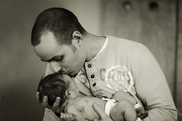
1. $IMG_4328edit1bwvan.webp2.$IMG_4358edit1bwvan.webp3.$IMG_4366edit1bwvan.webp4.$IMG_4394edit1bwvan.webp
 
I think these are better. Is there a reason you are not shooting in color?
 
I think these are better. Is there a reason you are not shooting in color?

nope just thought I would process them this way.....I can submit them in colour......just from mentoring most birth and fresh 48 sessions are processed in b&W?........... what is your thought?
 
I think these are better. Is there a reason you are not shooting in color?
Also where do you think I can imporve....what makes these average as oppose to great?
 
B&W is probably a good choice. Babies and moms don't exactly have flattering skin tones in those first hours. These look excellent to me, but I am not a pro. You've done a good job balancing the various factors -- you probably do NOT want to be using strobes here, so you're dealing with available light and available backgrounds.

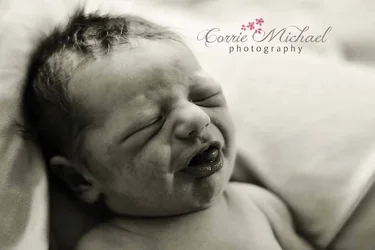
I would watch the contrast a bit, you're pushing it a fair bit which makes things dramatic, but loses some of the tender mood of these moments. The first one, in particular, has loads of deep dark blacks, lots of visual drama, when what we're looking at is a newborn.

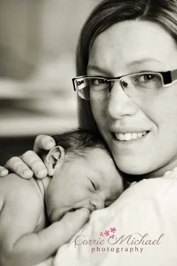
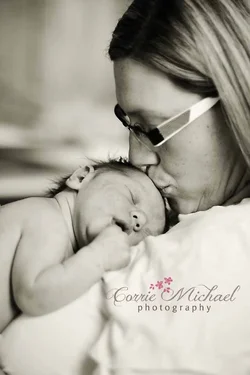
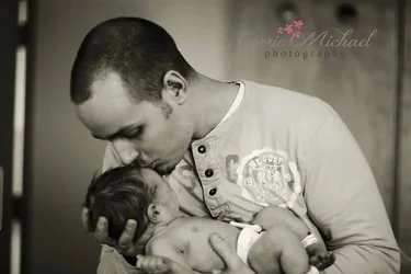
Watch the backgrounds a little more. You're throwing them out of focus, but they're still there. The last one, in particular, has some mildly distracting material there. The middle two feel a little tightly framed to me. The third one, with mom kissing the wee one, it probably works. The second one could, to my eye, definitely use a little more room to breathe.

These are all fairly minor issues, I like the work, generally.

 
Agree with amolitor.

I like 2 and 3 very much...I think the tight crop actually works, due to the fact that the surroundings are usually quite unattractive just after a birth. The first one would work for me if it wasn't so dark. The angle is a bit off putting for me too, but it would be fine most likely if it wasn't so dark. I love number 4, except for the light lines to the left of the photo. With those cropped out I would be drawn right to daddy and baby.
 
Also #4 seems tilted a little bit, if you look at the background, so that is a tad bit distracting.
 
I think 4 would look much better with the door frame on the left gone
 
Love the re-do on 4. 2 and 3 are nice.. 1 isn't flattering of the sweet babe. lol Everything I ever see on birth, etc are b&w.. I'd stick to it for birth.. but might be able to get away with color on 2and 3 since they are after the fact and could maybe work. I'd keep them softer on the color though, not harsh coloring.
 

Create an account or login to comment

You must be a member in order to leave a comment

Create account

Create an account on our community. It's easy!

Log in

Already have an account? Log in here.

Back
Top Bottom