What's new

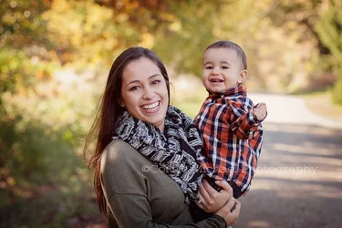
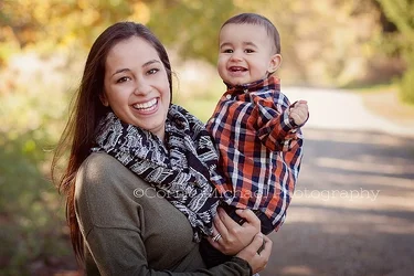
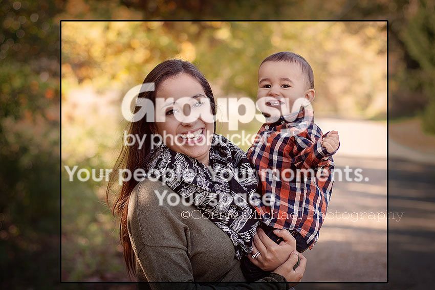
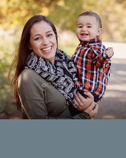
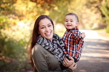
from one of my fall mini sessions C&C please

CorrieMichael

No longer a newbie, moving up!
Joined
Sep 28, 2012
Messages
447
Reaction score
166
Location
Canada
Can others edit my Photos
Photos OK to edit
$IMG_5707washdpilogo.webp
 
it's ok.. would have been better vertical with more of the woman below where you cut her off... especially with the overly bright elements in the background that are distracting. Proper Flash use would have allowed you do deal with that better also. Too much space on top and sides..
 
Last edited:
A simple crop goes a long way. Gets her out of the center of the frame, kills a lot of dead space and makes the landscape orientation work better.

$IMG_5707washdpilogo.webp
 
The original photo in my opinion is still a little bit too tight, but not bad. I like to frame mine wide. Why? I will have more options with cropping. You can switch it to vertical if you really have to. On the top of that, it will be easier to order canvases! If you do any tighter, you cant wrap the photo on the canvas frame. Food for thought. Shoot a little wide! This is the digital age.

 
What they said.
Pictures in the fairly deep shade, because of the lack of directional light tend to look both bluish and flat.
These look a bit 'edited' already but I would warm them a bit.
Since you want people to frame and save these, a 4 x 5 standard is much less expensive to mat and frame than a 4 x 6 image and, in this case, would make the people a little more important in the frame while still giving a nice hint of the lovely background.

I would be careful about letting them get too close to the top. Since you have so much room at the sides there is the possibility of giving the impression of the top being squashed. Give them a bit of room that will reflect nicely with the room at the sides.


IMG_5707washdpilogollll.jpg~original
 

The real "thing" going on here is a mother who has a small child she is literally supporting in her arms, and that's cropped off a bit awkwardly...that stage of the realtionship is eliminated by the cropping off at the arms in favor of more empty space above. In the original shot, the two have a lot of empty space to the left and right of them, and a good deal above them. They are what I call "riding low in the frame". Some people call it "falling out of the frame." As cgipson mentioned, the bright areas in the background are very prominent,m and pull the eye away from the people, one for her, one for him. What makes the arm chop a bit more noticeable is that beautiful highlight that runs along the shoulder and upper arm. I wish that her arm holding him up would have been included just a little bit more at the bottom of the frame, by lowering the camera a bit, and keeping the back of the camera more parallel with her standing position...seems like the camera height's a few inches higher than optimal.

The expressions of the mother and the boy are both very good.
 
If I had shot this.. it would have been framed (finished image) more like this:

$cm.webp

But then I am more of traditionalist than the OP is... she is from the new school, that more or less ignores traditional technique.
And as I mentioned above, I would have used flash..to warm it up.... since shade is a bit blue as Lew mentioned.
 
lighting better on this? $IMG_5707washdpi2logo.webp
 
Try not to clip appendages. The horizontal orientation is fine but you should have framed this below her arm and slightly above the waist and got her off center. Not feeling the big chunk of road in the background either. Should have angled it to get more foliage.
 
Those more squarish crops work out nicely, just so long as you're cool with a nonstandard aspect ratio.
 
Try not to clip appendages. The horizontal orientation is fine but you should have framed this below her arm and slightly above the waist and got her off center. Not feeling the big chunk of road in the background either. Should have angled it to get more foliage.

I think DiskoJoe's on to a very good option; looking at the photo, it seems like if the photographer had taken three or four steps to the right, that the different camera placement point would have eliminated the road entirely, and yielded a nice, clean, out of focus foliage background. The longer the lens focal length used, the narrower the angle of view behind the subject, so, moving backwards a short distance and then using a longer lens focal length can help get that narrow, selective angle of view.
 

Create an account or login to comment

You must be a member in order to leave a comment

Create account

Create an account on our community. It's easy!

Log in

Already have an account? Log in here.

Back
Top Bottom