What's new

Frustrated with color, C&C please...

jenncolang

TPF Noob!
Joined
Apr 11, 2008
Messages
67
Reaction score
0
Location
New Jersey!
Can others edit my Photos
Photos OK to edit
I'm not sure what I'm doing wrong, so if you have any ideas, please, shout from the roof tops. I've tried upping the saturation, but all it seems to do is make them seem red... I'm going to try a few actions I just bought, but I havn't recieved them yet...

I see so many photographers who have these gorgeous photos with these rich crisp colors, and I'm really striving for this and I can't seem to achieve it.

Thanks in advance!

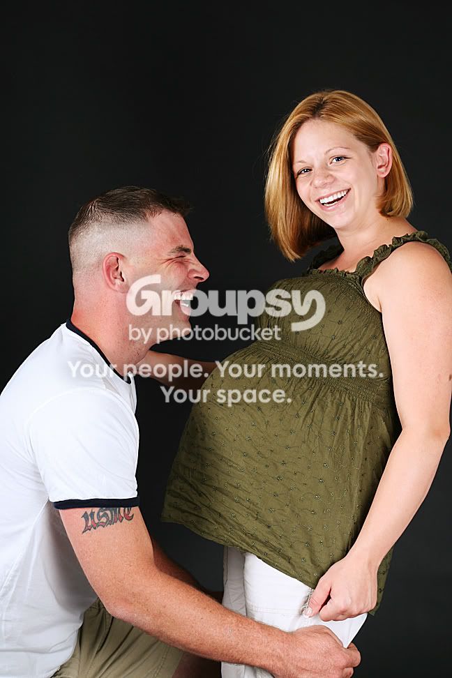
The first two have not been edited, the last has.

Picture024sm.jpg


Picture023sm.jpg


Picture015sm.jpg
 
I think that the pictures themselfs look wonderful , honestly i do not know what u want done with them or what to do to make them better then what they are
 
the lighting has washed out all shadow and detail in your faces and bodies.
Sometimes people think that in a portrait it has to resemble direct sunlight splashing their faces.
shadows are good you shouldn't erase them all.
 
Thank you both for your input... Please everyone keep it coming! I'm trying to learn, but it's difficult to find the best source to do so from, and then it can get frustrating. I am focusing on studio lighting right now, and need to figure out what the best source is to educate myself from.

I think that the pictures themselfs look wonderful , honestly i do not know what u want done with them or what to do to make them better then what they are
I do like the poses, and am fairly okay with the sharpness, but they do seem washed out and flat. If you google "children's photographers" their colors are very rich.. that's what I strive for. I want my pictures to be that beautiful. I don't want to give any actual examples, because I don't know what lines I would be crossing.


the lighting has washed out all shadow and detail in your faces and bodies.
Sometimes people think that in a portrait it has to resemble direct sunlight splashing their faces.
shadows are good you shouldn't erase them all.

I agree... The washed out look is not what I am going for, it is just how it is (unfortunatly, ugh) turning out. I think tomorrow I'm going to just sit and make someone sit in front of the lights and let me play. Unfortunately my studio lighting professor did not want to focus on portraits at all, so I'm left to learn that on my own.

Can anyone recommend some great books/websites?
 
try experimenting with one light... a larger softbox
at different placements around your subject. When you feel comfortable with the results you can get from that then add another light and so on.
Once you realize the limitations of one you can add two and then another.
Kind of like incremental understanding.
 
I'm a beginner, so my thoughts are more opinions than criticism...

I would like to see either all of his tattoo or none of it. I like it, though.The tattoo is tasteful even to those who don't usually like them, so it would IMO be a good thing to show off.
 
i dont know what your lighting set up is but for something like this i would of had 2 strobes facing at a 45* angle and a fill flash with my gold umbrella in the front to kill some of the shadow. or if you have a larger softbox you can just use one strobe directly in front
 
These are great poses. And nice captures.

I don't know much about lighting but maybe try a few curve adjustments. Here is a quick edit I did this morning.

Picture023sm.jpg
 
First question: What format are these shot in? RAW, .tif, or .jpg? If they're not RAW images, you're going to have difficulty 'tuning' them the way you want.

As boogaguy mentioned, your light has washed out the colours, especially from the lady's face. The first thing I would try is to reshoot this, with the same lighting but using a diffuser in front of the primary illuminating her face and do a bracketed series, say 1/3 stop, one over and two under.

I also think that perhaps the choice of clothing colour(s) is having an impact as well (the whites of his t-shirt are nearly blown). Her dark green top is naturally a rather 'muddy' colour which is never going to pop. I would look to have her in a brighter red, blue, or green top and him in a darker complimentary colour, say dark blue t-shirt.
Keep in mind however you don't want them to get lost in the background, which is what is happening to some degree in the last image of the child. His black shirt is almost lost against the dark background, while his face is at least 1/2 stop over-exposed. On the plus side, GREAT work on the eyes; those are amazing.
With respect to the last image, it feels a little soft to me. not 'nice portrait' soft, but just wrong point of foucs soft. In addition to the clothing-colour issue, I'd suggest cloning out the little bit of blue label on his chest.

At any rate, just my $00.02 worth - your milage may vary.
~John
 
Thanks so much everyone! Huge help in all directions!

To answer a few questions... theyw ere shot in jpg because i'm an idiot. I let my mom borrow my camera, and because she only shoots on p&s and can't edit I put it on jpg so i don't have to deal with her blank stares. then I forgot she had used it and forgot to put it back and was cursing myself... but usually for me, RAW

My lighting set up for this was simple.. two softboxes.. I would say on the smaller side, just plain with the white diffuser over it. On was pointed at the subject, one was slightly to her left? Without being able to map it out I am having a hard time explaining it. I would say one pointed at her nose, one pointed at the corner of her eye. I havn't been taught anything but the plain white cloth over the softbox, so I am trying to just sit and read, but it's hard to sit and figure it all out, and then find someone who wont get irritated about sitting in front of the lights.

Anyway I PPed these a little better, let me know what you think

Picture028sm.jpg


Picture023sm.jpg


sigh....
 

The old RAW/.jpg mix-up; been there, done that. It hurts. This one is nice, but again a tad over-exposed. You can see there's almost no detail in any of the whites she's wearing, and her skin is over-bright as well. How did you meter for this one?
 
try "unsharp mask" at a very slight level in PS. Also, on the solo portrait of the little boy...maybe a hair light would have seperated him a bit more from blending in with the background?

I don't think you need to reshoot unless it was for fun and they're up for it. The right editing should fix these up just fine.

I think this is a very sweet set!
Good work on poses and everything.
 
flat light is boring light
 
Is this the type of thing you are trying to achieve??

Picture024sm.jpg


Picture023sm.jpg
 
Last edited:
I like kanikula's edit's. If you like the way I PP, you can PM me if you want me to give it a shot.

I think you did great with posing, expression, sharpness and clarity. They do need just a bump in post processing :)
 

Create an account or login to comment

You must be a member in order to leave a comment

Create account

Create an account on our community. It's easy!

Log in

Already have an account? Log in here.

New Topics

Back
Top Bottom