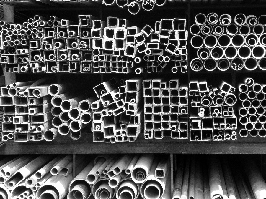
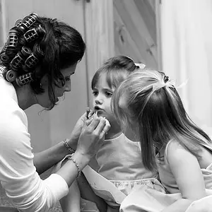
Aaah, nice ! Perfect use of b&w. Well noticed and used subject. Very synthetic and clean, almost abstract. I like it very much. Did you work this motive a little more ? Different angles ? Framing ? There are some groupings which would create nice pictures on its own.
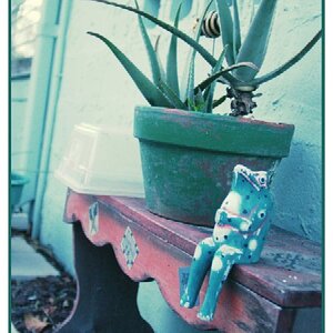
Ooh, this is a fun photo with an absolutely-perfect title. My only suggestion would be to darken the lower 25% of the frame a bit, not only because it appears a bit hot but also because it distracts from the real fun happening above.
Neat photo and I like the B&W conversion. Have you thought about cropping out the bottom part below the major shelf? The lower part that are almost all circular draws the viewer's eye away from the top part because it is alittle brighter. My 0.02¢ FWIW.
Aaah, nice ! Perfect use of b&w. Well noticed and used subject. Very synthetic and clean, almost abstract. I like it very much. Did you work this motive a little more ? Different angles ? Framing ? There are some groupings which would create nice pictures on its own.
Thank you very much, Timor; actually that was not a sure shot at the time of click; it was shot in the year of 2009; till the day i had never processed or thought of showing it anywhere; while i worked on it a few days earlier, i felt "this is not bad". Then i posted it. i had no other images from there. Regards
Ooh, this is a fun photo with an absolutely-perfect title. My only suggestion would be to darken the lower 25% of the frame a bit, not only because it appears a bit hot but also because it distracts from the real fun happening above.
Neat photo and I like the B&W conversion. Have you thought about cropping out the bottom part below the major shelf? The lower part that are almost all circular draws the viewer's eye away from the top part because it is alittle brighter. My 0.02¢ FWIW.




 thank you very much; Regards



![[No title]](/data/xfmg/thumbnail/37/37091-18fa97e6ac84c47479921254caf164c3.jpg?1734169826)
![[No title]](/data/xfmg/thumbnail/37/37090-2836dacbe52360ec3fdc1246a4e1d045.jpg?1734169826)