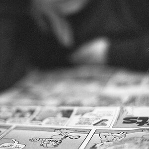
Its ealry before I start getting ready for work. I figured I would give what you said a try. Im not sure if I got it right. But I think it looks better than my others.
Well, if you were looking for critique maybe you should have posted it in the critique section of the forum.
I would have to say that it's pretty good... on the far right there is something in the frame.
Also, I think there is too much dead space to the right of the watch.
Where is the original shot? We might be able to comment better if you included that. And if you want to get Geronimo's attention, you might want to PM him...he can occasionally disappear for weeks at a time.
I think that looks nice. A lot better then if it was centered in my opinion. Also, not to over load you with my personal suggestions, but don't be afraid to crop to. On this one, I might crop the bottom a bit, just before the tile gets in focus.