Glass Chess Set, Strobist style!

andrew99

TPF Noob!
Joined
Jan 23, 2008
Messages
672
Reaction score
0
Location
Toronto, Canada
Website
ajwalker.ca
Can others edit my Photos
Photos NOT OK to edit
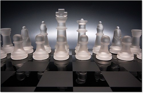
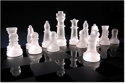
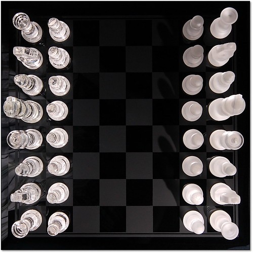
Here are a few shots of a glass chess set. I used 1 off camera flash, a Vivitar 285HV, at a low angle, with a cardboard snoot on it to limit the spread of light. Triggered with a Cactus V2S trigger. I'm using my Nikon D40 and Sigma 10-20 lens. Thanks for looking, and any comments/critism welcome! :)

2590364066_76ce9c1efa.jpg

2590364070_b766ff562c.jpg

2590364056_1f361e4fcd.jpg
 
Nice shots, but you can see your shirt and reflection in the last one.

Cheers
 
Pretty good work. #2 is money. #1 is a little too close, you're cutting off pieces, and #3 would be perfect except for the reflection. I didn't even notice that one until it was pointed out.
 
Haha, holy crap I didn't even realize that was my reflection, I just assumed it was light reflecting and diffracting off the glass pieces, but yes, you can see my stripped shirt in the left side of that photo. Oops! That will be hard to fix in Photoshop! :) Oh well, at least I'm wearing a shirt! ;) :):) Actually, to add further embarrassment, it might be the same shirt as in my avatar on this forum! :D

Thanks for the comments, much appreciated. :)
 
Nicely done Andrew. I especially like the second image. Great work with the lighting too. :D
 
Great lighting! These are really nice, except for what has already been noted.
 
Very sleek shots, especially for one light! I know if I'd try to shoot this, I'd add way too many lights in there and muck it up. I have to ask: how'd you get that lovely background shape with your light in #1? You were able to get that with just a snoot?
 
Definitely like 2 the best, great lighting and a cool angle.
 
Great work :hail: but I think you can fixx a thing or two.

On #1 you may want to tone down the back light. I think it distracts from your subject rather then enhancing but only alittle. Also try it in B&W. It may just be me but it looks like the chess set has a pink hue where your back light has a blue hue.

#2 is fine. Maybe try it in B&W.

With #3 you should reshoot it to remove your reflection. And also move your main light around to the other side of the board. The frosted pieces cast a shadow. The Clear ones will not or at lest not show as much.

Remember a good image is never finished its only abandon.

~Troy~
 
I like all three. I have that same chess set and now I feel I might try this just to see if I can duplicate your results. Nicely done.

Maybe next time replace your reflection with that of a black and white checkerboard. Maybe directly overhead and skewed 45 degrees.

Vince
 
Wow, thanks for all the comments!

To answer some questions that came up...

I originally tried using 2 lights, one umbrella up high and the snooted one down low, but it was too much light - too flat and even. I removed the umbrella'd light and tried with just the snooted light, and I liked it a lot more, it had more drama and you could see the glass chess pieces illuminating much better. Also the umbrella was reflecting on the board, which was extremely obvious.

The gray background on the first one is a piece of gray shiny poster board. This test shot should give you an idea of the setup:
DSC_8604-B.JPG


It took a lot of trial and error to get the highlight to be in the right placed and right angle! Actually, the background was the hardest thing about these photos -- no matter how I positioned the flashes, I was getting parts of the basement in the shot. I'll have to pick up some black velvet to use as a backdrop in the future!

Thanks again for all the comments! :)
 

Most reactions

Back
Top