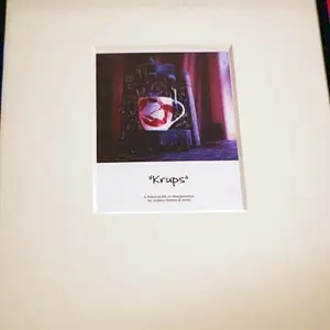
#1 is technically pretty ok, light's a little flat. Looks like a Senior Portrait, for whatever good or bad that is worth.
#3 is interesting, but I don't get it. It's soft, it's pretty green, it feels like it's going for something but I don't know what. Maybe it's just botched, maybe it's an idea that isn't coming together for me?
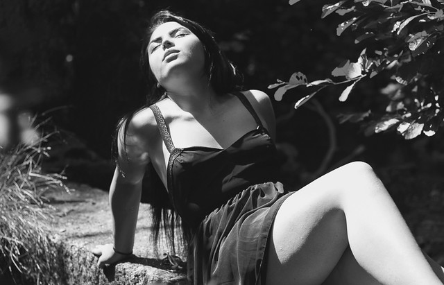
I like #2 far and away the best. I like b&w, I like a lot of b in my b&w, so I am prejudiced. I feel like it projects the heat of the day and an erotic heat all tangled together. It's very Liz Taylor, very Marilyn Monroe, on their best days. It's nothing like a senior portrait, it's nothing like a portrait at all. It's not a picture of Beth at all, arguably. It's pretty decent at being whatever it is, though.
#4 is similar, but the color and less dramatic handling of tones takes away from it, it's trying to be a more ordinary thing and failing at that, and also failing at being #2.





![[No title]](/data/xfmg/thumbnail/39/39440-bc17565eb7adee7f9859c53933e8543c.jpg?1734173530)


![[No title]](/data/xfmg/thumbnail/36/36301-27972c0474532c2ef657014362950733.jpg?1734168626)


![[No title]](/data/xfmg/thumbnail/37/37520-d3e4d6582aa2781be7abf64e8651db45.jpg?1734170680)