What's new

Got one picture and need some critique on composition

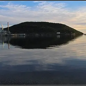
First, your horizon is very very very close to being level, but at this size, it's dropping a few pixels to the right. Line up the left side with the top of your browser window and you can see this. Before you get to the pier, you can see a few pixels of open sky. That's #1.

#2 - I think the composition is ok. I think I probably would have used a longer lens and stepped back a bit to make the pier larger and more prominent in the shot. As it is, it's quite small and doesn't contribute as much as I would like. I like the framing, but I don't like the focal length.

#3 - It appears a bit too yellow but I can live with it.

 
I think what makes this look uncomfortable to my eye is that the pier and the sea meet roughly in the middle of the composition. More so to the right, but still, it looks like you went for the center and were a bit off. In this case, following the rule of thirds would help with this, as long as careful consideration was put into placing the rock formations in the frame as well.

The colour seems strange. It seems to be heavy on the greens/yellows. Is this what you intended? It's not to my taste. I would tinker with the tint and WB a bit more. Focus seems good.

I'm not a fan of dark gloomy clouds like this. Unless it's a storm coming, I think the fluffy and gentle look of clouds should be preserved. It gives the picture an unnecessary heaviness.

My 2 cents.
 
*moved to landscape gallery*
Please remember that Beyond the Basics is not a photo critique subsection
 

Create an account or login to comment

You must be a member in order to leave a comment

Create account

Create an account on our community. It's easy!

Log in

Already have an account? Log in here.

Back
Top Bottom